Slide Text
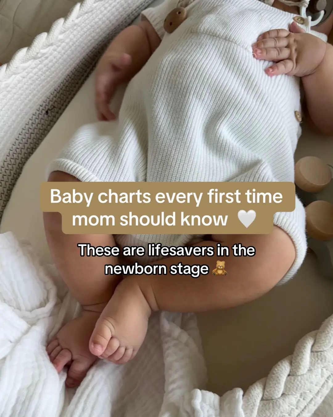
Baby charts every first time mom should know. These are lifesavers in the newborn stage.
Visual
Close-up of a baby in a white ribbed onesie lying on a soft white surface.
All Slides
@heymamatay carousel breakdown
Taylor
These charts are literal lifesavers #MomsofTikTok #mom #newborn #baby #babylove
Effectiveness score
9/10
Views
461.5K
Likes
21.7K
Saves
25.9K
Engagement
11.4%
Hook
Baby charts every first time mom should know. These are lifesavers in the newborn stage.
Goal
grow-following
Offer
information
CTA
Save this for later
Caption
These charts are literal lifesavers #MomsofTikTok #mom #newborn #baby #babylove
Strategic Summary
This carousel packages overwhelming, high-anxiety information (newborn scheduling) into bite-sized, visually soothing cheat sheets. The sheer density of utility triggers an instant 'save for later' reflex, evidenced by a bookmark rate 9.3x the norm. Partner and mom-friend tagging creates a secondary sharing loop that drives the virality.
The Winning Formula
Hyper-specific demographic callout + a sequence of dense but visually calming infographic cheat-sheets + a direct 'save for later' CTA.
What's working
- •Slide 1 calls out 'first time mom' directly, locking in audience identity in under 1 second.
- •The soft, minimalist beige and neutral aesthetic deliberately counters the underlying anxiety of the topic.
- •Information density forces the user to linger on each slide, skyrocketing dwell time.
- •Slide 8's explicit 'Save this for later' CTA perfectly aligns with the heavy utility of the preceding slides, resulting in massive bookmark conversion.
What's not working
- •Slide 5 breaks the infographic pattern by introducing a Spotify screenshot, which interrupts the 'chart' flow and feels slightly out of place.
- •Presenting rigid timelines (like Slide 4's wake windows) invariably aliens a portion of the audience whose babies don't match, though this does drive some comment debate.
Viral lesson
When you compress complex, stressful data into highly organized, aesthetically pleasing 'cheat sheets,' your content stops being a post and becomes a reference tool—which guarantees saves and shares.
Can a small creator replicate this? Extremely high for any creator who can curate niche industry rules or schedules into a cohesive, beautifully designed infographic carousel.
Structural Formula (steal-the-format)
Structure pattern
Aesthetic hook -> sequence of 5-6 highly dense infographic reference charts -> aesthetic CTA slide to save for later.
Copy formula
[Topic] charts every [Target Identity] should know + promise of being immediate 'lifesavers.'
What to swap (concrete remixes)
- •Swap 'first time mom' -> 'first year teacher' with classroom management timelines and behavior breakdown charts.
- •Swap 'first time mom' -> 'beginner lifter' with macro breakdowns, rep-range cheat sheets, and protein timing charts.
What NOT to copy
Do not copy the exact data or times inside the charts; the virality originates from the visually soothing, easily digestible UI packaging of overwhelming data, not the specific facts themselves.
Aesthetics
Soft beige/neutral minimalist baby aesthetic paired with flat-color instructional overlays.
Color palette
What it conveys: It feels incredibly safe, structured, and organized—acting as an emotional counterweight to the chaotic reality of bringing home a newborn.
Slide-by-slide forensics
1hookclose upcalmworks:yesgrab:85/100aesthetic:90/100Baby charts every first time mom should know 🤍
These are lifesavers in the newborn stage 🧸
Baby charts every first time mom should know 🤍 These are lifesavers in the newborn stage 🧸
Visual description
Close-up, top-down shot of a baby's chubby legs and lower torso. The baby is wearing a cream, ribbed knit onesie with wooden buttons, lying on a white muslin cloth inside a structured baby lounger. Muted, soft, warm lighting. Text is presented in rounded rectangular blocks (tan/beige base, crisp white text).
Scene setting
baby lounger on a bed
Visible people
Visible objects
Predicted audience reaction
Immediate self-identification as a target viewer ('first time mom') and high curiosity to see what 'lifesavers' they might not know yet.
Verdict: It sets a visually soothing tone while employing a highly specific identity hook that forces the target demographic to stop scrolling.
2step in listinfographiceducationalworks:yesgrab:75/100aesthetic:80/100Tired vs overtired
Crying
Difficult to calm down
Arching back and pushing away when settling to sleep
Resisting settling to sleep
Only napping for 30-45 minutes
False starts - waking 45 mins after bedtime
Waking every 2 hours overnight
Waking early morning, ready to party
Pulling at their ears
Rubbing their eyes
Closing their fists
Staring off into the distance
Jerky arm and leg movements
Frowning Red-looking brow line
Tired vs overtired Crying Difficult to calm down Arching back and pushing away when settling to sleep Resisting settling to sleep Only napping for 30-45 minutes False starts - waking 45 mins after bedtime Waking every 2 hours overnight Waking early morning, ready to party Pulling at their ears Rubbing their eyes Closing their fists Staring off into the distance Jerky arm and leg movements Frowning Red-looking brow line
Visual description
A brown rectangular card overlaid on the continuing background of the baby. The card features flat-color vector illustrations of two babies in fetal positions (one in white, one in dark brown) and text lists in light cream boxes comparing physical signs of being tired versus being overtired.
Scene setting
infographic overlay
Visible people
vs prior slide
Style: Continues the beige/brown minimalist color palette over the live background.
Story: Delivers the first 'chart' promised in the hook.
Predicted audience reaction
Reading horizontally to compare their own baby's recent meltdowns against the checklist to properly diagnose the issue.
Verdict: It immediately fulfills the promise of the hook with a highly actionable contrasting framework.
3step in listinfographicreassuranceworks:yesgrab:80/100aesthetic:85/100NEW BORN FEEDING TIP
Hungry Baby
Full Baby
NEW BORN FEEDING TIP Hungry Baby Full Baby
Visual description
A split-screen graphic overlay in pale pastel tones. The left side is light blue with a vector illustration of a clenched baby fist ('Hungry Baby'). The right side is pale green with an illustration of an open, relaxed baby hand ('Full Baby'). Backed by the continued image of the real baby.
Scene setting
infographic overlay
Visible people
vs prior slide
Style: Introduces new pastel colors (blue and green) but maintains the flat vector illustration aesthetic.
Story: Transitions the topic from baby sleep to physical feeding cues.
Predicted audience reaction
Experiencing a quick 'aha' moment upon learning a visually memorable biological cue.
Verdict: It is an incredibly fast, highly visual read that requires almost no effort to comprehend.
4step in listinfographicauthoritativeworks:yesgrab:80/100aesthetic:75/100AWAKE WINDOWS BY AGE
0-8 WEEKS -> 30-60 MINUTES
2-3 MONTHS -> 60-90 MINUTES
4-5 MONTHS -> 1.5-2.50 HOURS
6-8 MONTHS -> 2.5-3.5 HOURS
9-11 MONTHS -> 3-3.75 HOURS
12-18 MONTHS -> 4-5.5 HOURS
NESTED TO RESTED Sleep Consulting
AWAKE WINDOWS BY AGE 0-8 WEEKS -> 30-60 MINUTES 2-3 MONTHS -> 60-90 MINUTES 4-5 MONTHS -> 1.5-2.50 HOURS 6-8 MONTHS -> 2.5-3.5 HOURS 9-11 MONTHS -> 3-3.75 HOURS 12-18 MONTHS -> 4-5.5 HOURS NESTED TO RESTED Sleep Consulting
Visual description
A light beige overlay card displaying a flow chart of awake window durations based on age. It uses brown, cloud-shaped bubbles for the ages with arrows pointing to the corresponding time ranges. A watermark logo sits at top center.
Scene setting
infographic overlay
Visible people
Other text elements
- •NESTED TO RESTED Sleep Consulting watermark logo at top
vs prior slide
Style: Returns to the core beige and brown typography on a dominant light overlay block.
Story: Expands the scope of the carousel from the immediate newborn stage out to 18 months.
Predicted audience reaction
Intensely cross-referencing their own baby's schedule with the chart, either seeking validation or feeling anxious if the baby doesn't match.
Comments reacting to this slide
- "Mine is 2 weeks old and she a way more time awake 🥺"
- "My son is 6 months and only naps twice a day. His wake windows are a lot longer."
Verdict: It is the primary driver of comments in the post, as hard numbers naturally invite anecdotal debate from parents.
5step in listscreenshothelpfulworks:partialgrab:60/100aesthetic:70/100If your baby struggles to sleep, try playing them this playlist that will instantly calm them 🤍
Baby Sleep
Baby Sleep Music
Gentle lullabies and baby sleep music help your baby drift into peaceful sleep. Perfect sleep music for babie... see more
Little Teddy
If your baby struggles to sleep, try playing them this playlist that will instantly calm them 🤍 Baby Sleep Baby Sleep Music Gentle lullabies and baby sleep music help your baby drift into peaceful sleep. Perfect sleep music for babie... see more Little Teddy
Visual description
A dark brown overlay card featuring a screenshot of a Spotify playlist interface. The playlist titled 'Baby Sleep Music' features album art of a sleeping baby with arms raised over their head.
Scene setting
app screenshot overlay
Visible people
Other text elements
- •Spotify app UI elements
vs prior slide
Style: Swaps the custom graphic look for a raw app screenshot against a dark brown card.
Story: Pivots from providing direct data charts to recommending an external tool.
Predicted audience reaction
May screenshot the name of the playlist to search later, but mildly aware that it breaks the previous chart formatting.
Verdict: It breaks the visual 'cheat sheet' promise established in the hook, functioning slightly like an organic promotion, though logically connected to sleep.
6step in listinfographiceducationalworks:yesgrab:75/100aesthetic:80/100TUMMY TIME CHART
NEWBORN -> 2 - 3 MINUTES
2 MONTHS -> 20 - 30 MINUTES
3 MONTHS -> 40 - 60 MINUTES
4-6 MONTHS -> 1 - 2 HOURS
6+ MONTHS -> 2+ HOURS
TUMMY TIME CHART NEWBORN -> 2 - 3 MINUTES 2 MONTHS -> 20 - 30 MINUTES 3 MONTHS -> 40 - 60 MINUTES 4-6 MONTHS -> 1 - 2 HOURS 6+ MONTHS -> 2+ HOURS
Visual description
A clean, light card overlay depicting a vertical, snaking black timeline. Colored circle nodes represent the baby's age and connect via dotted lines to white rectangular boxes indicating how many minutes/hours of tummy time are required daily.
Scene setting
infographic overlay
Visible people
vs prior slide
Style: Returns to custom infographic design but introduces slightly more saturated pastel colors for the timeline nodes.
Story: Snaps the user back to milestone-based data charts.
Predicted audience reaction
Absorbing the timeline structure to verify if they are providing enough motor-skill development time.
Verdict: The timeline format is incredibly intuitive and visually pleasing, continuing to justify a 'save for later' action.
7step in listinfographicanalyticalworks:yesgrab:70/100aesthetic:75/100Baby Feeding Chart: Infant Nutritional Needs by Age
Age Range
Breast Milk
Formula
Solids
Tips
0-4 months
On demand, ~8-12 feeds/day
2-3 oz every 3-4 hours
None
Always check bottle temp — warm, not hot
4-6 months
On demand, 6-8 feeds/day
4-6 oz every 4 hours
Most haven't started yet — discuss with pediatrician
Introduce one new food at a time
6-8 months
Continue nursing as desired
3-4 feeds/ day, 4-6 oz
Pureed fruits, veggies, meats
Avoid honey & whole nuts
8-10 months
Continue nursing as desired
3-4 feeds/ day, 4-6 oz
Soft mashed foods & finger foods
Encourage self-feeding
10-12 months
Continue nursing as desired
3-4 feeds/day
Variety of textures, 3 meals + snacks
Transition to whole milk after 12 months if recommended
Baby Feeding Chart: Infant Nutritional Needs by Age Age Range Breast Milk Formula Solids Tips 0-4 months On demand, ~8-12 feeds/day 2-3 oz every 3-4 hours None Always check bottle temp — warm, not hot 4-6 months On demand, 6-8 feeds/day 4-6 oz every 4 hours Most haven't started yet — discuss with pediatrician Introduce one new food at a time 6-8 months Continue nursing as desired 3-4 feeds/ day, 4-6 oz Pureed fruits, veggies, meats Avoid honey & whole nuts 8-10 months Continue nursing as desired 3-4 feeds/ day, 4-6 oz Soft mashed foods & finger foods Encourage self-feeding 10-12 months Continue nursing as desired 3-4 feeds/day Variety of textures, 3 meals + snacks Transition to whole milk after 12 months if recommended
Visual description
A comprehensive data table utilizing purple header rows and beige data cells. It spans five columns detailing milk, formula, and solid food needs across five different age brackets up to 12 months. It's the most text-heavy slide in the carousel.
Scene setting
table overlay
Visible people
vs prior slide
Style: Diverges slightly by leading with a heavy purple tone for the table headers.
Story: Expands heavily on the initial feeding cue (Slide 3) into a comprehensive nutritional calendar.
Predicted audience reaction
Realizing there is far too much text to read in real-time, thereby forcing a decision to bookmark or screenshot the post.
Comments reacting to this slide
- "your temp chart doesn't cover Africa. your max is our average 😉"
Verdict: It is the ultimate 'utility' slide; the sheer density of data almost single-handedly justifies saving the entire post to reference later.
8ctaclose upsnugworks:yesgrab:80/100aesthetic:95/100Save this for later 🫶🏼
Save this for later 🫶🏼
Visual description
Full-frame image with no massive overlay blocking the view. A baby in a ribbed beige knit set lies in a soft, fluffy lounger, hugging a plush beige teddy bear over their face. A simple, centered text banner issues the CTA.
Scene setting
baby lounger on bed
Visible people
Visible objects
vs prior slide
Style: Drops all infographic elements to return to a pure, aesthetic lifestyle photo.
Story: Wraps the carousel with explicit instructions on what to do with the previous 6 slides of data.
Predicted audience reaction
Complying with the instruction because the preceding slides thoroughly proved their worth as reference material.
Verdict: It acts as a friction-free explicit request that capitalizes on the massive value delivered in the carousel.
Commerce intent
Comment ethnography
A mix of extreme gratitude for the cheat sheet and commiseration over the fact that their own babies often defy the 'rules.'
Comments that characterize the audience
- "Mine is 2 weeks old and she a way more time awake 🥺"
- "My son is 6 months and only naps twice a day. His wake windows are a lot longer."
- "Do I have a baby? No. will I still watch this? Absolutely"
Pain points revealed
- •Babies not conforming to 'standard' sleep/wake charts.
- •Newborn stage exhaustion and uncertainty.
Aspirations revealed
- •Having a predictable routine for their newborn.
- •Understanding exactly what their baby's physical cues mean.
Top questions asked
- •Does anyone else's baby stay awake longer?
Objections
- •My baby's wake windows are much longer than this chart states.
- •My reality does not match these maximums.
Diagnostics
Hook deep-dive
Baby charts every first time mom should know 🤍 These are lifesavers in the newborn stage 🧸
To ensure they aren't missing vital rules, schedules, or hacks that 'every first time mom' is utilizing.
Engagement read
Bookmarks and shares are astronomically high compared to comments, indicating the content functions purely as a high-utility reference tool rather than a conversation starter.
Mechanics
Providing a distinct, standalone piece of high-value reference data on every single slide.
Brand & funnel
Buying-journey moment: Feeling utterly overwhelmed with their newborn and frantically seeking structured, easy-to-digest schedules and signals.
Ideal Customer Profile
First-time mothers in the newborn stage who are overwhelmed, sleep-deprived, and seeking structured, actionable advice to simplify their daily routine.
Age
25-34
Gender
female
Readability
simple
Interests
Pain Points
Aspirations
Emotional Profile
Primary Emotion
reassuranceIntensity
Effectiveness
Emotions Evoked
Emotional Arc
curiosity → relief → empowerment → gratitude
Why It Lands
The content moves the viewer from a state of anxiety (new mom confusion) to relief (having a 'lifesaver' guide) and finally to empowerment (feeling equipped to handle the baby's needs).
Writing Analysis
Style
educational
Tone
relatable
Hook Type
listicle
Quality
The writing is exceptionally concise, stripping away jargon to focus on actionable data points. It respects the reader's time by using bullet points and clear headers.
Effectiveness
Goal Achievement
With over 25,000 bookmarks, the content is a masterclass in 'saveable' content. It perfectly serves the goal of growing a following by providing immense value that users want to keep in their 'Saved' folders.
Why It Spread
high utility/saveability
aesthetic visual consistency
direct address to a specific, highly-engaged demographic (first-time moms)
Content DNA
The CTA is perfectly aligned with the content's value proposition; since the content is a reference guide, asking for a 'save' is the most natural and effective action.
Narrative Arc
The carousel maintains high attention by providing a series of 'aha' moments, with each slide offering a new, distinct piece of helpful information.
Psychological Blueprint
Why It Spread
The post achieved a massive 11.37% engagement rate primarily because it is 'high-utility' content that demands to be saved for later reference. By packaging overwhelming parenting information into aesthetic, bite-sized charts, the creator solved an immediate pain point for new moms. The high bookmark-to-like ratio confirms that the audience viewed this as a permanent resource rather than just entertainment, triggering the algorithm to push it to similar users.
Framework
listicle revelationPrimary Tactic
loss aversionTactics Used
curiosity gap on slide 1 — 'baby charts every first time mom should know'
social proof via high bookmark count (implied value)
authority through simplified, expert-looking infographics
reciprocity by providing high-value, free 'cheat sheets'
Cognitive Biases
Zeigarnik effect (the need to finish the list of charts)
anchoring (using 'lifesaver' to anchor the value of the charts)
availability heuristic (making complex parenting info feel accessible and easy)
Tribal Markers
Trust Signals
Slide Breakdown (2 analyzed)
Text
Baby charts every first time mom should know. These are lifesavers in the newborn stage.
Visual
Close-up of a baby in a white ribbed onesie lying on a soft white surface.
Visual Elements
Color Palette
Copy Analysis
Power Words
Open Loop: yes — the promise of 'charts' creates a need to see what they are.
Visual Psychology
Attention: the text box overlay
Emotional cue: the baby's soft aesthetic triggers nurturing instincts
Composition: calm, clean, and trustworthy
Text
Tired vs overtired. [List of symptoms for both]
Visual
Infographic comparing two states of baby fatigue.
Visual Elements
Color Palette
Copy Analysis
Power Words
Open Loop: yes — the comparison invites the user to check their own baby's behavior.
Visual Psychology
Attention: the headline 'Tired vs overtired'
Emotional cue: the contrast between the two states provides clarity
Composition: to educate and provide immediate diagnostic value
Comment Intelligence
Sentiment
PositiveResonance
Intent
grow-following
Audience Vibe
The comments section is a hub of gratitude and shared relief among new mothers.
Standout Quotes
“This is exactly what I needed right now.”
“Saving this immediately, thank you!”
“I wish I had this three months ago.”
Top Comments
your temp chart doesn't cover Africa. your max is our average 😉
Mine is 2 weeks old and she a way more time awake 🥺
My son is 6 months and only naps twice a day. His wake windows are a lot longer.
@u.Sinqobile
@Kim 🥰