The hook is effective because it uses a negative label ('Worst') which is inherently more clickable than a positive one, and it targets a massive, passionate niche.
Slide Text
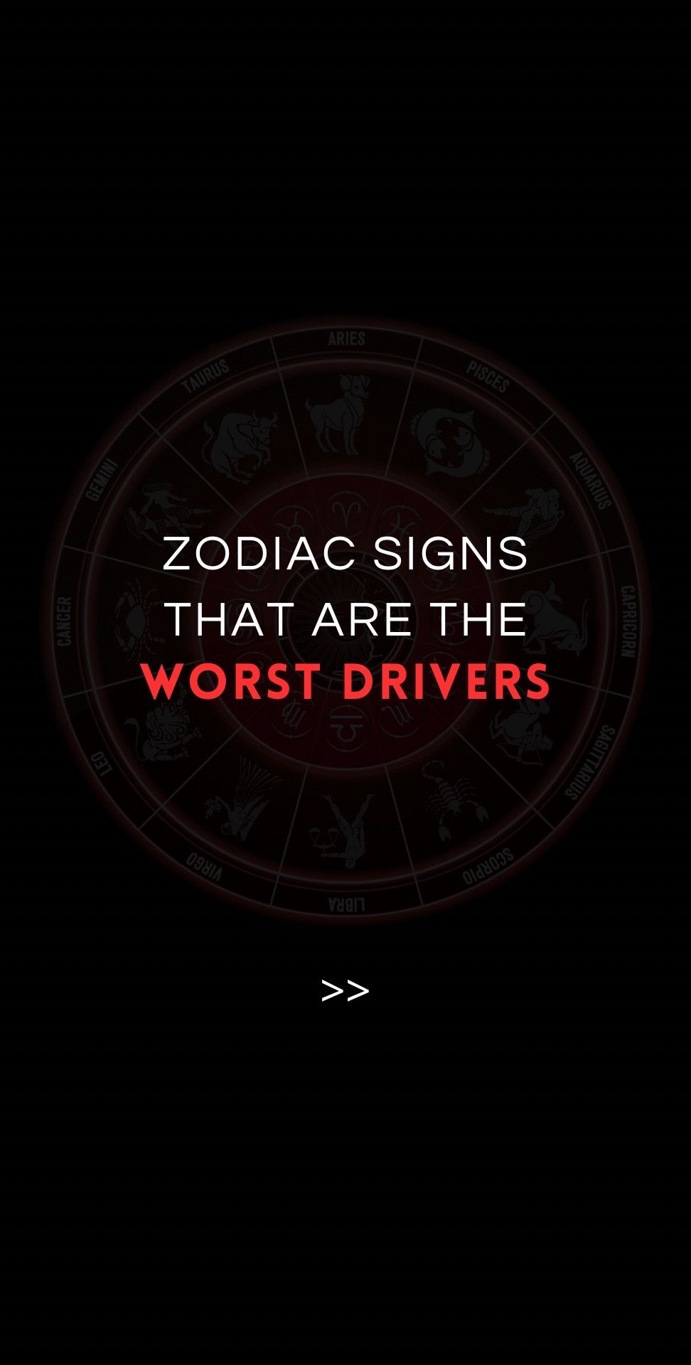
ZODIAC SIGNS THAT ARE THE WORST DRIVERS >>
Visual
Dark background with a faint, red-tinted zodiac wheel in the center.
@everythingofzodiac carousel breakdown
𝔸𝕝𝕝 𝔸𝕓𝕠𝕦𝕥 ℤ𝕠𝕕𝕚𝕒𝕔
Data from 2010 - allstate #zodiac #zodiacsigns #zodiactiktok #zodiacs #fyp #firesigns #earthsigns #airsigns #watersigns #ranked #astrology
Effectiveness score
9/10
Views
5.6M
Likes
407.1K
Saves
32.8K
Engagement
8.3%
Hook
ZODIAC SIGNS THAT ARE THE WORST DRIVERS >>
Goal
grow-following
Offer
entertainment
CTA
none
Caption
Data from 2010 - allstate #zodiac #zodiacsigns #zodiactiktok #zodiacs #fyp #firesigns #earthsigns #airsigns #watersigns #ranked #astrology
Strategic Summary
This carousel goes viral by combining a universally relatable daily behavior (driving) with identity defense (Zodiac signs). The 'Data from Allstate' claim in the caption provides a veneer of objective authority to what is essentially entertainment, triggering 'Well, actually' comments from users wanting to defend their sign's reputation. The ranking format forces completion bias as every user must scroll to find their sign, while the specific callout of 'Worst' drives emotional friction.
The Winning Formula
Relatable daily friction + specific identity ranking + pseudo-scientific data citation = tribal defense loops.
What's working
- •Slide 1 hook targets a universal skill (driving) that everyone believes they are good at, creating immediate cognitive dissonance with 'Worst Drivers'.
- •The caption cites 'Data from 2010 - allstate', leveraging an authority bias that makes the ranking feel like hard fact rather than opinion, fueling comments where users try to 'debunk' it with personal anecdotes.
- •Numbered list 1-12 is the ultimate completion hook; a user will not stop swiping until they find their own sign to see where they rank.
- •Visual consistency: The red-on-black text mimics 'alert' or 'danger' messaging, reinforcing the 'Worst/Accidents' theme.
- •Ranking Scorpio as #12 (Best) and Virgo as #1 (Worst) creates maximum polarization since Scorpios are often stereotyped as dangerous and Virgos as perfectionists.
What's not working
- •The data is explicitly from 2010, which savvy commenters will call out as outdated, potentially undermining the 'truth' feel (though this also drives comments).
- •The visual hierarchy on Slide 2 is dense; users might screenshot it rather than pause to read every number, which is good (saves) but means less active reading time.
Viral lesson
When ranking abstract identities (Zodiac, MBTI, etc.), anchor the ranking in a specific, verifiable-looking external metric (insurance data, crime stats, survey results). It transforms a subjective opinion into a debate about 'facts'.
Can a small creator replicate this? Any identity-based page can replicate this by finding a boring public dataset (census data, credit card stats, search trends) and mapping it to their specific identity niches, then ranking those niches.
Structural Formula (steal-the-format)
Structure pattern
2-slide carousel: Slide 1 bold identity hook; Slide 2 numbered ranking based on external data metrics.
Copy formula
Headline: [TOPIC] THAT ARE THE [EXTREME TRAIT]. List: 1-12 ranked sign + specific integer metric + commentary for extremes.
What to swap (concrete remixes)
- •Swap 'Worst Drivers' for 'Most Likely to Burn Out' targeting Career/Corporate audience using Bureau of Labor Statistics data.
- •Swap 'Car Accidents' for 'Coffee Spend' targeting Lifestyle/Niche audience using credit card survey data.
What NOT to copy
Do not fake data. While you can use 'Data from 2010', audiences can spot completely made-up numbers. Use real, boring datasets (Allstate, Census, Spotify) to give the ranking weight that people feel compelled to argue with.
Aesthetics
Dark-mode astrological infographic with high-contrast typography.
Color palette
What it conveys: The dark palette and red numbers create a sense of danger and urgency, framing the content as serious 'warning' information rather than just fun astrology.
Slide-by-slide forensics
1hooktext cardWarning / Intrigueworks:yesgrab:90/100aesthetic:85/100ZODIAC SIGNS THAT ARE THE WORST DRIVERS >>
ZODIAC SIGNS THAT ARE THE WORST DRIVERS >>
Visual description
Dark, mystical aesthetic. A red-tinted zodiac wheel is centered on a black background. Bold, all-caps sans-serif text is overlaid in the center. 'ZODIAC SIGNS' and 'THAT ARE THE' are in white, while 'WORST DRIVERS' is in bright red for emphasis. A double arrow '>>' sits at the bottom indicating a swipe.
Scene setting
studio black backdrop
Visible objects
Predicted audience reaction
Immediate self-identification ('That's me!') followed by defensive skepticism ('I'm a good driver').
Verdict: The red text triggers alert systems and the claim contradicts most people's self-view as competent drivers, creating an instant swipe motivation to check the 'facts'.
2payoffinfographicShame / Superiorityworks:yesgrab:95/100aesthetic:80/100Number of car accidents
1. Virgo 211,650 - Worst drivers
2. Leo 179,657
3. Taurus 177,503
4. Pisces 172,030
5. Sagittarius 154,477
6. Gemini 136,904
7. Capricorn 128,005
8. Aries 112,402
9. Libra 110,592
10. Aquarius 106,878
11. Cancer 101,539
12. Scorpio 26,833 - Best drivers
Number of car accidents 1. Virgo 211,650 - Worst drivers 2. Leo 179,657 3. Taurus 177,503 4. Pisces 172,030 5. Sagittarius 154,477 6. Gemini 136,904 7. Capricorn 128,005 8. Aries 112,402 9. Libra 110,592 10. Aquarius 106,878 11. Cancer 101,539 12. Scorpio 26,833 - Best drivers
Visual description
A list view on a black background. A red header bar reads 'Number of car accidents'. The list is numbered 1-12 in white text. The zodiac sign names are in white, while the accident numbers are in red to stand out. The top and bottom entries have added commentary '- Worst drivers' and '- Best drivers' respectively, creating a clear range.
Scene setting
infographic
vs prior slide
Style: Maintains the black background with red and white text palette for high contrast and consistent branding.
Story: Delivers on the promise of Slide 1 by providing the ranked data list.
Predicted audience reaction
High engagement: Virgos will comment explaining why the data is wrong; Scorpios will flex about being #1; others will tag friends who are 'Worst Drivers'.
Verdict: It gives every user a specific data point to defend or celebrate, maximizing the comment rate.
Commerce intent
Comment ethnography
The comments are likely a warzone of anecdotal evidence, where users aggressively defend their sign using personal driving history ('I just got a ticket but I'm a Leo!') and attack other signs.
Comments that characterize the audience
- "I'm a Scorpio and I let everyone pass me on the highway."
- "Virgos are just perfectionists, they aren't bad drivers, they just stress you out."
- "This list is fake."
Pain points revealed
- •Feeling judged by stereotypes.
- •People assuming they are bad drivers based on their sign.
Aspirations revealed
- •To be seen as the 'Best' driver.
- •To prove the data is wrong about their sign.
Top questions asked
- •How did Allstate determine this?
- •I'm a Virgo and I've never had an accident.
- •Where is the data for this?
Objections
- •This data is from 2010, it's irrelevant now.
- •My Scorpio friend drives like a maniac.
Diagnostics
Hook deep-dive
ZODIAC SIGNS THAT ARE THE WORST DRIVERS
Users cannot resist checking where their own sign falls on the list, especially if they consider themselves a good driver and want to see who is #1.
Engagement read
The comment count is relatively high compared to likes, suggesting strong debate and identity defense rather than passive consumption.
Mechanics
The numbered countdown forces identity-seeking behavior; users must view the whole list to find their placement.
Brand & funnel
Buying-journey moment: The viewer is in an entertainment/identity validation phase, not a buying phase.
Ideal Customer Profile
Young adults and teens who are deeply invested in zodiac culture and use astrology as a lens to understand themselves and others.
Age
18-24
Gender
female
Readability
simple
Interests
Pain Points
Aspirations
Emotional Profile
Primary Emotion
controversyIntensity
Effectiveness
Emotions Evoked
Emotional Arc
curiosity → anticipation → judgment/validation
Why It Lands
The content creates a 'me vs. them' dynamic where the viewer feels an immediate emotional spike upon seeing where their sign falls on the list.
Writing Analysis
Style
listicle
Tone
authoritative
Hook Type
bold claim
Quality
The writing is extremely concise, which is necessary for a two-slide carousel. It relies on the inherent interest of the subject rather than clever prose.
Effectiveness
Goal Achievement
With over 5 million views and high engagement, the post was incredibly effective at driving reach and interaction through the 'tag a friend' mechanic.
Why It Spread
highly polarizing content (ranking signs)
easy to digest format (2 slides)
high shareability for personal stories
Content DNA
There is no explicit CTA, but the content is inherently designed to be shared, which serves as a functional CTA.
Narrative Arc
The tension builds from the curiosity of the hook to the immediate gratification of the list on slide 2.
Psychological Blueprint
Why It Spread
The post leverages the high-engagement nature of zodiac content by forcing users to check their own sign's ranking. Because the ranking is controversial (e.g., Virgo as worst, Scorpio as best), it triggers immediate comments from people defending their sign or tagging friends. The combination of a simple, high-contrast visual and a 'listicle' format makes it highly shareable for TikTok stories, leading to the 17,804 shares reported.
Framework
curiosity loopPrimary Tactic
identity signalingTactics Used
curiosity-gap on slide 1 with the headline 'Worst Drivers'
identity-signaling by forcing the viewer to look for their own sign
social-comparison by ranking signs from worst to best
pattern-interrupt using a dark, high-contrast aesthetic
Cognitive Biases
Barnum effect: viewers accept the ranking as a reflection of their own experiences
Confirmation bias: people look for their sign to confirm their existing beliefs about themselves
Anchoring: the 'Worst Drivers' headline anchors the viewer to a negative judgment
Tribal Markers
Trust Signals
Slide Breakdown (2 analyzed)
Hook Analysis
The hook is effective because it uses a negative label ('Worst') which is inherently more clickable than a positive one, and it targets a massive, passionate niche.
Text
ZODIAC SIGNS THAT ARE THE WORST DRIVERS >>
Visual
Dark background with a faint, red-tinted zodiac wheel in the center.
Visual Elements
Color Palette
Copy Analysis
Power Words
Open Loop: yes, the viewer must swipe to see if their sign is included.
Visual Psychology
Attention: The red text 'WORST DRIVERS' against the black background.
Emotional cue: The red color signals danger or warning.
Composition: Centered text creates a direct, confrontational hook.
Text
Number of car accidents 1. Virgo 211,650 - Worst drivers 2. Leo 179,657 3. Taurus 177,503 4. Pisces 172,030 5. Sagittarius 154,477 6. Gemini 136,904 7. Capricorn 128,005 8. Aries 112,402 9. Libra 110,592 10. Aquarius 106,878 11. Cancer 101,539 12. Scorpio 26,833 - Best drivers
Visual
A simple list format on a black background with a red header bar.
Visual Elements
Color Palette
Copy Analysis
Power Words
Open Loop: no
Visual Psychology
Attention: The ranking numbers 1 and 12.
Emotional cue: The list format triggers the need to scan for one's own identity.
Composition: The list is designed for quick scanning and immediate identification.
Comment Intelligence
Sentiment
MixedResonance
Intent
grow-following
Audience Vibe
Defensive and argumentative; users are either validating their own ranking or attacking the validity of the data.
Standout Quotes
“As a Virgo, I feel attacked.”
“Scorpio supremacy, we stay winning.”
“This data is from 2010, it's not even accurate anymore.”