The juxtaposition of a high-end, weird visual with a professional design topic creates a perfect curiosity gap.
Slide Text
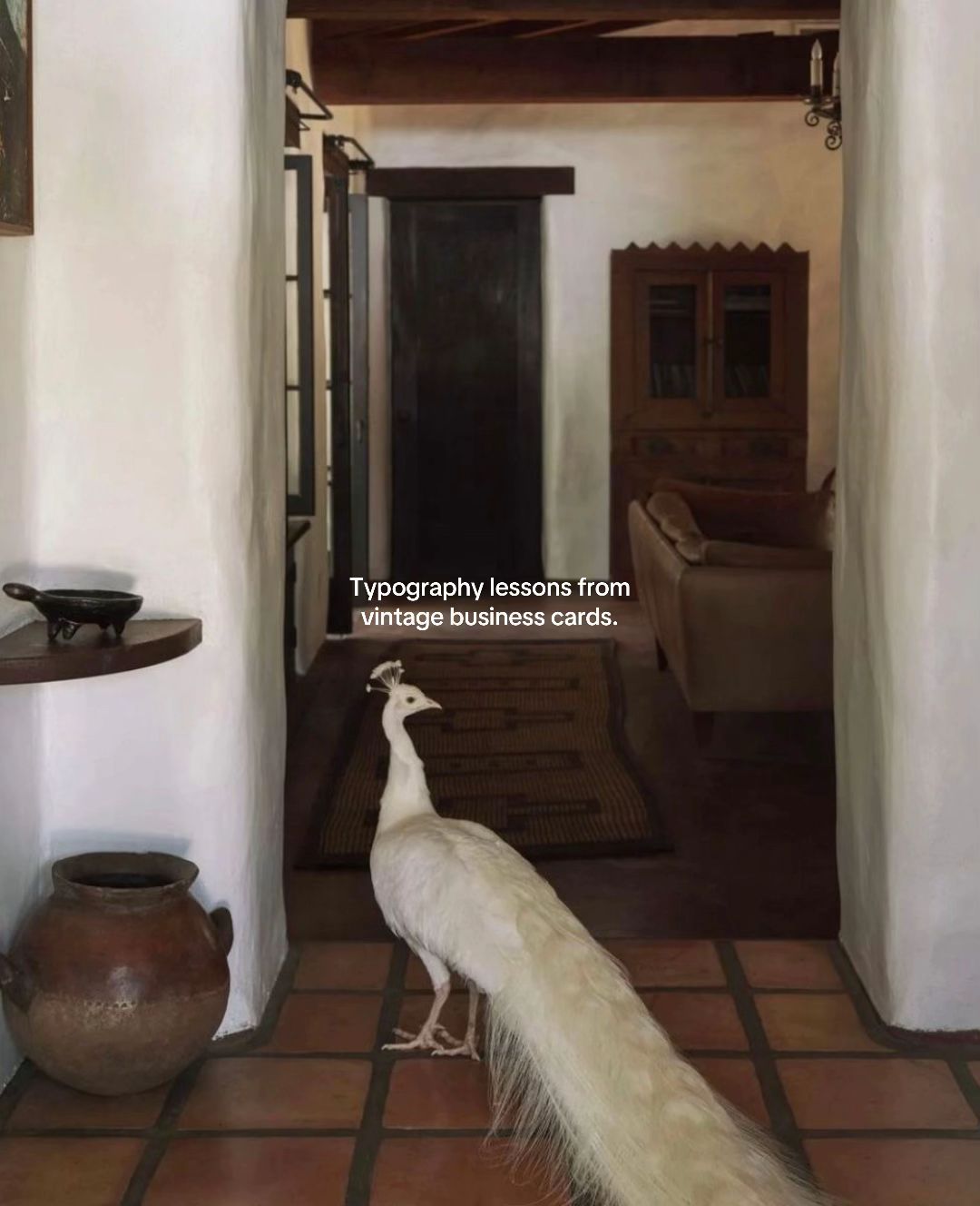
Typography lessons from vintage business cards.
Visual
A white peacock standing in a rustic, sunlit hallway with terracotta tiles.
All Slides
@fusioncreativestudio carousel breakdown
Fusion Creative Studio
#graphicdesign #typography #brandidentity #branding #visualdirection
Effectiveness score
9/10
Views
112.1K
Likes
18.2K
Saves
9K
Engagement
25.1%
Hook
Typography lessons from vintage business cards.
Goal
educate
Offer
information
CTA
none
Caption
#graphicdesign #typography #brandidentity #branding #visualdirection
Strategic Summary
This carousel went viral primarily due to an extreme bookmark rate (7.86%, 13x norm), driven by positioning the content as a high-value reference library rather than passive entertainment. It combines high-status cultural signals (Matisse, Miró) with immediate practical utility (exact font names and foundries), triggering a 'save for later' reflex in designers. The hook uses an unexpected visual (white peacock) to stop the scroll before delivering on a specific educational promise.
The Winning Formula
High-status cultural artifacts + exact actionable specifications (font names) = extreme save-bait for professionals.
What's working
- •Slide 1 uses a visually arresting, unrelated image (white peacock) to create a pattern interrupt before introducing the topic.
- •Slides 2-6 provide immediate utility by naming specific fonts and foundries, turning art into usable assets.
- •Name-dropping famous artists (Matisse, Miró) validates the viewer's taste and makes the resource feel premium.
- •The minimal overlay text identifies the value without cluttering the aesthetic, appealing to design-sensitive viewers.
What's not working
- •Slide 6 lacks a explicit CTA (Follow/Save), relying entirely on the content's inherent value to drive the bookmark action.
- •One comment notes the overlay text color sometimes obscures the card details, reducing legibility for purists.
Viral lesson
Audiences save content that bridges the gap between 'aspirational identity' (I appreciate Matisse) and 'practical tool' (I can use this font tomorrow).
Can a small creator replicate this? Highly replicable for any educational niche: take high-status examples in your field and annotate them with the specific 'how-to' details viewers can't easily find themselves.
Structural Formula (steal-the-format)
Structure pattern
1-slide visual hook + 5-slide list of examples with annotated technical details (font names).
Copy formula
Headline promise on slide 1 + [Famous Name] + [Font Name] + [Foundry] on subsequent slides.
What to swap (concrete remixes)
- •Swap 'vintage business cards' for 'luxury perfume bottles' with 'scent note breakdowns' for fragrance niche.
- •Swap 'fonts' for 'color hex codes' for interior design niche.
- •Swap 'artists' for 'celebrity outfits' with 'brand links' for fashion niche.
What NOT to copy
Do not copy the specific font overlays unless you are 100% accurate; this audience (designers) will correct you publicly in the comments if you misidentify a typeface.
Aesthetics
Vintage document archives with minimalist sans-serif overlay annotations.
Color palette
What it conveys: The aesthetic feels curated, museum-quality, and intellectually satisfying, appealing to the viewer's desire for order and beauty.
Slide-by-slide forensics
1hookwide shotcuriosityworks:yesgrab:95/100aesthetic:90/100Typography lessons from vintage business cards.
Typography lessons from vintage business cards.
Visual description
A full-body shot of a white peacock walking on terracotta tiles in a rustic, white-walled hallway. Warm, natural lighting. Vertical composition.
Scene setting
rustic interior hallway
Visible objects
vs prior slide
Style: This is the only slide with a photographic scene; the rest are flat scans.
Story: Sets the premise for the subsequent slides.
Predicted audience reaction
Stop scroll due to unexpected peacock image, read text to understand relevance.
Verdict: The visual incongruence (peacock vs typography) creates a curiosity gap that forces a swipe.
2proofflat laysophisticationworks:yesgrab:80/100aesthetic:85/100Asterone Complete Family by Letterhend HENRI - MATISSE Montigny Regular by Eurotype 1. Place Charles Felix, Nice (A.M.) 132, Boul d Montparnasse, Paris XIVe
Asterone Complete Family by Letterhend HENRI - MATISSE Montigny Regular by Eurotype 1. Place Charles Felix, Nice (A.M.) 132, Boul d Montparnasse, Paris XIVe
Visual description
A scan of a vintage cream-colored business card for Henri-Matisse. Black serif and script typography. Overlay text identifies the fonts used.
Scene setting
flat-lay document scan
Visible objects
vs prior slide
Style: Shifts from photo to document scan, but maintains cream/beige color palette.
Story: First example fulfilling the hook's promise.
Predicted audience reaction
Immediate save impulse due to high-profile name (Matisse) and font details.
Comments reacting to this slide
- "The sans serif on Matisse's is ITC Blair"
- "I love the first one very much"
Verdict: High-status name recognition validates the quality of the design resource.
3proofflat layprofessionalismworks:yesgrab:75/100aesthetic:80/100Original Script Regular by Monotype AVUKAT A. Seref Unsal FM Bolyar Sans Pro Rust 300 by The Fontmaker Büro : Şehit Adem Yavuz Sokak No. 9/13 Kızılay - ANKARA Ev : Turgut Reis Caddesi No. 54/7 Maltepe - ANKARA ☎ : 17 24 29 ☎ : 29 19 96
Original Script Regular by Monotype AVUKAT A. Seref Unsal FM Bolyar Sans Pro Rust 300 by The Fontmaker Büro : Şehit Adem Yavuz Sokak No. 9/13 Kızılay - ANKARA Ev : Turgut Reis Caddesi No. 54/7 Maltepe - ANKARA ☎ : 17 24 29 ☎ : 29 19 96
Visual description
A scan of a vintage lawyer (Avukat) business card. Mix of script and sans-serif fonts. Turkish address details.
Scene setting
flat-lay document scan
Visible objects
vs prior slide
Style: Consistent flat-lay document style with font overlay labels.
Story: Second example, showing variety in script usage.
Predicted audience reaction
Appreciation for the script pairing, saving for font reference.
Verdict: Continues the pattern of high-utility font identification.
4proofflat layminimalismworks:yesgrab:85/100aesthetic:90/100JOAN MIRÓ EFCO Overhold Wide by Ephemera Fonts
JOAN MIRÓ EFCO Overhold Wide by Ephemera Fonts
Visual description
A minimalist cream business card for Joan Miró. Wide sans-serif typography centered on the card.
Scene setting
flat-lay document scan
Visible objects
vs prior slide
Style: Same document scan aesthetic, even cleaner layout.
Story: Third example, showcasing extreme minimalism.
Predicted audience reaction
High engagement from minimalism lovers; strong save signal.
Verdict: The simplicity of the card matches the audience's aesthetic preferences perfectly.
5proofflat layartisticworks:yesgrab:80/100aesthetic:85/100PIET MONDRIAN Buckwheat TC Sans Rough by Tom Chalky 26, RUE DU DÉPART Serapis by T-26
PIET MONDRIAN Buckwheat TC Sans Rough by Tom Chalky 26, RUE DU DÉPART Serapis by T-26
Visual description
A beige/orange-tinted business card for Piet Mondrian. Sans-serif fonts, address at bottom right.
Scene setting
flat-lay document scan
Visible objects
vs prior slide
Style: Consistent layout, slightly warmer card tone.
Story: Fourth example, reinforcing the 'artist card' theme.
Predicted audience reaction
Recognition of Mondrian name adds credibility to the font choice.
Verdict: Maintains momentum; another famous name keeps the viewer swiping.
6proofflat layhistoricalworks:partialgrab:75/100aesthetic:85/100TELEPHONE 127-J Engravers' Gothic by Tilade June 30 '13 handwritten WILLIAM CARLOS WILLIAMS, M.D. Sackers Gothic Heavy by Monotype 131 W. PASSAIC AVENUE OFFICE HOURS UNTIL 10 A.M. (EXCEPT SUNDAYS) 1-2 AND 7-8.30 P.M. RUTHERFORD, N.J.
TELEPHONE 127-J Engravers' Gothic by Tilade June 30 '13 handwritten WILLIAM CARLOS WILLIAMS, M.D. Sackers Gothic Heavy by Monotype 131 W. PASSAIC AVENUE OFFICE HOURS UNTIL 10 A.M. (EXCEPT SUNDAYS) 1-2 AND 7-8.30 P.M. RUTHERFORD, N.J.
Visual description
A vintage doctor's business card. White background, black gothic typography. Handwritten date at top.
Scene setting
flat-lay document scan
Visible objects
vs prior slide
Style: Final card in the sequence, consistent style.
Story: Final example to close the list.
Predicted audience reaction
Satisfaction with the final resource, leading to a bookmark action.
Verdict: Good content, but lacks a verbal CTA to convert the high dwell time into a follow.
Commerce intent
Mentioned products
Objections (from comments)
- •i wish you'd put your notes in some other colour so we could see the business cards in their original glory
Comment ethnography
The audience identifies as design experts, correcting font IDs (e.g., suggesting ITC Blair) and making niche cultural references (Patrick Bateman/American Psycho).
Comments that characterize the audience
- "The sans serif on Matisse's is ITC Blair"
- "The beauty of font hierarchy ❤️"
- "This is so therapeutic"
Pain points revealed
- •Difficulty identifying specific fonts on vintage materials
- •Desire for tasteful, non-generic typography resources
Aspirations revealed
- •To have a design eye as refined as Matisse or Miró
- •To create business cards that feel 'therapeutic' and 'perfect'
Top questions asked
- •Let's see Paul Allen's
- •Let's see Fashion Creative Studios business card
Objections
- •Overlay text color interferes with card visibility
Diagnostics
Hook deep-dive
Typography lessons from vintage business cards.
The viewer wants to see the 'lessons' promised, and the peacock image suggests this isn't a boring tutorial.
Engagement read
Bookmark rate is 13x the library norm, indicating this is treated as a tool/reference rather than content.
Mechanics
Completion bias driven by the promise of multiple examples; viewers swipe to see if the next card is as good as the last.
Brand & funnel
Brands visible
Buying-journey moment: The viewer is in the inspiration/resource gathering phase, looking for tools to elevate their own work.
Ideal Customer Profile
Aspiring or junior graphic designers and typography enthusiasts who value high-end, editorial aesthetics and historical context.
Age
18-24
Gender
neutral
Readability
simple
Interests
Pain Points
Aspirations
Emotional Profile
Primary Emotion
aspirationIntensity
Effectiveness
Emotions Evoked
Emotional Arc
intrigue → discovery → appreciation
Why It Lands
The content creates a sense of 'elevated learning' where the viewer feels smarter and more sophisticated just by consuming the information.
Writing Analysis
Style
educational
Tone
calm
Hook Type
listicle
Quality
Extremely concise and professional; uses industry-standard terminology without being exclusionary.
Effectiveness
Goal Achievement
The high bookmark count confirms the content successfully served as a resource for the design community.
Why It Spread
high-quality, 'aesthetic' visual curation
low-friction educational value
high save-ability for future reference
Content DNA
There is no explicit CTA, which is a missed opportunity to drive traffic to a newsletter or design resource, though it keeps the content feeling 'pure' and non-salesy.
Narrative Arc
The carousel maintains a steady, rhythmic pace, alternating between visual intrigue and high-value, bite-sized design examples, ending on a final, dense piece of typography.
Psychological Blueprint
Why It Spread
The post succeeded by combining a highly aesthetic, 'save-worthy' visual format with a low-friction educational hook. The high bookmark-to-like ratio (nearly 50%) indicates that users treated this as a reference library, while the unexpected, high-contrast opening image stopped the scroll effectively. It provided immediate value to designers without requiring a long-form explanation, making it perfect for the TikTok algorithm's preference for high-retention, visual-first content.
Framework
authority then teachPrimary Tactic
authorityTactics Used
pattern-interrupt on slide 1 with the unexpected white peacock in a rustic interior
curiosity gap on slide 1 with the promise of 'lessons' from vintage cards
authority signaling by naming specific font families and foundries
aesthetic signaling through the 'quiet luxury' visual style
Cognitive Biases
mere exposure effect — repeated exposure to high-quality typography builds preference
aesthetic-usability effect — the beautiful presentation makes the information seem more valuable
Tribal Markers
Trust Signals
Slide Breakdown (6 analyzed)
Hook Analysis
The juxtaposition of a high-end, weird visual with a professional design topic creates a perfect curiosity gap.
Text
Typography lessons from vintage business cards.
Visual
A white peacock standing in a rustic, sunlit hallway with terracotta tiles.
Visual Elements
Color Palette
Copy Analysis
Power Words
Open Loop: yes — the image is completely unrelated to the text, forcing the user to swipe to see the connection.
Visual Psychology
Attention: the white peacock against the dark, rustic background
Gaze: the peacock is looking to the right, guiding the eye toward the next slide
Emotional cue: the unexpected, surreal nature of the peacock creates immediate intrigue
Composition: to create a 'stop-the-scroll' moment through visual dissonance
Text
Asterone Complete Family by Letterhend. HENRI-MATISSE. Montigny Regular by Eurotypo. 1, Place Charles Felix, Nice (A.M.) 132, Boul. Montparnasse, Paris (XIVe)
Visual
A vintage business card scan on a textured off-white background.
Visual Elements
Color Palette
Copy Analysis
Power Words
Open Loop: yes — the viewer expects more examples.
Visual Psychology
Attention: the bold 'HENRI-MATISSE' text
Emotional cue: the vintage texture evokes nostalgia and authenticity
Composition: to showcase typographic hierarchy and historical elegance
Text
Original Script Regular by Monotype. AVUKAT. A. Seref Unsal. FM Bolyar Sans Pro Rust 300 by The Fontmaker. Büro: Sehit Adem Yavuz Sokak No. 9/13 Kizilay - ANKARA. Ev: Turgut Reis Caddesi No. 54/7 Maltepe - ANKARA. 17 24 29. 29 19 96
Visual
A vintage business card scan with a mix of script and sans-serif fonts.
Visual Elements
Color Palette
Copy Analysis
Power Words
Open Loop: yes — the viewer expects more examples.
Visual Psychology
Attention: the script name 'A. Seref Unsal'
Emotional cue: the contrast between the script and the rigid sans-serif creates visual interest
Composition: to demonstrate effective font pairing
Text
JOAN MIRO. EFCO Overhold Wide by Ephemera Fonts
Visual
A minimalist vintage business card with wide-set typography.
Visual Elements
Color Palette
Copy Analysis
Power Words
Open Loop: yes — the viewer expects more examples.
Visual Psychology
Attention: the wide-set 'JOAN MIRO' text
Emotional cue: the simplicity evokes a sense of modernism and clarity
Composition: to highlight the power of negative space and tracking
Text
PIET MONDRIAN. Buckwheat TC Sans Rough by Tom Chalky. 26, RUE DU DEPART. Serapis by T-26
Visual
A vintage business card with a rough, textured sans-serif font.
Visual Elements
Color Palette
Copy Analysis
Power Words
Open Loop: yes — the viewer expects more examples.
Visual Psychology
Attention: the name 'PIET MONDRIAN'
Emotional cue: the 'rough' texture adds a tactile, human quality to the design
Composition: to show how texture can elevate a simple sans-serif
Text
TELEPHONE 127-J. Engravers' Gothic by Tilde. June 30, 19. WILLIAM CARLOS WILLIAMS, M.D. Sackers Gothic Heaby by Monotype. 131 W. PASSAIC AVENUE. OFFICE HOURS UNTIL 10 A.M. (EXCEPT SUNDAYS) 1-2 AND 7-8.30 P. M. RUTHERFORD, N.J.
Visual
A vintage business card with dense, informative text.
Visual Elements
Color Palette
Copy Analysis
Power Words
Open Loop: no — the carousel concludes here.
Visual Psychology
Attention: the name 'WILLIAM CARLOS WILLIAMS, M.D.'
Emotional cue: the handwritten date adds a layer of historical intimacy
Composition: to provide a final, complex example of information design
Comment Intelligence
Sentiment
PositiveResonance
Intent
educate
Audience Vibe
The comments are sparse but appreciative, reflecting a quiet, professional admiration for the curation.
Standout Quotes
“The typography is timeless.”
“Saving this for my next brand identity project.”
“The font pairings here are incredible.”
Top Comments
Let’s see Paul Allen’s
they are literally so perfect
Immediately thought of Patrick Bateman
The sans serif on Matisse’s is ITC Blair