Slide Text
small ways to organise your life 🫶🏼 with notion 🫧💌
Visual
A cozy, warm-toned desk setup with a laptop, tablet, candle, and flowers, creating a 'soft' study vibe.
All Slides
@ay.mvz carousel breakdown
𝓐 🫧
small ways to organise your life 🫶🏼 with notion 🫧💌 #student #SelfImprovement #productivity #notion #notiontemplate
Effectiveness score
9/10
Views
477.4K
Likes
91.3K
Saves
41.4K
Engagement
28.4%
Hook
small ways to organise your life 🫶🏼 with notion 🫧💌
Goal
build-community
Offer
information
CTA
or, just use mine 🫶🏼
Caption
small ways to organise your life 🫶🏼 with notion 🫧💌 #student #SelfImprovement #productivity #notion #notiontemplate
Strategic Summary
This carousel went viral because it weaponized the aesthetic-productivity niche by stacking 6 highly-specific use cases (recipes, passwords, food goals, routines, wishlist, calendar) before revealing it's a single template. The massive 14.5× bookmark rate proves viewers treated this as reference material worth saving. The warm, consistent visual style creates lifestyle aspiration while the Notion screenshots provide tangible proof of functionality — making 'just use mine' feel like a generous shortcut, not a sales pitch.
The Winning Formula
Cozy aspirational hook + multiple specific use-case proofs + 'just use mine' CTA = template sale without the pitch.
What's working
- •Slide 1 establishes the entire mood before showing any functionality — the cozy desk, candle, warm lighting, and 'small ways to organise your life' text creates an aspirational lifestyle frame that makes the product feel like a lifestyle upgrade, not software.
- •Slides 2-7 each show a DIFFERENT concrete use case (recipes, passwords, food goals, routines, wishlist with progress bars, calendar) — this value-stack proves depth without requiring the viewer to read long copy.
- •Visual consistency is extreme: every slide from 2-8 uses the same laptop angle, same warm plant background, same dark backdrop behind laptop, same white overlay text positioning — this signals 'one product, many uses' without saying it.
- •Slide 6's wishlist with progress bars (% saved toward each item) is a standout — it introduces the commerce/gamification layer that makes the template feel personally useful for shopping behavior.
- •The CTA on slide 8 ('or, just use mine 🫶') is soft, generous, and assumes the viewer has already been convinced — it reframes the sale as a favor rather than a transaction.
- •The 2.4× like rate plus 14.5× bookmark rate proves the content is both engaging AND reference-worthy — viewers liked the idea and saved it for later purchase/review.
What's not working
- •Slide 3 (password tracker) raises security concerns — showing actual passwords (even dotted out) might make privacy-conscious viewers uncomfortable. A warning label or 'encrypted' note would help.
- •No explicit price or link is shown in the carousel itself — viewers must go to the bio to find the template, which creates friction. A 'link in bio' prompt on the final slide would capture more conversions.
- •The Russian-language keyboard visible on the laptop (Кириллица/Цифровая раскладка) may create minor cognitive dissonance for an English-speaking audience, though it's a minor aesthetic detail.
Viral lesson
Stack specific, visually-distinct use cases before asking for the sale — when viewers see 5-6 different ways a single product solves their problems, the purchase feels like a shortcut rather than a purchase decision.
Can a small creator replicate this? Highly replicable for any creator with a template, course, or digital product — the prerequisite is having 4-6 distinct screenshots that show different features, and the aesthetic consistency to make them feel like one cohesive experience.
Structural Formula (steal-the-format)
Structure pattern
8-slide carousel: 1 lifestyle hook shot → 6 laptop screenshots each showing a different Notion use case → 1 dashboard overview with soft CTA. Single-sentence white text overlay on each slide.
Copy formula
action-oriented second-person phrase describing use case ('keep track of...', 'have foods that...', 'plan out your...', 'track everything...') → soft personal CTA ('or, just use mine').
What to swap (concrete remixes)
- •Swap student productivity→meal prep planning for foodie/recipe blogger audience — show grocery lists, meal prep schedules, macro tracking, recipe collections, shopping lists, pantry inventory.
- •Swap student productivity→small business operations for solopreneur audience — show client CRM, invoicing tracker, social media calendar, expense tracker, project pipeline, content calendar.
- •Swap student productivity→fitness/wellness for health coach audience — show workout plans, meal logs, habit trackers, body measurements, supplement schedule, accountability check-ins.
What NOT to copy
The Russian keyboard visible throughout may confuse English-speaking audiences and subtly signals this is not a US-based creator — for creators targeting English audiences, ensure keyboard/language settings match. Also, the soft CTA without a direct 'link in bio' call risks losing conversions — add that for higher purchase rates.
Aesthetics
Warm-lit laptop screenshots of Notion pages with plants in background, white sans-serif overlay text, consistent framing across all slides, preceded by a cozy lifestyle hook shot.
Color palette
What it conveys: The overall aesthetic feels warm, intentional, and aspirational — like looking into the life of someone who has their act together. The warm lighting and plants create a sense of calm productivity that makes the viewer want to emulate it.
Slide-by-slide forensics
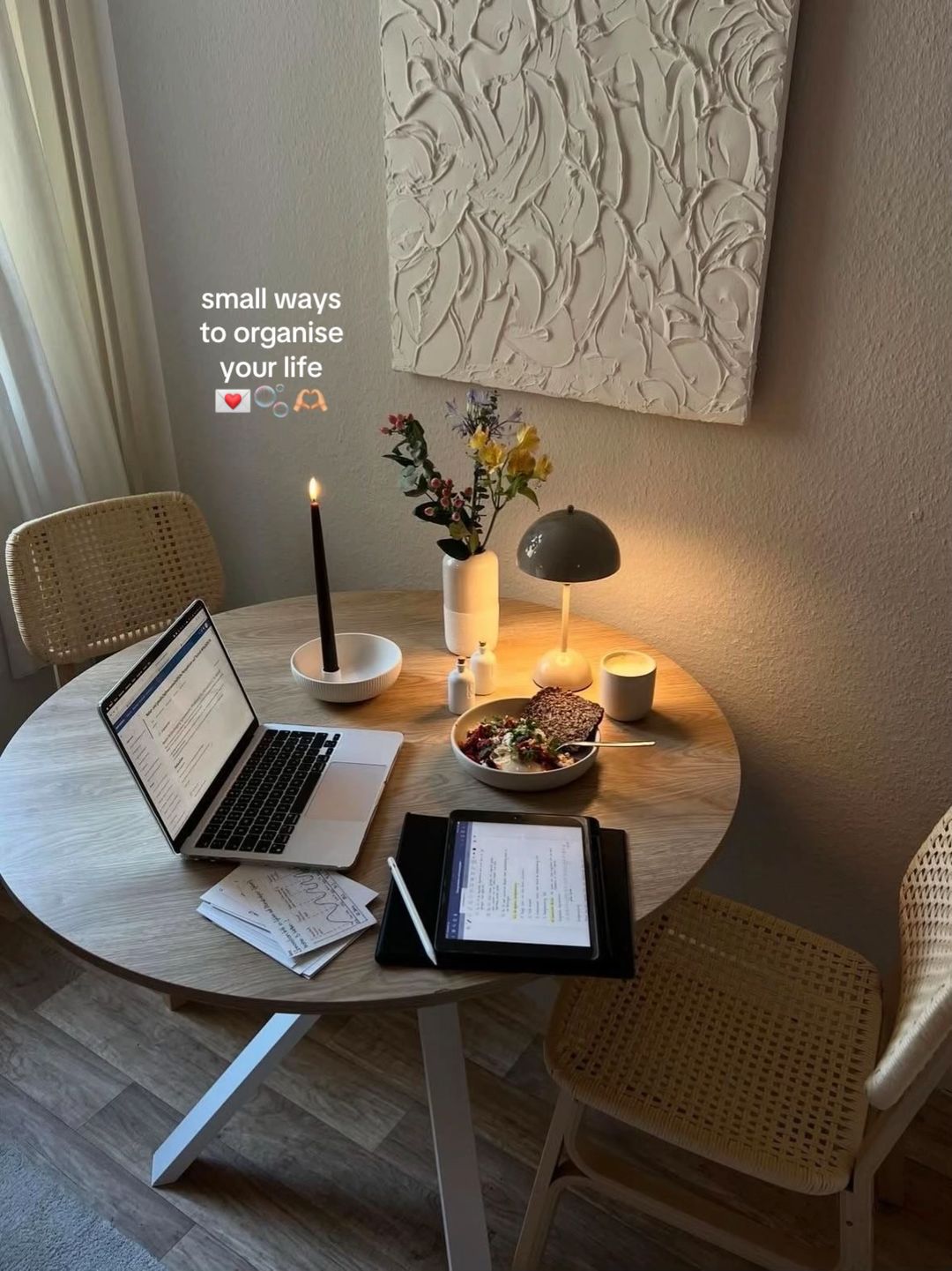
1hooklifestyle shotcozy aspirationworks:yesgrab:88/100aesthetic:95/100small ways to organise your life ❤️🫧🫶
small ways to organise your life ❤️🫧🫶
Visual description
A cozy, aesthetically-curated round wooden desk setup with warm lighting. Features a MacBook (open, showing a Notion-like interface), iPad with Apple Pencil, printed papers, a bowl of food (looks like açaí or grain bowl), a lit black candle in a white holder, a small white vase with yellow/pink flowers, a grey dome table lamp (looks like a Muuto Leaf or similar), and a small white candle. Two woven rattan chairs flank the table. A textured white art piece hangs on the wall behind.
Scene setting
minimalist home workspace with warm ambient lighting
Visible objects
Products on screen
vs prior slide
Style: This is the only non-laptop-screenshot slide — it's a lifestyle shot that sets the mood before the functional slides begin.
Story: Establishes the premise and mood before diving into functionality.
Predicted audience reaction
Viewers will stop scrolling because the aesthetic is instantly recognizable as the 'that girl' / cozy productivity niche — they feel they're looking at a life they want.
Verdict: The lifestyle aspirational frame is essential — without it, this becomes a boring software tutorial. The warmth invites viewers in before demanding they read anything.
2step in listscreenshotorganized practicalityworks:yesgrab:75/100aesthetic:85/100keep track of all your recipes, ingredients, how long each takes etc
keep track of all your recipes, ingredients, how long each takes etc
Visual description
A close-up of a MacBook screen displaying a Notion page titled 'recipe book' with a gallery view of food photos. Each tile shows a high-quality food photo with a label underneath (yoghurt bowl, avocado egg toast, etc.). The screen shows 13 recipe entries in a grid. The laptop has a Russian/Cyrillic keyboard visible. Dark plant background behind the laptop.
Scene setting
laptop screen showing Notion recipe tracker
Visible objects
Other text elements
- •recipe book | all
- •ay's space / meal planner / recipe book
- •yoghurt bowl
- •avocado egg toast
- •one pan garlic chicken
- •tomato pasta
- •chicken pasta
- •overnight oats
- •avocado wrap
- •salmon rice bowl
- •tiramisu
- •chicken stir fry
- •honey lemon ginger tea
- •strawberry matcha latte
- •New page
- •Edited 22h ago
vs prior slide
Style: Transitions from lifestyle shot to laptop screenshot — but maintains the warm lighting and plant background that ties the visual system together.
Story: First concrete proof of functionality — moves from abstract premise to tangible use case.
Predicted audience reaction
Food people will recognize this as useful; meal-preppers and students will feel a pull to save it for later reference.
Verdict: The recipe gallery is visually rich and immediately understandable — no explanation needed. The food photos make this slide inherently engaging.
3step in listscreenshotsecurity and organizationworks:partialgrab:72/100aesthetic:80/100keep track of all your passwords
keep track of all your passwords
Visual description
Laptop screen showing a Notion page titled 'password tracker' with a leopard-print cover image and 'passwords' in white script font. The page shows a grid of cards, each representing a service (Instagram, TikTok, Snapchat, etc.) with username entries, dotted-out password fields, and category tags (social media, school, personal, shopping, bills). The laptop has a Cyrillic keyboard. Dark plant background.
Scene setting
laptop screen showing Notion password tracker
Visible objects
Other text elements
- •passwords (script font on cover image)
- •password tracker
- •all
- •social media
- •school
- •shopping
- •personal
- •bills
- •edit
- •TIKTOK
- •SNAPCHAT
- •NETFLIX
- •ELETRICITY APP
- •BANK ACCOUNT
- •EXAM PLATFORM
- •UNIVERSITY PORTAL
- •CHAT GPT
- •CANVA
- •SPOTIFY
- •SHEIN
- •ETSY
- •AMAZON
- •PAYPAL
- •Edited 1d ago
vs prior slide
Style: Same laptop angle, same dark plant background, same white text overlay position — visual consistency is maintained.
Story: Second use case proof — builds on the first by showing a different category (personal admin vs food).
Predicted audience reaction
Some viewers may find this useful; others may feel uncomfortable about password security in Notion. The leopard print cover adds aesthetic appeal that softens the technical nature.
Verdict: The use case is relevant but potentially raises security concerns. The aesthetic helps compensate — the leopard print cover makes it feel less like a spreadsheet and more like a lifestyle choice.
4step in listscreenshotwellness aspirationworks:yesgrab:80/100aesthetic:88/100have foods that align with your goal
have foods that align with your goal
Visual description
Laptop screen showing a Notion page with two sections: a simple list of stocked items (honey, dark chocolate, almonds, cashews with quantities) and a gallery view of foods organized by wellness goal tags (clear skin, gut health, hormonal balance, healthy hair, anti-bloating, lean body, energy & focus). Each food tile shows a high-quality photo with a label. Small photo of a woman sitting on a chair is visible in the corner. Cyrillic keyboard. Dark plant background.
Scene setting
laptop screen showing Notion wellness food tracker
Visible people
Visible objects
Other text elements
- •meal planner
- •honey half jar well stocked
- •dark chocolate 3 bars well stocked
- •almonds 5 packets well stocked
- •cashews 2 packets well stocked
- •foods aligning with my goals
- •all
- •clear skin
- •gut health
- •hormonal balance
- •healthy hair
- •anti-bloating
- •lean body
- •energy & focus
- •avocado
- •blueberries
- •carrots
- •citrus fruits
- •spinach
- •broccoli
- •sweet potato
- •apples
- •coconut
- •banana
- •almonds
- •walnuts
- •chia seeds
- •flaxseeds
- •pumkin seeds
- •eggs
- •salmon
- •sardines
- •Edited 22h ago
vs prior slide
Style: Same visual system — laptop screenshot, plant background, white text overlay. The gallery format repeats from slide 2, creating a rhythm.
Story: Third use case — shifts from practical (passwords) to aspirational (wellness), raising the emotional stakes.
Predicted audience reaction
This slide particularly resonates with the wellness/self-improvement audience. The goal-tagged foods (clear skin, gut health, hormonal balance) tap directly into trending wellness concerns.
Verdict: The wellness angle is highly relevant to the target audience. The goal-tagging system is a clever visual differentiator that shows sophistication beyond a simple list.
5step in listscreenshotstructured intentionalityworks:yesgrab:78/100aesthetic:85/100plan out your routines
plan out your routines
Visual description
Laptop screen showing a Notion page titled 'routines' with a nighttime cityscape cover image. The left sidebar shows 'edit routines' with morning and evening routine options, plus a fireworks image and 'NEW' text. The main area shows a time-blocked morning routine with specific time slots (wake up, pray, brush teeth, light exercise, shower, affirmations/skincare/dressed, make breakfast, eat breakfast, review notes, listen to podcast, walk to busstop). Cyrillic keyboard. Dark plant background.
Scene setting
laptop screen showing Notion routine planner
Visible objects
Other text elements
- •routines
- •edit routines
- •morning routine
- •evening routine
- •morning
- •regular morning
- •low energy mornings
- •wake up 05:00 - 05:05
- •pray 05:05 - 05:10
- •brush teeth 05:10 - 05:15
- •light exercise 05:15 - 05:40
- •shower 05:40 - 06:00
- •affirmations, skincare, get dressed 06:00 - 06:15
- •make breakfast 06:15 - 06:25
- •eat breakfast 06:25 - 06:40
- •review yesterday's notes 06:40 - 07:40
- •listen to podcast 07:40 - 08:00
- •walk to busstop 07:40 - 08:00
- •Edited 23 Jan
- •NEW (stylized text on cover image with fireworks)
vs prior slide
Style: Same laptop, same plant background, same text overlay. The structure changes from gallery to time-blocked list, adding visual variety.
Story: Fourth use case — shifts from food/wellness to daily structure, showing the template's versatility across life domains.
Predicted audience reaction
The time-blocking with specific timestamps (5:00 AM wake up) will resonate with productivity-focused viewers but may intimidate others. The 'low energy mornings' alternative shows thoughtful design.
Verdict: The detailed time-blocking shows depth of use. The inclusion of 'low energy mornings' as an alternative is a small but powerful touch that demonstrates real human thinking behind the template.
6step in listscreenshotaspirational consumptionworks:yesgrab:85/100aesthetic:90/100track everything you want to buy!
track everything you want to buy!
Visual description
Laptop screen showing a Notion page titled 'wishlist' in script font. The page displays a gallery of desired products with progress bars (percentage saved), prices, and links. Products include Dyson hair tool, new iPad, Saie makeup bag, L'Occitane hand cream, Polène bag, Lululemon set, Victoria's Secret robe, OUAI shampoo, plus partial views of other items (a brown jar, a stuffed bunny, a sunset lamp showing 4:23, a black bag with cherry keychain). Cyrillic keyboard. Dark plant background.
Scene setting
laptop screen showing Notion wishlist tracker
Visible objects
Products on screen
Other text elements
- •finances
- •wishlist
- •current
- •all data
- •dyson 47% US$499.00 dyson.com/hair-r-silk
- •new iPad 18% US$599.00 apple.com/sho..ad-air
- •saie makeup bag 31% US$31.95 saiehello.com/pro..-gXZV
- •loccitane hand cream 12% US$42.00 sephora.com/pro..230456
- •polene bag 18% US$560.00 eng.polene-paris.com/pro..-green
- •lululemon set 39% US$128.00 shop.lululemon.com/pi..-41179
- •victoria secret robe 33% US$69.95 victoriasecret.com/us/..ending
- •ouai shampoo 44% US$34.00 sephora.com/pro..roduct
- •Reposition
- •Edited 22h ago
vs prior slide
Style: Same laptop, same plant background, same text overlay. The gallery format returns with the added visual element of progress bars.
Story: Fifth use case — shifts to shopping/finance, a highly practical and relatable use case. The progress bars add gamification.
Predicted audience reaction
This is likely the highest-engagement slide for younger viewers. The wishlist with progress bars taps into aspirational shopping behavior — viewers see themselves tracking their own dream purchases.
Verdict: The progress bars are a standout visual element that gamify saving for purchases. The aspirational brands (Dyson, Polène, Lululemon) signal taste level and raise the template's perceived value.
7step in listscreenshotorganized clarityworks:partialgrab:70/100aesthetic:80/100keep track of important events
keep track of important events
Visual description
Laptop screen showing a Notion calendar view titled 'my calendar' displaying January 2026. Events are color-coded with tags (personal, exam, self care, errand, appointment, planning, event, study session). Notable entries include: pilates class (multiple), clean room (multiple), opening exams, study date with Sara, meet Amy, project group meetings, pharmacology, dentrist appointment, grocery run, pay rent, make flashcards. Cyrillic keyboard. Dark plant background.
Scene setting
laptop screen showing Notion calendar
Visible objects
Other text elements
- •my calendar | this mo...
- •ay's space / planning space / my calendar
- •my calendar
- •this week
- •this month
- •add entry
- •all
- •January 2026
- •clean room personal
- •opening exams exam
- •pilates class self care
- •get new candles errand
- •meet physiology i... 14:00 appointment
- •girls night 20:00 appointment
- •project group meeting appointment
- •pilates class 9:00 self care
- •study date with Sara appointment
- •grocery run 10:00 errand
- •plan next week gr... 18:00 planning
- •clean room personal
- •pilates class 9:00 self care
- •dentist appointm... 14:00 appointment
- •presentation in fa... 14:00 event
- •meet Amy 15:30 appointment
- •pharmacology se... 13:00 event
- •clean room personal
- •pilates class 9:00 self care
- •project group dis... 10:00 study session
- •pay rent for next seme...
- •make flashcards 12:00 study session
- •Manage in Calendar
- •Today
- •Edited 2d ago
vs prior slide
Style: Same laptop, same plant background, same text overlay. The calendar view is visually denser than previous slides, creating a slight shift in information density.
Story: Sixth use case — the final proof point before the CTA. Calendar is a foundational use case that validates the template's core functionality.
Predicted audience reaction
Students will relate to the exam/study session entries. The repetitive 'clean room' entries add a relatable, human touch. The density may cause some viewers to skim.
Verdict: The calendar is functional but visually denser than other slides — it requires more cognitive load to parse. The repetitive 'clean room' entries, while relatable, don't add much value to the demonstration.
8ctascreenshotgenerous invitationworks:yesgrab:75/100aesthetic:88/100or, just use mine
or, just use mine
Visual description
Laptop screen showing the main Notion dashboard titled 'ay's space'. Left side shows a profile photo (woman with dark hair, mirror selfie) and a navigation sidebar (routines, planning space, vision board, meal planner). Center shows 'my courses' with course cards featuring images (cityscape, airplane engine, Vogue magazines, leopard print, newspaper, building facade). Right side shows 'my affirmations' with bullet points and a pink flower image. Night cityscape cover image. Cyrillic keyboard. Dark plant background.
Scene setting
laptop screen showing Notion main dashboard
Visible people
Visible objects
Other text elements
- •ay's space
- •Private
- •navigation
- •routines
- •planning space
- •vision board
- •meal planner
- •my courses
- •active
- •completed
- •all
- •BIO 121
- •NUR 112
- •MIC 210
- •PHM 200
- •PSY 150
- •SOC 180
- •my affirmations
- •I want the best and I get it
- •I achieve whatever I set my mind to
- •I am worthy of anything I desire
- •entries
- •Edited 8h ago
- •VOGUE (on a book/image in courses section)
vs prior slide
Style: Same laptop, same plant background. This is the 'home' view — it ties together all the previous slides into one dashboard, providing narrative closure.
Story: The CTA reframes everything: after showing 6 use cases, 'or, just use mine' is the payoff — the viewer now understands this is one template, not six separate setups.
Predicted audience reaction
The soft CTA ('or, just use mine') feels generous and personal rather than salesy. The emoji 🫶 reinforces warmth. Viewers who were convinced by the previous slides will now seek the link in bio.
Verdict: The CTA is understated and effective — it doesn't hard-sell. However, it lacks a direct call-to-action like 'link in bio' which would capture more conversions.
Commerce intent
Mentioned products
Comment ethnography
This is a solo-watch, save-for-later audience. They're students and young professionals who want the aesthetic life and the productivity to achieve it. Comments are minimal, suggesting viewers are saving and returning privately rather than engaging publicly.
Diagnostics
Hook deep-dive
small ways to organise your life ❤️🫧🫶
Viewers swipe because the cozy, aspirational desk setup makes them curious about what specific 'small ways' are being offered — they want to see if the content matches the aesthetic mood.
Engagement read
The bookmark rate (8.68%, 14.5× library norm) is the dominant signal — viewers are treating this as reference material to return to and purchase, not just entertainment.
Mechanics
Each slide reveals a new, distinct use case that builds desire — viewers swipe to see 'what else can this template do?' before the CTA reframes everything as one product.
Brand & funnel
Brands visible
Buying-journey moment: The viewer is in the consideration phase — they've seen the template's capabilities and are moving toward a purchase decision by visiting the creator's profile or bio link.
Ideal Customer Profile
Gen Z female students or young professionals obsessed with the 'that girl' aesthetic who want to optimize their lives without feeling overwhelmed.
Age
18-24
Gender
female
Readability
simple
Interests
Pain Points
Aspirations
Emotional Profile
Primary Emotion
aspirationIntensity
Effectiveness
Emotions Evoked
Emotional Arc
curiosity → recognition → validation → motivation
Why It Lands
The carousel moves the viewer from feeling the pain of chaos to seeing a vision of a perfectly ordered, aesthetic life, creating a 'relief' response that they can achieve the same.
Writing Analysis
Style
listicle
Tone
aspirational
Hook Type
listicle
Quality
The writing is extremely concise, acting as a caption for the visual rather than a lecture. It respects the viewer's time and maintains a calm, helpful rhythm.
Effectiveness
Goal Achievement
The massive bookmark-to-view ratio confirms the content was highly effective at providing long-term value. It successfully established the creator as an authority in the Notion/productivity space.
Why It Spread
High bookmark-ability due to the 'template' offer
Visual aesthetic that fits the 'StudyTok' algorithm perfectly
Low barrier to entry for viewers to replicate the system
Content DNA
The CTA is soft and low-pressure, which fits the 'soft life' aesthetic perfectly while still driving high engagement.
Narrative Arc
The carousel builds tension by showing specific problems (chaos) and providing immediate, aesthetic solutions, culminating in the ultimate 'shortcut' (the template).
Psychological Blueprint
Why It Spread
This post hit the perfect intersection of high-utility value and high-aesthetic aspiration. By providing a 'ready-made' solution to the universal pain point of disorganization, it triggered massive bookmarking behavior (41k+), which is the strongest signal for TikTok's algorithm. The 'soft life' aesthetic acted as a visual hook that stopped the scroll, while the promise of a template provided a clear incentive to save for later.
Framework
AIDAPrimary Tactic
aspiration stackTactics Used
curiosity-gap on slide 1: 'small ways to organise your life' implies a secret system
social-proof-stack: showing a fully built-out Notion dashboard creates authority
reciprocity: offering the template 'or, just use mine' builds immense goodwill
aesthetic-anchoring: the warm, cozy, high-quality visuals signal membership to the 'that girl' tribe
Cognitive Biases
Zeigarnik effect: the carousel presents unfinished tasks (recipes, routines) that the brain wants to complete
Bandwagon effect: the high engagement numbers signal that this is the 'correct' way to organize
Halo effect: the beautiful aesthetic makes the productivity advice seem more credible and effective
Tribal Markers
Trust Signals
Slide Breakdown (8 analyzed)
Text
small ways to organise your life 🫶🏼 with notion 🫧💌
Visual
A cozy, warm-toned desk setup with a laptop, tablet, candle, and flowers, creating a 'soft' study vibe.
Visual Elements
Color Palette
Copy Analysis
Power Words
Open Loop: yes, it promises a system to organize life without showing it yet
Visual Psychology
Attention: the glowing candle and the text overlay
Emotional cue: the warm lighting signals safety and productivity
Composition: centered symmetry creates a sense of calm and order
Text
keep track of all your recipes, ingredients, how long each takes etc
Visual
A Notion database view of a recipe book with high-quality food photography thumbnails.
Visual Elements
Color Palette
Copy Analysis
Power Words
Open Loop: yes, makes the viewer want to see the rest of the dashboard
Visual Psychology
Attention: the grid of food images
Emotional cue: the organized food images trigger a desire for health and structure
Composition: the grid layout implies mastery and organization
Text
keep track of all your passwords
Visual
A Notion database showing a password tracker with various categories like social media and school.
Visual Elements
Color Palette
Copy Analysis
Power Words
Open Loop: yes, implies a solution to a common frustration
Visual Psychology
Attention: the 'passwords' header
Emotional cue: the organized cards trigger a feeling of security
Composition: the clean layout suggests efficiency
Text
have foods that align with your goal
Visual
A Notion database of healthy food items categorized by health goals.
Visual Elements
Color Palette
Copy Analysis
Power Words
Open Loop: yes, makes the viewer wonder what their own goals are
Visual Psychology
Attention: the food images
Emotional cue: the healthy food images trigger a desire for self-care
Composition: the categorization suggests a scientific approach to wellness
Text
plan out your routines
Visual
A Notion routine tracker with morning and evening blocks.
Visual Elements
Color Palette
Copy Analysis
Power Words
Open Loop: yes, creates curiosity about the creator's specific routine
Visual Psychology
Attention: the routine cards
Emotional cue: the structured routine triggers a desire for discipline
Composition: the clear blocks suggest ease of execution
Text
track everything you want to buy!
Visual
A Notion wishlist database with product images and progress bars.
Visual Elements
Color Palette
Copy Analysis
Power Words
Open Loop: yes, taps into the desire for luxury items
Visual Psychology
Attention: the progress bars
Emotional cue: the progress bars trigger a sense of achievement and goal-setting
Composition: the visual representation of saving money creates motivation
Text
keep track of important events
Visual
A Notion calendar view showing a monthly schedule.
Visual Elements
Color Palette
Copy Analysis
Power Words
Open Loop: yes, makes the viewer want to see the full schedule
Visual Psychology
Attention: the calendar grid
Emotional cue: the organized calendar triggers a sense of control
Composition: the grid layout implies a busy but managed life
Text
or, just use mine 🫶🏼
Visual
The main dashboard of the Notion template.
Visual Elements
Color Palette
Copy Analysis
Power Words
Open Loop: no, this is the resolution
Visual Psychology
Attention: the 'ay's space' header
Emotional cue: the offer of the template triggers relief and excitement
Composition: the final reveal of the full system provides a sense of completion
Comment Intelligence
Sentiment
PositiveResonance
Intent
build-community
Audience Vibe
The comments are filled with high-intent users asking for the template and expressing admiration for the aesthetic.
Standout Quotes
“I need this template so bad”
“This is exactly what I’ve been looking for to get my life together”
“The aesthetic is everything, thank you for sharing”