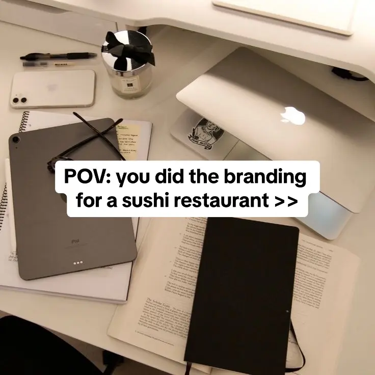
The 'POV' format is a proven TikTok staple that immediately places the viewer in the shoes of the creator, while the mention of a specific niche (sushi restaurant) adds enough intrigue to warrant a swipe.
Slide Text
POV: you did the branding for a sushi restaurant >>
Visual
A top-down, slightly cluttered desk with a laptop, iPad, notebook, and candle, creating a 'work-in-progress' vibe.
All Slides
@deetripper carousel breakdown
Dee®
A rebrand I recently did for a sushi restaurant #branddesigner #brandingdesign #branding
Effectiveness score
9/10
Views
191.5K
Likes
21.9K
Saves
4.8K
Engagement
14.5%
Hook
POV: you did the branding for a sushi restaurant >>
Goal
build-community
Offer
service
CTA
none
Caption
A rebrand I recently did for a sushi restaurant #branddesigner #brandingdesign #branding
Strategic Summary
This carousel succeeds as a high-fidelity visual 'flex' that serves as rapid inspiration for other designers and brand enthusiasts. By starting with a relatable, highly aesthetic 'POV' setup of a designer's workspace, it immediately grounds the viewer in the identity of the creator before delivering an exceptionally clean, cohesive, and photorealistic case study. The massive 4.2x bookmark rate proves its primary utility is an aspirational reference piece.
The Winning Formula
Aspirational workspace POV hook + purely visual, text-minimal high-fidelity design mockups = instant 'save for later' inspiration.
What's working
- •Slide 1 uses an aspirational desk flat-lay (Apple products, aesthetic candle) to establish credibility and vibe before showing any actual work.
- •The 'POV:' hook gamifies the portfolio, making the viewer the protagonist ('you did the branding') rather than just saying 'Look at my work'.
- •Consistent color palette (cream, black, crimson red) mimicking the Japanese flag, which comments immediately recognized and praised.
- •High-end photorealistic mockups on varied textures (curtains, cardboard, tape, slate) provide realistic context that elevates the perceived value of simple design.
What's not working
- •Slide 2 features nonsensical hours ('AM 12H / PM 22H'), breaking the illusion of a real client project for detail-oriented viewers (called out in top comments).
Viral lesson
Portfolios shouldn't feel like resumes; they should feel like an immersive moodboard. Framed as a POV, your work becomes the audience's aspiration.
Can a small creator replicate this? Highly replicable for any visual creator (designers, architects, stylists) who can pair a high-quality lifestyle setup hook with premium, cohesive visual slides.
Structural Formula (steal-the-format)
Structure pattern
1-slide lifestyle setup hook -> 1-slide environmental intro shot -> 5-slide varying mockup presentation shifting between 2D flats and 3D textured renders -> 1-slide context sign-off
Copy formula
POV statement + niche descriptor -> purely visual journey marked only by the faux-brand's internal typography.
What to swap (concrete remixes)
- •Swap 'branding for a sushi restaurant' to 'styling for an indie musician' for a fashion/wardrobe portfolio.
- •Swap 'branding for a sushi restaurant' to '3D rendering an off-grid cabin in the woods' for an architectural/CGI portfolio.
- •Swap 'branding for a sushi restaurant' to 'planning a Mediterranean destination wedding' for an event planner portfolio.
What NOT to copy
Do not attempt this structure if your mockups or deliverables are amateur. The entire format relies on the jaw-droppingly high visual fidelity of slides 4-7 to validate the smugness of the 'POV' desk setup in slide 1.
Aesthetics
premium minimalist Japanese-inspired brand boards utilizing high-contrast photorealistic texture mockups
Color palette
What it conveys: It feels expensive, meticulous, and calm before you read any words. The negative space signals luxury confidence.
Slide-by-slide forensics
1hookflat layaspirationworks:yesgrab:85/100aesthetic:90/100POV: you did the branding for a sushi restaurant >>
POV: you did the branding for a sushi restaurant >>
Visual description
Overhead/flat-lay shot of a modern, aesthetic designer's desk in warm, soft lighting. Visible are a MacBook with a glowing Apple logo, a space gray iPad beside an open notepad, a pair of black wire-rimmed glasses, a couple of pens, a white iPhone, and a luxury candle with a black bow. The composition is deliberately casual but highly curated.
Scene setting
minimalist designer desk workspace
Visible objects
Products on screen
Predicted audience reaction
Immediate awe of the 'cool creative lifestyle' vibe, creating the desire to swipe to see what this person created.
Verdict: It establishes immediate authority through aesthetic lifestyle signaling before any design work is shown.
2reveallifestyle shotsophisticationworks:partialgrab:80/100aesthetic:85/100SUSHI RESTAURANT YAMADORI SALVE YAMADORI AM 12H PM 22H THE BEST YOU HAD
SUSHI RESTAURANT YAMADORI SALVE YAMADORI AM 12H PM 22H THE BEST YOU HAD
Visual description
A dark, moody architectural interior shot featuring vertically draped sheer curtains illuminated by warm, linear spotlights. The brand's typography is cleanly superimposed in the center in a crisp white sans-serif font, alongside a small circular logo featuring a bird silhouette.
Scene setting
upscale moody restaurant interior
Visible objects
vs prior slide
Style: Total shift from bright flat-lay environment to dark moody ambient interior, pivoting from 'the creator's world' to 'the brand's world'.
Story: Reveals the final vibe of the brand context.
Predicted audience reaction
Appreciation for the sleek architectural integration, but confusion over the AM/PM formatting.
Comments reacting to this slide
- "This looks good but the hours on the 2nd slide make no sense to me"
Verdict: The visual mood lands perfectly, but the copy error in the hours distracts viewers from the pure aesthetic enjoyment.
3breathertext cardserenityworks:yesgrab:60/100aesthetic:90/100
Visual description
A completely minimalist digital canvas. Solid cream-colored background with a stylized, minimalist black outline graphic of a diving bird in the dead center.
Scene setting
digital art canvas
vs prior slide
Style: Stark contrast from dark lighting to flat solid cream vector background.
Story: Strips away the environmental context to show the raw, fundamental logo asset.
Predicted audience reaction
Appreciation of the pure linework and simplicity of the bird icon.
Verdict: It acts as a visual palate cleanser that lets the viewer absorb the core mark before applying it to complex packaging.
4step in listproduct shotcuriosityworks:yesgrab:70/100aesthetic:88/100YAMADORI EARN POINTS - GET A FREE DISH CONSUME IMMEDIATELY 450G YAMADORI COMIDA JAPONESA FRESCA DE VERDADE INGREDIENTS 100% ORGANICOS VALIDATE 10/7
YAMADORI EARN POINTS - GET A FREE DISH CONSUME IMMEDIATELY 450G YAMADORI COMIDA JAPONESA FRESCA DE VERDADE INGREDIENTS 100% ORGANICOS VALIDATE 10/7
Visual description
Flat vector layout displaying two brand collateral mockups on a cream background: a loyalty card (top) showing a punch-hole progress system with red circles, and a circular label (bottom) over a subtle beige layout, likely for a bowl lid lid or deli container, featuring cleanly structured typographic hierarchy.
Scene setting
digital branding presentation board
Visible objects
vs prior slide
Style: Maintains the flat vector presentation style and cream background from the previous slide, expanding the ecosystem.
Story: Demonstrates the brand's practical application of typography and color accents (the red elements).
Predicted audience reaction
Examining the layout and grid systems; observing the introduction of Portuguese text alongside English.
Verdict: It proves the designer's ability to translate the logo into functional, systematic brand collateral.
5step in listproduct shotboldnessworks:yesgrab:75/100aesthetic:85/100YAMADORI CONSUME IMMEDIATELY 450G
YAMADORI CONSUME IMMEDIATELY 450G
Visual description
Flat digital layout divided into two sections. Top: Front and back of a vibrant red business or insert card with the black logo inside a dark circle. Bottom: A frontal mockup of a beige, geometric takeout container featuring a gray vertical branding sticker/tape with the brand name.
Scene setting
digital branding presentation board
Visible objects
vs prior slide
Style: Maintains the flat vector mockup style but introduces large blocks of stark crimson red.
Story: Pushes the physical packaging concept further while introducing the high-contrast aesthetic.
Predicted audience reaction
Recognizing the Japanese aesthetic connection through the red and stark typography.
Comments reacting to this slide
- "clean, sanitized, Japan flag 🇯🇵 inspired."
Verdict: The sudden flood of red against the cream anchors the visual identity firmly in its Japanese inspiration.
6escalationclose uppremiumworks:yesgrab:90/100aesthetic:95/100YAMADORI
YAMADORI
Visual description
A highly textured, photorealistic macro shot featuring branded white sealing tape folding over a dark, rough stone or concrete-like charcoal surface. Deep shadows fall diagonally across the tape. The tape bears the repeating YAMADORI text and the red circle logo mark.
Scene setting
studio macro surface photography
Visible objects
vs prior slide
Style: Abrupt shift from flat 2D graphic layouts back to heavy, photorealistic, dimensional texture mapping.
Story: Brings the flat collateral from the previous two slides into vivid tactile reality.
Predicted audience reaction
Heavy tactile appreciation. This is exactly the kind of slide that triggers saves to moodboards.
Comments reacting to this slide
- "this is colddddd"
Verdict: It sells the sheer professional execution; the texture mapping makes it look tangibly real, confirming the designer's high skill level.
7step in listproduct shotsatisfactionworks:yesgrab:75/100aesthetic:88/100YAMADORI SUPER SUSHI BOX SUPER SUSHI IN HERE 100% ORGANIC FOR YOU NO BULLSHIT SUGAR FREE
YAMADORI SUPER SUSHI BOX SUPER SUSHI IN HERE 100% ORGANIC FOR YOU NO BULLSHIT SUGAR FREE
Visual description
Two front-facing studio mockups of cardboard takeout carry-boxes with top handles set against a soft cream background. Top box is minimalist kraft paper with small branding and micro-copy. Bottom box shows a tonal, oversized cropped watermark print of the bird logo spanning the surface.
Scene setting
clean studio product photography
Visible objects
vs prior slide
Style: Returns to a flatter, higher-key lighting scenario with soft shadows compared to the deep contrast of the macro shot.
Story: Shows the ultimate end-user artifact: the delivery mechanism.
Predicted audience reaction
Enjoying the subtle copy ('NO BULLSHIT SUGAR FREE') and the alternate background pattern application.
Verdict: Provides excellent inspiration for structure and hierarchy in standard box packaging.
8payofflifestyle shotwarmthworks:yesgrab:65/100aesthetic:85/100SUSHI [logo] SUSHI
SUSHI [logo] SUSHI
Visual description
A blurred, ambient photograph of a sushi chef's hands preparing sushi on a dark slate board atop a light wooden sushi counter. A light tan circular overlay containing the black bird logo is centered over the image like a watermark to tie it back to the brand presentation.
Scene setting
high-end sushi bar
Visible people
Visible objects
vs prior slide
Style: Shifts entirely to lifestyle/documentary photography, dropping all mockups.
Story: Closes the loop by returning to the human element implied in slide 1—showing the world where this design lives.
Predicted audience reaction
Closure. The project feels complete and grounded in reality.
Verdict: It successfully lands the plane by injecting warmth and human craft back into a rigid geometric presentation.
Commerce intent
Mentioned products
Buy-intent phrases (from comments)
- •Love this, makes me want to spend money 💵
Comment ethnography
Peers deeply appreciating the technical execution ('cold', 'hard', 'clean'), showing it's reaching fellow creatives.
Comments that characterize the audience
- "clean, sanitized, Japan flag 🇯🇵 inspired. I like it"
- "did you make the logo in illustrator?"
- "This looks good but the hours on the 2nd slide make no sense to me"
Aspirations revealed
- •creating highly cohesive premium brand suites
- •having a successful/cool creative agency
Top questions asked
- •did you make the logo in illustrator?
- •song?
Objections
- •This looks good but the hours on the 2nd slide make no sense to me
Diagnostics
Hook deep-dive
POV: you did the branding for a sushi restaurant >>
The viewer wants to judge if the final creative output lives up to the aesthetic promise of the highly curated desk setup.
Engagement read
The bookmark rate (2.50%) is over 4x the norm, heavily indicating the carousel serves as an evergreen visual reference rather than standard ephemeral content.
Mechanics
Rapid succession of highly stylized, contextually varying photorealistic package mockups.
Brand & funnel
Brands visible
Buying-journey moment: They are evaluating the creator's competency as a designer by reviewing their portfolio.
Ideal Customer Profile
Aspiring or mid-level graphic designers and brand strategists who value minimalist, high-end aesthetics and want to see 'behind-the-scenes' of professional client work.
Age
18-24
Gender
neutral
Readability
simple
Interests
Pain Points
Aspirations
Emotional Profile
Primary Emotion
aspirationIntensity
Effectiveness
Emotions Evoked
Emotional Arc
curiosity → discovery → satisfaction → appreciation
Why It Lands
The content taps into the viewer's desire to create 'beautiful' work. It provides a sense of satisfaction through the order and cleanliness of the design system presented.
Writing Analysis
Style
inspirational
Tone
aspirational
Hook Type
identity statement
Quality
The writing is extremely sparse, letting the visuals do the heavy lifting. This is a strategic choice that respects the viewer's time and keeps the focus on the design work.
Effectiveness
Goal Achievement
The high number of saves indicates this is highly effective for building a reputation as a high-quality designer. It functions as a 'living portfolio' that builds trust with potential clients.
Why It Spread
highly shareable aesthetic
high save-ability for reference
satisfying, clean visual transitions
Content DNA
There is no explicit CTA, which is a missed opportunity to drive traffic to a portfolio or inquiry form, though it keeps the content feeling 'organic' and non-salesy.
Narrative Arc
The flow is a steady reveal of a brand system, starting with the hook, moving to the primary logo, then showing various applications (packaging, cards), and ending with a lifestyle shot.
Psychological Blueprint
Why It Spread
The post succeeded because it perfectly aligns with the 'aesthetic-as-content' trend in the design community. By presenting a high-end, minimalist brand identity, it serves as both inspiration and a portfolio piece, triggering high save rates (4,797) from designers who want to emulate this style. The 14.52% engagement rate is driven by the 'aspirational' nature of the content, where viewers bookmark it as a reference for their own future projects.
Framework
curiosity loopPrimary Tactic
aspiration stackTactics Used
curiosity-gap on slide 1: 'POV: you did the branding for a sushi restaurant >>' creates an open loop about the quality of the work
social-proof-stack: showing the final deliverables as a finished, high-end product
authority-signaling: the clean, professional, and sophisticated design style implies expertise
pattern-interrupt: the shift from a messy desk (slide 1) to a hyper-minimalist, high-end brand presentation (slide 2)
Cognitive Biases
halo effect: the high-quality, aesthetic design of the slides makes the creator appear more competent and trustworthy
aesthetic-usability effect: users perceive the design as more 'effective' because it is visually pleasing
Tribal Markers
Trust Signals
Slide Breakdown (2 analyzed)
Hook Analysis
The 'POV' format is a proven TikTok staple that immediately places the viewer in the shoes of the creator, while the mention of a specific niche (sushi restaurant) adds enough intrigue to warrant a swipe.
Text
POV: you did the branding for a sushi restaurant >>
Visual
A top-down, slightly cluttered desk with a laptop, iPad, notebook, and candle, creating a 'work-in-progress' vibe.
Visual Elements
Color Palette
Copy Analysis
Power Words
Open Loop: yes, the '>>' implies there is more to see, specifically the result of the work.
Visual Psychology
Attention: the white text box in the center
Emotional cue: the 'work-in-progress' desk creates a sense of relatability for other creatives
Composition: centered text creates immediate focus
Text
SUSHI RESTAURANT YAMADORI SALVE YAMADORI AM 12H PM 22H THE BEST YOU HAD
Visual
A dark, moody, and elegant shot of a restaurant interior with curtains, featuring the brand name in a clean, modern font.
Visual Elements
Color Palette
Copy Analysis
Power Words
Open Loop: no, this is the reveal
Visual Psychology
Attention: the brand name 'YAMADORI'
Emotional cue: the dark, moody lighting evokes a premium, high-end feeling
Composition: symmetry and clean typography convey authority and professionalism
Comment Intelligence
Sentiment
PositiveResonance
Intent
build-community
Audience Vibe
The comments are sparse but appreciative, focusing on the aesthetic quality of the design.
Standout Quotes
“This is so clean.”
“The logo mark is beautiful.”
“Love the color palette.”
Top Comments
clean, sanitized, Japan flag 🇯🇵 inspired. I like it
this is colddddd
This looks good but the hours on the 2nd slide make no sense to me
Damn that looks GREAT! #talanted
Song is pouring wok - icewear vezzo (he deleted off Spotify/Apple but it’s on YouTube)