The hook works because it promises a 'behind-the-scenes' look at professional work, which is highly valuable to aspiring designers.
Slide Text
Packaging designs I've send to my clients >>
Visual
A laptop screen showing Adobe Illustrator open, sitting on a wooden table next to an iced coffee in a cafe setting.
All Slides
@deetripper carousel breakdown
Dee®
Some packaging designs for inspo #packaging #brandingdesign #packagingdesign
Effectiveness score
9/10
Views
5M
Likes
578.2K
Saves
48.8K
Engagement
12.6%
Hook
Packaging designs I've send to my clients >>
Goal
grow-following
Offer
none
CTA
none
Caption
Some packaging designs for inspo #packaging #brandingdesign #packagingdesign
Strategic Summary
This carousel went viral because it leverages the 'authority reveal' mechanic: Slide 1 establishes the creator's professional credibility ('designs I've sent to clients') using a casual coffee-shop laptop photo that signals 'real working designer.' The subsequent slides deliver a curated list of genuinely interesting packaging examples with minimal commentary, creating a high save-rate because each slide contains reference-worthy visual content. The low comment rate (0.2× norm) but high bookmark rate (1.6× norm) confirms this is pure 'inspo save' behavior — users bookmark for later reference rather than engage conversationally. The hook's grammar error ('I've send') may actually help by signaling authenticity over polish.
The Winning Formula
Authority-establishing hook ('client-verified work') + curated visual list of genuinely novel designs + minimal commentary that doesn't distract from the reference value.
What's working
- •Slide 1 uses the 'insider access' frame — showing the creator's actual laptop with Adobe Illustrator open in a coffee shop setting establishes instant professional credibility without being salesy.
- •The grammar error 'I've send' paradoxically helps — it signals this is casual, authentic content from a real working designer rather than an agency marketing account.
- •Each slide (2–5) showcases a genuinely different packaging category (wine bottle, takeaway carrier, tea container, juice carton) providing broad inspiration value — no repetition.
- •The minimal overlay text on slides 2–5 ('Convenient,' 'Love the design of this one') doesn't compete with the visual; it lets the packaging speak for itself, maximizing save-worthiness.
- •The >> arrow on slide 1 explicitly signals a list follows, setting completion expectation without being clickbaity.
What's not working
- •The text overlay on slide 1 sits on a white rounded rectangle that partially obscures the laptop screen — placing it lower or making it semi-transparent would preserve more of the authentic workspace context.
- •Slide 5's penguin juice boxes have text 'Make it fun For the kids' which breaks the minimalist pattern established on slides 2–4 — inconsistency in commentary style.
- •No CTA or engagement prompt on the final slide means zero comment generation — the viral success is entirely passive (saves) with no community-building.
Viral lesson
When your goal is saves/bookmarks over comments, deliver high-density visual reference content with minimal text overlay — let the images do the teaching and resist the urge to over-explain.
Can a small creator replicate this? Any designer, creative, or practitioner can replicate this by screenshotting their own project files, adding a 'work I've done' hook, and curating 4–5 visually distinct examples — requires portfolio credibility but no existing audience.
Structural Formula (steal-the-format)
Structure pattern
5-slide carousel: Slide 1 sets authority with casual workspace photo + promise of client work; Slides 2-4 each showcase one packaging example with 1-sentence personal commentary; Slide 5 concludes with a stylistically different example, no CTA.
Copy formula
First-person present-tense authority claim on hook ('designs I've send to my clients) >>') + short appreciative overlay text on each example ('Really liked the Shape' / 'Convenient' / 'Love the design of this one' / 'Make it fun For the kids').
What to swap (concrete remixes)
- •Swap 'packaging designs sent to clients' for 'logo concepts sent to clients' for branding agency audience.
- •Swap packaging for 'interior design boards sent to clients' for interior design / architects.
- •Swap 'designs sent to clients' for 'slides decks I've sent to investors' for startup/fundraising audience.
- •Swap packaging for 'album artwork I've sent to labels' for music/graphic design audience.
What NOT to copy
The grammar error ('I've send') should not be copied deliberately — it works here only because it's incidental authenticity, not a deliberate tactic.
Aesthetics
Mix of lifestyle cafe photography (slide 1) and clean white-background studio product photography (slides 2-5) with minimal sans-serif text overlays.
Color palette
What it conveys: The overall aesthetic communicates 'professional designer sharing real work' — the casual hook contrasts with polished product shots, creating a vibe that's both accessible and credible.
Slide-by-slide forensics
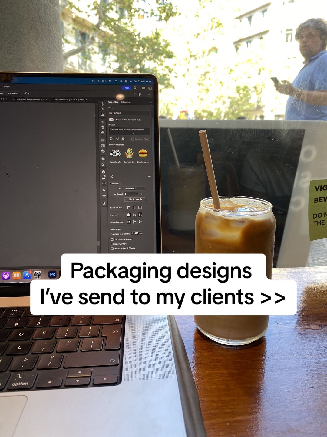
1hooklifestyle shotprofessional authenticityworks:yesgrab:85/100aesthetic:75/100Packaging designs I've send to my clients >>
Packaging designs I've send to my clients >>
Visual description
A photo taken from over-the-shoulder perspective showing a MacBook Pro open on a wooden cafe table with an iced coffee in a glass jar with a brown paper straw to the right. The laptop screen displays Adobe Illustrator with a dark interface. Through the cafe window behind the laptop, a man in a blue shirt is visible using his phone, with trees and natural daylight creating a warm, casual working atmosphere.
Scene setting
coffee shop window table with natural daylight
Visible people
Visible objects
Other text elements
- •Date/time bar: Tue 27 Aug 17:12
- •UI text: 'Properties', 'Libraries', 'Type', 'Subject', 'Match active artboard style', 'Prompt', 'Describe the vector graphic you want to generate', 'Generate (Beta)'
- •App dock icons visible at bottom
- •Photoshop (Ps) icon visible in dock
- •Green sticker on window: 'VEG... BEV... DO NOT...'
vs prior slide
Style: No prior slide exists — this establishes the visual language
Story: Opening shot establishing creator credibility and setting up the premise
Predicted audience reaction
Designers and brand owners will stop scrolling because the hook promises exclusive access to approved client work rather than generic 'packaging inspo.'
Verdict: The authentic coffee-shop workspace aesthetic combined with the 'client work' authority signal makes viewers trust the upcoming examples are professionally validated, not just Pinterest moodboard finds.
2step in listproduct shotminimalist eleganceworks:yesgrab:80/100aesthetic:90/100DILÉ [D·ROSA]
Really liked the Shape of this one
DILÉ [D·ROSA] Really liked the Shape of this one
Visual description
A product shot of a rosé wine bottle against pure white background. The bottle has a unique contoured silhouette with two wavy indentations on the left side that create cutout shapes in the white label, revealing the orange-pink liquid beneath. The label is minimalist with black text reading 'DILÉ' and '[D·ROSA]' below it. The bottle has a silver foil cap.
Scene setting
studio white background product photography
Visible objects
Products on screen
vs prior slide
Style: Abrupt shift from lifestyle cafe photography to clean studio product photography on white background
Story: Moves from promise to first deliverable — the first packaging example that demonstrates the 'work sent to clients'
Predicted audience reaction
Designers will pause to study the clever use of negative space where the label cutouts reveal the bottle shape underneath
Verdict: The genuinely novel bottle shape provides real reference value — the text commentary is minimal and doesn't distract from studying the design.
3step in listproduct shotfunctional clevernessworks:yesgrab:75/100aesthetic:85/100Convenient
Convenient
Visual description
A four-image composite showing a cardboard takeaway packaging design in various states. Top image shows the flat yellow cardboard with cutouts for a brown cardboard insert with cup holders. Bottom left shows a hand holding the assembled carrier by its handle. Bottom right shows the carrier loaded with food boxes and a drink. The design uses yellow die-cut cardboard as a structural carrier with brown cardboard insert.
Scene setting
studio white background product photography
Visible people
Visible objects
Other text elements
- •'TAKE AWAY' text logo on cardboard (appears twice on assembled versions)
vs prior slide
Style: Same white-background studio product photography style as slide 2
Story: Shifts from aesthetic wine bottle to functional food packaging — demonstrates variety in packaging design categories
Predicted audience reaction
Restaurant owners and food brand designers will save this for the practical takeaway innovation
Verdict: The multi-stage visual showing flat-to-assembled states adds educational value beyond a static shot, though 'Convenient' as text is vague.
4step in listproduct shotasian inspired sophisticationworks:yesgrab:82/100aesthetic:92/100Love the design
Of this one
Love the design Of this one
Visual description
A product grouping showing three bamboo-shaped green glass bottles stacked vertically next to a kraft paper box. The bottles are shaped like bamboo sections with gold bands between sections. Each bottle has a cork-style cap and vertical Chinese characters. The kraft box has die-cut windows revealing dark bottles inside, decorated with green bamboo leaf graphics and a small red stamp seal.
Scene setting
studio white background product photography
Visible objects
Other text elements
- •Vertical Chinese characters on the bottles
- •Small square stamp/seal on the kraft box
- •Small label text on box bottom
vs prior slide
Style: Same white-background studio product photography, though color palette shifts to green/brown
Story: Moves from Western food packaging to Asian-inspired beverage packaging — demonstrates cultural design influence
Predicted audience reaction
This is likely the most saved slide — the bamboo-shaped bottles are highly distinctive and the kraft packaging is on-trend
Verdict: The bottle shape itself mimics bamboo — a premium, memorable design that screams 'reference worthy.' The text 'Love the design of this one' signals the creator's genuine appreciation.
5step in listproduct shotplayful whimsyworks:partialgrab:78/100aesthetic:88/100Make it fun
For the kids
Make it fun For the kids
Visual description
Two groupings of penguin-shaped juice cartons. Top section shows four colored variations (black/white, orange, blue, green) arranged together. Bottom section shows five black-and-white penguin cartons in a diagonal line. Each carton has a straw, yellow penguin feet at the base, a penguin face with orange beak, and a fold-over top that creates an ear-like shape. The design is by 'Oscar' (visible on side in small logo).
Scene setting
studio white background product photography
Visible objects
Other text elements
- •Barcode on side panels
- •Small penguin logo on side
- •Nutritional iconography on back panels
- •250ml volume marking
vs prior slide
Style: Consistent white-background product photography style
Story: Final example shifts to children's packaging — rounding out the showcase with a fun, playful design that contrasts the previous slides' sophistication
Predicted audience reaction
Parents and kids-brand designers will find this novel; others may find it stylistically jarring compared to the sophisticated previous examples
Verdict: The text overlay 'Make it fun For the kids' is the only commentary that explains the design's purpose rather than expressing personal appreciation — breaks the pattern and feels slightly off-tone.
Commerce intent
Comment ethnography
The implied audience is designers and brand owners seeking packaging inspiration; the lack of comments suggests viewers consume silently and save for reference rather than converse.
Diagnostics
Hook deep-dive
Packaging designs I've send to my clients >>,
The hook promises exclusive access to professionally-validated packaging work (not generic Pinterest moodboard) — designers and brand owners swipe because they want to see what 'real clients' actually approve.
Engagement read
Bookmarks (1.6x norm) massively outperform comments (0.2x norm) and shares (0.4x norm), confirming this is reference content consumed silently rather than conversationally.
Mechanics
The hook promises insider access to client-approved work; each slide delivers a distinct, high-quality visual example that rewards the swipe with new inspiration.
Brand & funnel
Brands visible
Buying-journey moment: The viewer is in the 'gathering inspiration' phase — browsing for design reference rather than looking to hire.
Ideal Customer Profile
Aspiring or junior graphic designers and creative entrepreneurs looking for inspiration and validation of their aesthetic taste.
Age
18-24
Gender
neutral
Readability
simple
Interests
Pain Points
Aspirations
Emotional Profile
Primary Emotion
aspirationIntensity
Effectiveness
Emotions Evoked
Emotional Arc
curiosity → aesthetic satisfaction → professional validation → inspiration
Why It Lands
The content triggers a 'satisfaction' response through clean, high-end design, while the 'client work' framing provides a sense of professional aspiration, making the viewer feel like they are getting a look behind the curtain of a successful designer.
Writing Analysis
Style
conversational
Tone
relatable
Hook Type
social proof
Quality
The writing is minimal and functional, serving only to frame the visuals. It is concise and avoids clutter, which is appropriate for a visual-heavy carousel.
Effectiveness
Goal Achievement
The massive number of bookmarks (48k+) indicates the content successfully positioned itself as a valuable resource, which is the primary driver for growth in the design niche.
Why It Spread
highly bookmarkable 'resource' style content
visually stunning imagery that stops the scroll
low cognitive load, high aesthetic reward
Content DNA
There is no explicit CTA, which is a missed opportunity for conversion, though it likely helped the organic reach by keeping the content purely 'value-based'.
Narrative Arc
The flow is a simple, rhythmic reveal of high-quality images, maintaining a steady level of interest without a specific narrative climax.
Psychological Blueprint
Why It Spread
The post leveraged the 'design inspo' trend by combining high-quality, visually satisfying imagery with a low-friction, fast-paced carousel format. By framing the content as 'work I've sent to clients,' it bypassed the 'random Pinterest dump' feel and established authority, triggering high save rates (48k+) from designers who want to reference these styles later. The 12.6% engagement rate is driven by the 'bookmarkability' of the content as a resource.
Framework
authority then teachPrimary Tactic
authorityTactics Used
curiosity gap on slide 1 — 'I've send to my clients' implies a secret or high-value insight
pattern interrupt — the mix of professional design software (slide 1) and high-end product photography
social proof by association — implying these designs are client-approved
visual anchoring — using high-quality, aesthetically pleasing images to stop the scroll
Cognitive Biases
halo effect — the high quality of the images makes the viewer perceive the creator as more skilled/authoritative
mere exposure — the rapid, easy-to-consume format makes the content feel familiar and pleasant
anchoring — the first slide sets a professional tone that validates the subsequent images
Tribal Markers
Trust Signals
Slide Breakdown (2 analyzed)
Hook Analysis
The hook works because it promises a 'behind-the-scenes' look at professional work, which is highly valuable to aspiring designers.
Text
Packaging designs I've send to my clients >>
Visual
A laptop screen showing Adobe Illustrator open, sitting on a wooden table next to an iced coffee in a cafe setting.
Visual Elements
Color Palette
Copy Analysis
Power Words
Open Loop: yes — the viewer wants to see the actual designs mentioned in the hook
Visual Psychology
Attention: the text overlay and the laptop screen
Emotional cue: the 'creative cafe' lifestyle aesthetic
Composition: to establish professional authority through the context of a working designer
Text
Really liked the Shape of this one
Visual
A bottle of DILÉ wine with a unique, ergonomic, wavy-shaped bottle design.
Visual Elements
Color Palette
Copy Analysis
Power Words
Open Loop: yes — keeps the viewer swiping to see more designs
Visual Psychology
Attention: the unique shape of the bottle
Emotional cue: curiosity about the design
Composition: to showcase a singular, high-impact design element
Comment Intelligence
Sentiment
PositiveResonance
Intent
grow-following
Audience Vibe
The comments are sparse but reflect a high level of appreciation for the aesthetic quality of the designs.
Standout Quotes
“The wine bottle design is genius.”
“So much inspiration here.”
“Love the penguin juice boxes!”