It uses a 'lifestyle-as-hook' technique. It doesn't look like a boring educational post; it looks like a fashion magazine, which stops the scroll of the target audience.
Slide Text
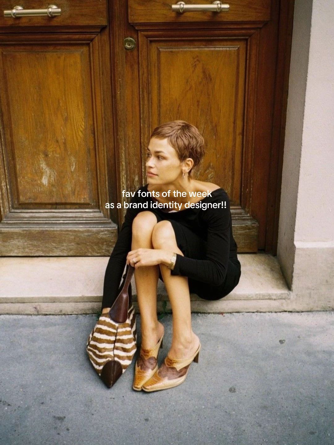
fav fonts of the week as a brand identity designer!!
Visual
A stylish woman sitting on the ground in front of a wooden door, wearing a black dress and animal print bag.
All Slides
@fusioncreativestudio carousel breakdown
Fusion Creative Studio
#designstudio #font #branding #brandidentity #visualdirection
Effectiveness score
9/10
Views
110K
Likes
14.1K
Saves
11K
Engagement
23.5%
Hook
fav fonts of the week as a brand identity designer!!
Goal
inspire
Offer
information
CTA
none
Caption
#designstudio #font #branding #brandidentity #visualdirection
Strategic Summary
The virality is driven entirely by its utility as a high-aesthetic reference asset, causing an astronomical 16.5x bookmark rate. By coupling an aspirational 'cool girl' lifestyle hook with impeccably laid-out typographic specimens, the creator establishes elite taste and authority. Audiences save the post to use the fonts later, and follow to adopt the creator's curated identity.
The Winning Formula
Aspirational lifestyle hook + exact, credible professional titles + highly curated visual reference material = infinite saves.
What's working
- •Slide 1 uses an aspirational fashion/lifestyle photo instead of a graphic design template, establishing 'cool girl' aesthetics before teaching.
- •The 'as a [professional title]' hook instantly establishes authority and credibility.
- •Providing the exact font names and designer credits makes the carousel highly actionable, driving massive bookmarks.
- •Displaying the fonts in elegant, real-world context layouts rather than plain alphabets proves the creator's 'taste' and elevates perceived value.
What's not working
- •There is no clear CTA on Slide 6 (e.g., 'follow for next week's list'), leaving some engagement/conversion on the table despite the viral reach.
Viral lesson
Utility wrapped in an aspirational aesthetic creates a compounding save-to-reach loop; people save to steal the assets and follow for the taste.
Can a small creator replicate this? Highly replicable for any curator or professional—just replace fonts with your niche's tools (e.g., specific paint colors, Shopify templates, or fabric sources) and display them in premium context.
Structural Formula (steal-the-format)
Structure pattern
Aspirational lifestyle hero image + 5 slides of highly curated, visually contextualized lists/examples of industry-specific tools + annotations detailing EXACT item names.
Copy formula
Casual superlative + timeframe + 'as a [authoritative professional title]'
What to swap (concrete remixes)
- •Swap 'brand identity designer/fonts' to 'interior designer/paint swatches in real rooms' for home decor audiences.
- •Swap to 'commercial video editor/color grading LUTs' for filmmaker niches.
- •Swap to 'UI/UX engineer/Figma component libraries' for tech audiences.
What NOT to copy
Do not just list the items on a blank screen. The entire viral mechanism relies on proving your taste by displaying the tools in a highly elevated, visually stunning context.
Aesthetics
High-fashion editorial minimalism mixed with classical typographic specimen layouts.
Color palette
What it conveys: It makes you feel like you are browsing the private archive of a high-end luxury art director.
Slide-by-slide forensics
1hooklifestyle shotaspirational chicworks:yesgrab:90/100aesthetic:95/100fav fonts of the week as a brand identity designer!!
fav fonts of the week as a brand identity designer!!
Visual description
A young woman with a short pixie cut, wearing a black top or dress, sits on a stone step in front of grand wooden double doors. She looks off-camera to the left. She holds a bold, zebra-striped and brown leather bag, and wears textured brown and tan heeled mules.
Scene setting
outdoor European-style city street step
Visible people
Visible objects
Predicted audience reaction
Immediate awe of her personal style, concluding that if her fashion is this good, her design taste will be elite.
Comments reacting to this slide
- "Oh you have taste"
Verdict: It perfectly anchors the purely digital subject (fonts) in a highly aspirational physical identity.
2step in listtext cardvintage eleganceworks:yesgrab:80/100aesthetic:90/100uppercase are Old Roman by Patrick Michael Murphy
lowercase are Bowen Script by Andrew Ashton
1871 Dreamer Script Normal by GLC
(Bowen Script again)
uppercase are Old Roman by Patrick Michael Murphy lowercase are Bowen Script by Andrew Ashton 1871 Dreamer Script Normal by GLC (Bowen Script again)
Visual description
A beautiful typographic layout resembling an antique book title page. Cream or aged paper background with classical serif and elegant script typographies mixed perfectly, with small editorial overlay annotations on the left and bottom.
Scene setting
digital layout on textured paper
Visible objects
Other text elements
- •RINGS of INTENTION
- •SILHOUETTES INSPIRED BY THE Spiritual Architecture OF ITALY AND MOTIFS INSPIRED BY THE Tropical Flora OF SAINT PETERS-BURG, FL.
- •Lauren Jennings
- •Designer & Goldsmith
vs prior slide
Style: Total shift from lifestyle photography to purely digital/typographic layouts.
Story: Delivers on the hook by providing the first piece of highly curated value.
Predicted audience reaction
Taking screenshots or saving the post immediately to remember the font combinations.
Comments reacting to this slide
- "the displaying of these fonts make them look even more elegant. love!"
- "Great fonts. Adding to my collection."
Verdict: It over-delivers on the promise by not just naming fonts, but showing how a master combines them.
3step in listtext cardminimalist gallery vibeworks:yesgrab:75/100aesthetic:90/100Simple Soft by Ben Blom
(big kerning here ofc)
Free Zone Regular by Joffre Lefevre
Simple Soft by Ben Blom (big kerning here ofc) Free Zone Regular by Joffre Lefevre
Visual description
A minimalist, soft pink background with elegant, widely-spaced typography. Annotations pointing to specific text elements are placed casually on the left side.
Scene setting
digital gallery layout
Other text elements
- •Luciano Caruso
- •E X E M P L A
- •(1966 - 1973)
- •Visual Art Center
vs prior slide
Style: Maintains the same structural layout format (beautiful specimen + small annotations) but shifts color palette to blush pink.
Story: Continues the list with a new aesthetic style.
Predicted audience reaction
Appreciation the slightly more modern, mid-century museum feeling.
Verdict: It maintains the high aesthetic bar while varying the color and style to keep the viewer engaged.
4step in listinfographicarchitectural precisionworks:yesgrab:75/100aesthetic:85/100Garcon Grotesque by Thomas Jockin
Garcon Grotesque by Thomas Jockin
Visual description
A stark, technical grid displaying the typographic proportions of 'DEVEAUX NEW YORK' in a clean, bold serif or grotesque font. Light gray grid lines and measurement units (1 UNIT, 2/3) are visible in the background against off-white.
Scene setting
technical design file
Visible objects
Other text elements
- •DEVEAUX NEW YORK
- •DEVEAUX
- •NEW YORK
- •1 UNIT
- •2/3
vs prior slide
Style: Returns to cream/off-white background but introduces technical/architectural line elements.
Story: Shows a different flavor of design—precision branding rather than bookish elegance.
Predicted audience reaction
Fascination with the behind-the-scenes structural grid.
Verdict: The drafting lines add a layer of 'insider professional' credibility that plain text wouldn't.
5step in listtext cardluxury heritageworks:yesgrab:70/100aesthetic:90/100Garamond Premier by Robert Slimbach and Claude Garamond
Here it's also Garamond Premier (Medium Italic)
Garamond Premier by Robert Slimbach and Claude Garamond Here it's also Garamond Premier (Medium Italic)
Visual description
A highly refined, classic editorial layout on soft greyish-blue paper. A large, elegant serif headline atop perfectly spaced italic accents and address block at the bottom. A faint border frames the content.
Scene setting
luxury letterhead or editorial page
Other text elements
- •GRACE FULLER
- •Design
- •985 Madison Avenue New York, New York 10075. Telephone +1 212 433 4499
vs prior slide
Style: Returns to the purely editorial, clean layout approach seen in slide 2 and 3.
Story: Provides a deeply classic luxury typographic specimen.
Predicted audience reaction
Acknowledging the timeless perfection of Garamond when used correctly.
Verdict: It secures the narrative that the creator masters both modern and classical aesthetics.
6payofftext cardminimalist starknessworks:partialgrab:60/100aesthetic:85/100Cyan by Robbie de Villiers might be the closest
Cyan by Robbie de Villiers might be the closest
Visual description
A list of cat breeds stacked centrally in a thin, elegant, light-silver serif font on a stark white background. The annotation is placed flush left.
Scene setting
minimalist digital canvas
Other text elements
- •MAINE COON
- •BENGAL
- •SELKIRK REX
- •BOMBAY
- •ABYSSINIAN
- •SOMALI
- •CHARTREUX
- •LA PERM
- •THAI SIAMESE
vs prior slide
Style: Drops the textured/colored backgrounds for a stark white, reducing visual warmth.
Story: Provides the final typography resource, though slightly more tentatively ('might be the closest').
Predicted audience reaction
Will save for the font, but feels slight confusion over the abrupt end of the list without a sign-off.
Verdict: It delivers the value, but misses a critical opportunity to convert this hyper-engaged state into a distinct CTA (like, comment, or follow).
Commerce intent
Buy-intent phrases (from comments)
- •Adding to my collection.
Comment ethnography
High aesthetic validation, acknowledging the creator's impeccable 'taste' and aligning with an in-group identity ('font tok').
Comments that characterize the audience
- "Oh you have taste"
- "commenting to stay on font tok"
- "the displaying of these fonts make them look even more elegant. love!"
Pain points revealed
- •Finding high-quality, elegant typography combinations
Aspirations revealed
- •To possess elite design taste and curation skills
- •To be part of the cool, 'in-the-know' designer community
Top questions asked
- •And your song choice?????
Diagnostics
Hook deep-dive
fav fonts of the week as a brand identity designer!!
To discover which exact typographic tools a verified professional uses, with the intention of co-opting them for their own use.
Engagement read
The bookmark rate is 16.5x the norm, revealing that the content operates less as entertainment and more as an indispensable utility/reference asset.
Mechanics
The promise of discovering new, premium typography assets with actionable credits on each swipe.
Brand & funnel
Buying-journey moment: Searching for high-end creative inspiration and concrete assets to elevate their own design projects or brand.
Ideal Customer Profile
Aspiring or junior brand designers who value high-end, editorial aesthetics and are looking for 'insider' font recommendations to elevate their own work.
Age
18-24
Gender
female
Readability
simple
Interests
Pain Points
Aspirations
Emotional Profile
Primary Emotion
aspirationIntensity
Effectiveness
Emotions Evoked
Emotional Arc
curiosity → discovery → appreciation → utility
Why It Lands
The content makes the viewer feel like they are getting a peek behind the curtain of a professional designer's process, validating their own interest in high-end design.
Writing Analysis
Style
listicle
Tone
aspirational
Hook Type
identity statement
Quality
The writing is extremely concise and lets the typography do the heavy lifting. It avoids fluff, focusing purely on the utility of the information provided.
Effectiveness
Goal Achievement
The high number of saves (10,969) indicates the content is highly effective as a resource, which is the primary goal for this type of educational/inspirational carousel.
Why It Spread
high aesthetic value makes it highly shareable
utility-driven content (font lists) drives massive save rates
the 'cool' factor of the hook photo attracts the target design demographic
Content DNA
There is no explicit CTA, which is a missed opportunity for conversion, though it keeps the aesthetic clean and 'cool'.
Narrative Arc
The carousel builds value by showing increasingly sophisticated font applications, peaking with the technical layout on slide 4.
Psychological Blueprint
Why It Spread
The post succeeded by blending high-fashion lifestyle imagery with actionable design resources, creating a 'saveable' asset that functions as a curated mood board. By positioning the fonts as 'favs' rather than a generic list, it taps into the viewer's desire to emulate the creator's taste. The high save-to-view ratio (nearly 10%) proves it is treated as a utility tool for other designers, while the aesthetic hook ensures it fits perfectly into the 'design-tok' feed.
Framework
authority then teachPrimary Tactic
authorityTactics Used
curiosity gap on slide 1 — 'fav fonts' implies exclusive knowledge
identity signaling — using a specific 'cool girl' aesthetic to attract a specific tribe
authority building — sharing specific font names and their creators
pattern interrupt — using a high-fashion lifestyle photo as a hook for a technical design post
Cognitive Biases
mere exposure effect — repeatedly seeing these fonts makes them feel familiar and desirable
authority bias — assuming these fonts are 'the best' because they are presented by a 'brand identity designer'
halo effect — the aesthetic quality of the slides makes the font recommendations seem higher quality
Tribal Markers
Trust Signals
Slide Breakdown (6 analyzed)
Hook Analysis
It uses a 'lifestyle-as-hook' technique. It doesn't look like a boring educational post; it looks like a fashion magazine, which stops the scroll of the target audience.
Text
fav fonts of the week as a brand identity designer!!
Visual
A stylish woman sitting on the ground in front of a wooden door, wearing a black dress and animal print bag.
Visual Elements
Color Palette
Copy Analysis
Power Words
Open Loop: yes — the viewer wants to see which fonts a professional designer actually uses.
Visual Psychology
Attention: the woman's face and the contrast of the text
Gaze: the woman is looking off-camera, creating a sense of mystery
Emotional cue: the 'cool girl' aesthetic triggers a desire to be part of that world
Composition: to establish a high-end, editorial mood immediately
Text
RINGS of INTENTION- SILHOUETTES INSPIRED BY THE Spiritual Architecture OF ITALY AND MOTIFS INSPIRED BY THE Tropical Flora OF SAINT PETERS- BURG, FL. uppercase are Old Roman by Patrick Michael Murphy lowercase are Bowen Script by Andrew Ashton 1871 Dreamer Script Normal by GLC Lauren Jennings Designer & Goldsmith (Bowen Script again)
Visual
Minimalist, off-white background with black serif and script typography.
Visual Elements
Color Palette
Copy Analysis
Power Words
Open Loop: no
Visual Psychology
Attention: the large header text
Emotional cue: the elegance of the font choices
Composition: to showcase the fonts in a real-world, sophisticated context
Text
Luciano Caruso EX E M P L A (1966 - 1973) Simple Soft by Ben Blom (big kerning here ofc) Free Zone Regular by Joffre Lefevre Visual Art Center
Visual
Pale pink background with minimalist sans-serif typography.
Visual Elements
Color Palette
Copy Analysis
Power Words
Open Loop: no
Visual Psychology
Attention: the word EX E M P L A
Emotional cue: the 'big kerning' note adds a touch of professional personality
Composition: to demonstrate the impact of spacing and font choice
Text
Garcon Grotesque by Thomas Jockin DEVEAUX NEW YORK DEVEAUX NEW YORK
Visual
Off-white background with technical design guidelines and typography.
Visual Elements
Color Palette
Copy Analysis
Power Words
Open Loop: no
Visual Psychology
Attention: the bold text DEVEAUX NEW YORK
Emotional cue: the technical lines suggest precision and professional expertise
Composition: to show the font in a branding context
Text
GRACE FULLER Garamond Premier by Robert Slimbach and Claude Garamond Here it's also Garamond Premier (Medium Italic) Design 985 Madison Avenue New York, New York 10075. Telephone +1 212 433 4499
Visual
Light blue-grey background with elegant serif typography.
Visual Elements
Color Palette
Copy Analysis
Power Words
Open Loop: no
Visual Psychology
Attention: the large header GRACE FULLER
Emotional cue: the classic, timeless feel of the Garamond font
Composition: to show the font in a high-end editorial/business card context
Text
MAINE COON BENGAL SELKIRK REX BOMBAY ABYSSINIAN SOMALI CHARTREUX LA PERM THAI SIAMESE Cyan by Robbie de Villiers might be the closest
Visual
White background with light grey text.
Visual Elements
Color Palette
Copy Analysis
Power Words
Open Loop: no
Visual Psychology
Attention: the list of words
Emotional cue: the subtle, almost invisible text creates a sense of 'if you know, you know'
Composition: to provide a final, subtle recommendation
Comment Intelligence
Sentiment
PositiveResonance
Intent
inspire
Audience Vibe
The comments are sparse but highly appreciative, with users tagging friends and saving the post for future reference.
Standout Quotes
“So elegant.”
“Saving this for my next project.”
“These font choices are incredible.”
Top Comments
wow love
And your song choice????? Instant follow I’m obsessed
commenting to stay on font tok
wow 😍😍😍
Yes.