Slide Text
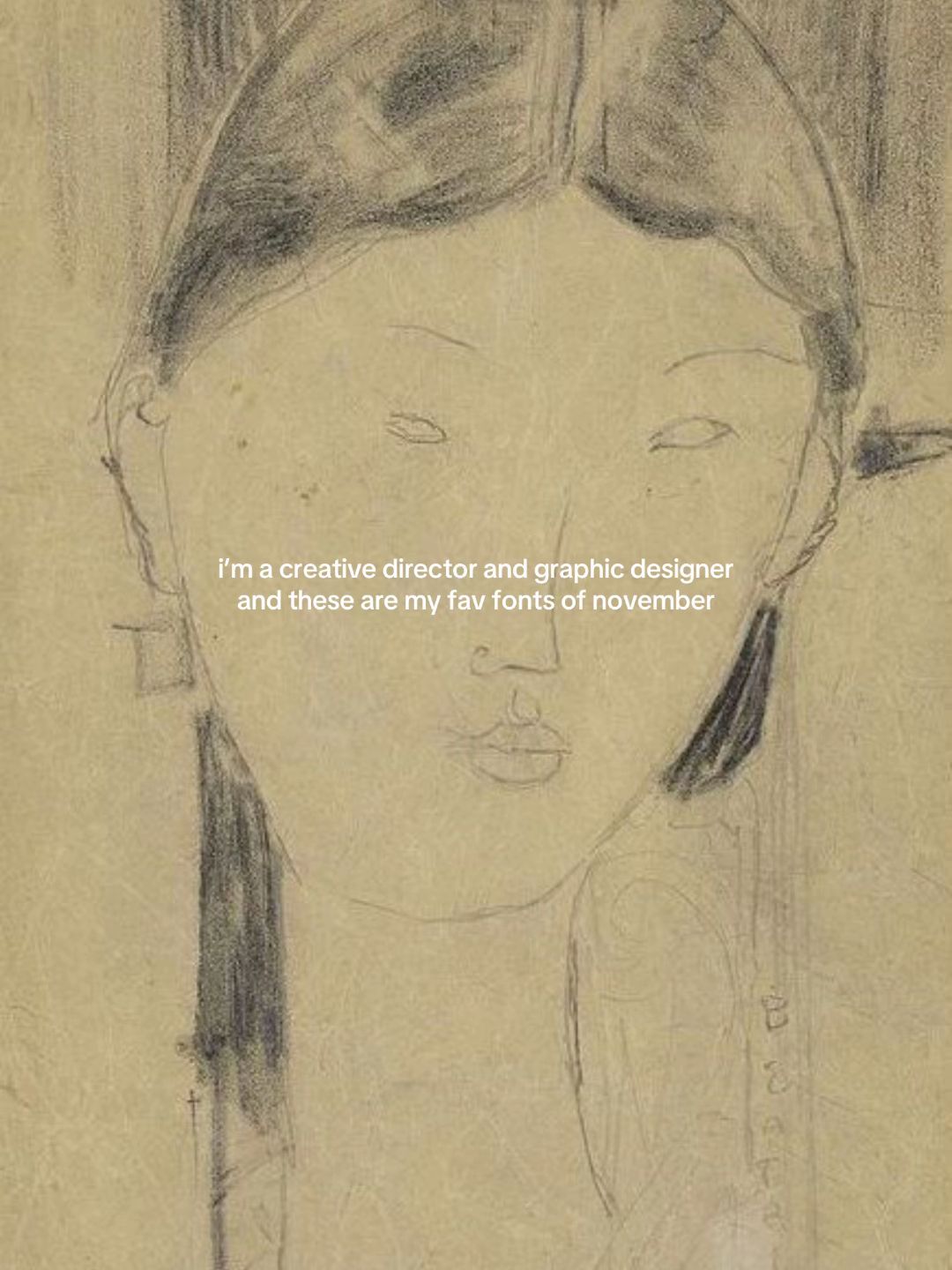
i'm a creative director and graphic designer and these are my fav fonts of november
Visual
A vintage-style pencil sketch of a woman's face on textured, aged paper.
All Slides
@fusioncreativestudio carousel breakdown
Fusion Creative Studio
#branding #graphicdesign #font #brandidentity #designstudio
Effectiveness score
9/10
Views
86.2K
Likes
11.9K
Saves
6.3K
Engagement
21.6%
Hook
i'm a creative director and graphic designer and these are my fav fonts of november
Goal
build-community
Offer
information
CTA
none
Caption
#branding #graphicdesign #font #brandidentity #designstudio
Strategic Summary
This carousel went viral because it combines high-status authority ('I'm a creative director') with immediate, actionable utility (exact font names). The aesthetic is distinctively 'high-end archival,' triggering save behavior for future reference. The comments reveal an audience that values 'taste' as much as the technical information, validating the creator's curation skills.
The Winning Formula
Authority credential + Specific monthly curation + High-fidelity vintage aesthetic + Exact font names for immediate utility.
What's working
- •Slide 1 establishes immediate credibility ('creative director') which justifies the opinions that follow.
- •Slides 2-6 provide high-utility payoff: every slide names specific fonts, making the save actionable for designers.
- •The vintage/archival visual theme creates a cohesive 'high-taste' brand identity that audiences want to associate with.
- •Slide 6 (Halston) specifically triggered comment recognition, proving the cultural relevance of the references.
What's not working
- •Slide 4 text is slightly denser than others, potentially causing a微 drop-off in reading speed.
- •No direct CTA on the last slide (Slide 6 is just another example), missing a chance to convert saves into follows.
Viral lesson
Utility drives saves, but 'taste' drives follows. When you give people tools (fonts) wrapped in a desirable aesthetic (vintage luxury), they save the tool and follow the curator.
Can a small creator replicate this? Highly replicable for any B2B or skill-based niche: claim authority, curate a 'monthly favorites' list, and ensure every slide gives a specific name/link/tool the audience can use.
Structural Formula (steal-the-format)
Structure pattern
6-slide identity hook followed by 5 examples of curated items with specific names, ending on the strongest brand example.
Copy formula
lowercase conversational overlay + precise font metadata (Name by Designer).
What to swap (concrete remixes)
- •Swap fonts→color palettes for interior design niche.
- •Swap fonts→camera settings for photography niche.
- •Swap 'creative director'→'fitness coach' for health niche.
What NOT to copy
Do not copy the specific vintage aesthetic unless it matches your brand; the 'authority claim' must be truthful to your actual expertise level.
Aesthetics
Vintage archival design documents with muted cream tones and precise typography overlays.
Color palette
What it conveys: The overall aesthetic feels like opening a high-end design archive, evoking feelings of exclusivity and timeless taste.
Slide-by-slide forensics
1hooktext cardsophisticated curiosityworks:yesgrab:85/100aesthetic:90/100i'm a creative director and graphic designer and these are my fav fonts of november
i'm a creative director and graphic designer and these are my fav fonts of november
Visual description
A pencil sketch of a woman's face, stylized and abstract, on textured beige paper. The text is centered in white sans-serif.
Scene setting
text-card over art
Visible people
Visible objects
Predicted audience reaction
Designers stop scrolling because the authority claim validates their time investment.
Verdict: Perfectly sets the 'who' and 'what' without clutter, using a high-art background to signal quality.
2step in listflat layluxury classicismworks:yesgrab:80/100aesthetic:95/100Lovato Lovato by Kosal Sen
DOLL CHARRIN
DÉTAIL DE LA CHEMINÉE ET DES BUFFETS
DE LA SALLE À MANGER
Engravers Gothic Bold by Isabella Chaeva
Lovato Lovato by Kosal Sen DOLL CHARRIN DÉTAIL DE LA CHEMINÉE ET DES BUFFETS DE LA SALLE À MANGER Engravers Gothic Bold by Isabella Chaeva
Visual description
Architectural drawing in black ink on cream paper, featuring a silhouette of a panther statue on a mantle.
Scene setting
vintage architectural archive
Visible objects
vs prior slide
Style: Maintains the cream/beige vintage paper texture and centered overlay text.
Story: Moves from the promise (Slide 1) to the first proof point (Slide 2).
Predicted audience reaction
Users read the font names immediately to see if they know them.
Verdict: Strong visual (panther) paired with specific data (font names) creates high save value.
3step in listflat layprestigeworks:yesgrab:90/100aesthetic:95/100Engravers Roman (D)
by Morris Fuller Benton
THE
PLAZA
New York
i feel like Archive Petite Script is the closest!
(by Archive Type)
ofc it's handwritten but
Anne's Hand by Richard Hubbard
is a similar one
BARATTA 89
Engravers Roman (D) by Morris Fuller Benton THE PLAZA New York i feel like Archive Petite Script is the closest! (by Archive Type) ofc it's handwritten but Anne's Hand by Richard Hubbard is a similar one BARATTA 89
Visual description
Vintage document header for 'The Plaza New York' with a green crest logo. Handwritten notes visible on the left edge.
Scene setting
vintage hotel stationery
Visible objects
Products on screen
Other text elements
- •handwritten notes on the left margin
vs prior slide
Style: Consistent cream background and overlay font style.
Story: Continues the list with a highly recognizable brand (Plaza).
Predicted audience reaction
High recognition of 'The Plaza' increases perceived value of the font pairing.
Comments reacting to this slide
- "@inspiredby.sk: Engravers Roman 😩"
Verdict: The specific mention of 'Engravers Roman' triggered a direct comment reaction, proving this slide's resonance.
4step in listflat layartistic reverenceworks:partialgrab:75/100aesthetic:90/100Nicolas Cochin
by Charles-Nicholas Cochin and Georges Peignot
Réflexions sur l'Art Mural
HENRI-MATISSE. DÉCORATION. ETAT DU 22-XI-38.
ITC Blair Medium by Jim Spiece
Nicolas Cochin by Charles-Nicholas Cochin and Georges Peignot Réflexions sur l'Art Mural HENRI-MATISSE. DÉCORATION. ETAT DU 22-XI-38. ITC Blair Medium by Jim Spiece
Visual description
Book page featuring a line drawing by Henri Matisse. Text is in a classic serif font.
Scene setting
art book page
Visible people
Visible objects
vs prior slide
Style: Consistent vintage paper texture.
Story: Adds variety by introducing fine art reference (Matisse).
Predicted audience reaction
Appreciation for the art history connection, though slightly less 'brand' recognition than Slide 3.
Verdict: Visually beautiful but lacks the immediate brand recognition of Plaza or Halston, making it slightly less 'comment-able'.
5step in listinfographicmodernist chicworks:yesgrab:80/100aesthetic:85/100NEW
Diamond Ring by Ryoichi Tsunekawa
is the closest one i found
Y
RK
SBGA
DESIGN INDUSTRY PR &
COMMUNICATIONS FIRM FOUNDED BY
SUSAN BECHER IN 1982. LED BYA
Engravers Gothic CE by Tilde
NEW Diamond Ring by Ryoichi Tsunekawa is the closest one i found Y RK SBGA DESIGN INDUSTRY PR & COMMUNICATIONS FIRM FOUNDED BY SUSAN BECHER IN 1982. LED BYA Engravers Gothic CE by Tilde
Visual description
Minimalist graphic design layout with large thin letters spelling NEW YORK and a circular sketch insert.
Scene setting
design portfolio piece
Visible people
Visible objects
vs prior slide
Style: Shifts from archival photo to graphic design layout, but keeps color palette.
Story: Shows application of fonts in a layout context.
Predicted audience reaction
Designers appreciate the layout breakdown and font pairing context.
Verdict: Provides context on how to *use* the fonts, not just what they are.
6revealflat layiconic luxuryworks:yesgrab:90/100aesthetic:95/100Cinta Hup 76
HALSTON
©1979 HALSTON ENTERPRISES INC. NEW YORK, N.Y.
33 EAST 68TH STREET, NEW YORK, N.Y. 10021 U.S.A.
Microgramma EF
by Alessandro Butti a
Parsi Regular by Naghi Naghashian
Cinta Hup 76 HALSTON ©1979 HALSTON ENTERPRISES INC. NEW YORK, N.Y. 33 EAST 68TH STREET, NEW YORK, N.Y. 10021 U.S.A. Microgramma EF by Alessandro Butti a Parsi Regular by Naghi Naghashian
Visual description
Vintage black and white advertisement featuring a sculptural spoon/object and the HALSTON logo in large sans-serif.
Scene setting
vintage print ad
Visible objects
Products on screen
Other text elements
- •small copyright text under Halston logo
vs prior slide
Style: Returns to photographic archive style, closing the loop with Slide 2.
Story: Ends on a high-note brand (Halston) for maximum impact.
Predicted audience reaction
Strong recognition of Halston triggers comments and saves.
Comments reacting to this slide
- "@carolineshawstylist: The Halston one… 🔥"
Verdict: The Halston brand is a strong closer that validates the entire list's quality.
Commerce intent
Mentioned products
Comment ethnography
A community of designers and aesthetes who speak the language of typography ('Engravers Roman') and recognize luxury brand history ('Halston').
Comments that characterize the audience
- "@inspiredby.sk: Engravers Roman 😩"
- "@carolineshawstylist: The Halston one… 🔥"
- "@lulybencomo: This looks like my art and this inspires me a lot about how to use my art work."
Pain points revealed
- •finding fonts that match a specific vintage aesthetic
- •needing credible sources for font selection
Aspirations revealed
- •to have 'good taste' like the creator
- •to work on high-end branding projects (Halston, Plaza)
Diagnostics
Hook deep-dive
i'm a creative director and graphic designer and these are my fav fonts of november
The viewer wants to know what fonts a 'creative director' uses to validate their own choices or improve their work.
Engagement read
Bookmark rate is 12x the library norm, indicating this is treated as a reference tool rather than entertainment.
Mechanics
Each slide promises a new font pairing, forcing a swipe to complete the collection.
Brand & funnel
Brands visible
Buying-journey moment: The viewer is actively looking for design assets and inspiration for current projects.
Ideal Customer Profile
Aspiring or junior graphic designers and creative professionals who value high-end, editorial, and sophisticated design aesthetics.
Age
18-24
Gender
neutral
Readability
simple
Interests
Pain Points
Aspirations
Emotional Profile
Primary Emotion
aspirationIntensity
Effectiveness
Emotions Evoked
Emotional Arc
curiosity → discovery → appreciation
Why It Lands
The content makes the viewer feel like they are gaining access to an 'insider' list, which validates their interest in high-end design and fuels their professional aspirations.
Writing Analysis
Style
conversational
Tone
aspirational
Hook Type
identity statement
Quality
The writing is concise and functional, acting as a caption for the visual examples rather than a narrative. It is perfectly suited for a quick-consumption carousel.
Effectiveness
Goal Achievement
The extremely high bookmark-to-view ratio (over 7%) indicates that the content successfully achieved its goal of providing high-value information that the audience wants to return to.
Why It Spread
high saveability due to the 'resource' nature of the content
aesthetic appeal that aligns with the target audience's visual preferences
low barrier to entry for consumption
Content DNA
There is no explicit CTA, which is a missed opportunity for conversion, but it keeps the content feeling purely editorial and non-salesy.
Narrative Arc
The flow is a consistent, rhythmic reveal of fonts paired with archival imagery, maintaining interest through visual variety.
Psychological Blueprint
Why It Spread
The carousel succeeded by positioning itself as a high-value, low-friction resource for a niche audience. With 6,274 bookmarks, it functions as a 'saveable' utility, where the aesthetic value of the slides makes users want to keep it for future reference. The combination of professional authority and a 'curated' vibe creates a strong signal for the design community, leading to high engagement despite the lack of a traditional CTA.
Framework
authority then teachPrimary Tactic
authorityTactics Used
authority on slide 1: 'i'm a creative director' establishes immediate credibility
curiosity gap on slide 1: 'fav fonts of november' implies a curated, exclusive list
social proof through curation: the creator acts as a filter for the audience's taste
identity signaling: the use of high-art imagery signals membership in a 'sophisticated' design tribe
Cognitive Biases
authority bias: viewers trust the recommendations because the creator identifies as a creative director
curation bias: viewers value the list because it saves them the effort of searching for high-quality fonts themselves
Tribal Markers
Trust Signals
Slide Breakdown (2 analyzed)
Text
i'm a creative director and graphic designer and these are my fav fonts of november
Visual
A vintage-style pencil sketch of a woman's face on textured, aged paper.
Visual Elements
Color Palette
Copy Analysis
Power Words
Open Loop: yes, the reader needs to swipe to see the actual fonts recommended.
Visual Psychology
Attention: the sketch of the face
Emotional cue: the vintage, artistic aesthetic
Composition: to establish an immediate 'high-design' tone
Text
Lovato Lovato by Kosal Sen DOLL CHARRIN DÉTAIL DE LA CHEMINÉE ET DES BUFFETS DE LA SALLE À MANGER Engravers Gothic Bold by Isabella Chaeva
Visual
A technical architectural drawing of a fireplace with a panther silhouette on top.
Visual Elements
Color Palette
Copy Analysis
Power Words
Open Loop: yes, the list continues.
Visual Psychology
Attention: the panther silhouette
Emotional cue: the technical, archival feel
Composition: to showcase typography in a professional context
Comment Intelligence
Sentiment
PositiveResonance
Intent
build-community
Audience Vibe
The comments are sparse but highly appreciative, reflecting a quiet, professional admiration for the curation.
Standout Quotes
“So good.”
“Love these.”
“Incredible curation.”
Top Comments
So nice, you might like this I found in the street in Dublin
Great selects. Love your taste!
These are so noiceee
Art deco vibe
ughhh love these 100% my vibe