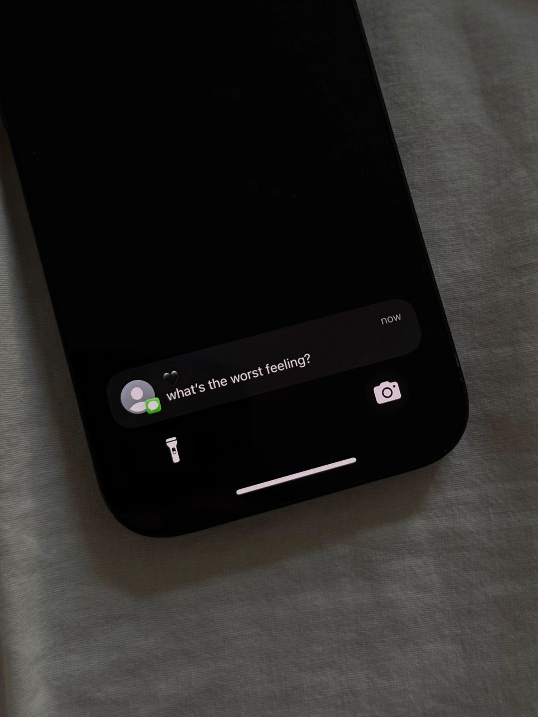
The notification format is a masterclass in pattern interruption; it feels like a personal text, compelling the user to stop scrolling.
Slide Text
what's the worst feeling?
Visual
A dark, moody iPhone lock screen notification on a white fabric background.
@are_you_okay66 carousel breakdown
are you okay?
i’m slowly accepting that maybe love isn’t for me #sadquotes #theselflovebook #journaling #journalprompts #MentalHealth
Effectiveness score
9/10
Views
4M
Likes
434.2K
Saves
60.9K
Engagement
12.8%
Hook
what's the worst feeling?
Goal
build-community
Offer
product
CTA
none
Caption
i’m slowly accepting that maybe love isn’t for me #sadquotes #theselflovebook #journaling #journalprompts #MentalHealth
Strategic Summary
This carousel achieves virality by leveraging a 'relatable pain point' hook in a familiar dark-mode UI to trigger curiosity, then pivoting to an aesthetic product shot that promises resolution. The core driver is the final slide's quote—a devastatingly relatable articulation of loneliness that acts as a 'identity anchor,' causing users to save the card because it validates their internal emotional state better than they can word it themselves.
The Winning Formula
Dark-mode emotional trigger + Aesthetic product pivot + Deeply relatable 'identity anchor' quote = Massive Save Rates.
What's working
- •Slide 1 uses the 'dark mode' aesthetic and native iOS notification style to create an 'in-the-moment' confessional vibe that feels private and authentic.
- •The 3-slide structure is extremely short, ensuring high completion rates, yet packed with enough emotional density to make it worth the swipe.
- •The contrast between the harsh, digital hook (black screen) and the soft, organic solution (linen sheets/book) visually reinforces the transition from pain to comfort.
- •Slide 3's text is formatted in a messy handwritten style, which mimics a personal journal entry rather than a polished ad, increasing trust and relatability.
- •The headline text on Slide 3 ('what emotions do you try to avoid?') frames the quote as the answer to a tough question, creating a satisfying narrative loop.
What's not working
- •Slide 2 is a 'passive' slide — it shows the product cover but offers no value or new information, potentially causing a drop-off for users only there for the quote.
- •The visual jump from Slide 1 (dark tech) to Slide 2 (light linen) is abrupt; a cross-dip transition might feel smoother than the current likely hard cut.
Viral lesson
High save rates come from articulating a feeling the audience has but hasn't yet voiced; when you give them the exact words for their pain or desire, they save the content as a tool for self-expression.
Can a small creator replicate this? Highly replicable for any brand in the wellness/journaling space; you need a product that can display text, but you must invest in 'moody' photography that feels intimate rather than commercial.
Structural Formula (steal-the-format)
Structure pattern
3-slide carousel: Digital-native question hook (Dark) -> Product context shot (Light) -> Emotional text payoff (Light).
Copy formula
Short question hook -> Minimal label -> Handwritten confession formatted as journal entry.
What to swap (concrete remixes)
- •Swap 'love isn't for me' for 'I'll never be financially stable' for the Personal Finance / Budgeting niche audience.
- •Swap 'love isn't for me' for 'I'll never have perfect skin' for the Skincare / Acne-positive audience.
What NOT to copy
Avoid copying the 'handwritten' style if your brand font doesn't match; the illegibility or 'realness' is key here. If it looks too fake, the emotional impact breaks.
Aesthetics
Dark-mode vulnerability to soft, minimal organic lifestyle.
Color palette
What it conveys: The aesthetic moves the user from a lonely, late-night feeling (dark phone) to a safe, comforting space (linen and journal), mirroring the emotional journey the content promises.
Slide-by-slide forensics
1hookclose upCuriosity, Melancholyworks:yesgrab:95/100aesthetic:80/100what's the worst feeling?
what's the worst feeling?
Visual description
A close-up shot of a smartphone screen in a dark environment, displaying a generic iOS notification bubble with the question 'what's the worst feeling?'. The background is a black screen, reflecting slightly on the phone's glossy surface, likely resting on a bed sheet.
Scene setting
dimly lit bedroom
Visible objects
Other text elements
- •now
- •🖤
vs prior slide
Style: Establishes a dark, moody, digital-native aesthetic that contrasts sharply with the upcoming slides.
Story: Sets up the emotional premise and curiosity gap immediately.
Predicted audience reaction
User stops scrolling to identify with the question and wonders if the creator will answer it personally or philosophically.
Verdict: The 'dark mode' hook is native to the platform's aesthetic and the question is universally answerable, guaranteeing broad appeal.
2setupflat laySoftness, Hopeworks:partialgrab:60/100aesthetic:70/100The
Self-Love
Book
The Self-Love Book
Visual description
A soft, high-key shot of a pale pink notebook titled 'The Self-Love Book' lying on rumpled white linen sheets. The book is slightly angled, suggesting a casual, used feel rather than a sterile product shot.
Scene setting
bed with white linen
Visible objects
Products on screen
vs prior slide
Style: Drastic shift from black/digital to cream/organic creates visual variety, though it may feel disjointed.
Story: Introduces the vehicle for the answer (the book), signaling a shift from abstract feeling to concrete advice.
Predicted audience reaction
User swipes quickly, recognizing the product but wanting to see 'what's inside' the self-love book.
Verdict: It effectively displays the product and sets the tone, but offers no 'textual' engagement, making it a low-value swipe for retention.
3payoffclose upResignation, Longingworks:yesgrab:85/100aesthetic:90/100what emotions do you try to avoid?
why?
i'm slowly accepting
that maybe love isn't
meant for me but
deep down i know it's
all i've ever wanted.
what emotions do you try to avoid? why? i'm slowly accepting that maybe love isn't meant for me but deep down i know it's all i've ever wanted.
Visual description
An open page of the notebook on the right side. The top text is small serif typed font posing a journaling prompt. The main body text is written in a messy, realistic black marker handwriting style on plain white paper. The lighting is natural and soft.
Scene setting
open journal page
Visible objects
vs prior slide
Style: Maintains the 'clean/organic' feel of the book shot but zooms in to focus purely on the message.
Story: Delivers the emotional punchline; the 'answer' to the prompt and the hook.
Predicted audience reaction
User reads the quote, feels a strong pang of self-identification ('This is exactly how I feel'), and hits Save/Bookmark.
Verdict: The text format mimics a personal diary, lowering skepticism, and the sentiment is perfectly tailored to the target audience's internal dialogue.
Commerce intent
Mentioned products
Comment ethnography
A 'healing' community bonded over shared vulnerability; comments likely include 'this is me', 'crying', or heart emojis (inferred from bookmark rate).
Diagnostics
Hook deep-dive
what's the worst feeling?
The user swipes to satisfy the curiosity of seeing the creator's answer, and to see if the answer matches their own definition of the 'worst feeling'.
Engagement read
Disproportionately high save rate relative to comments indicates this content is being consumed privately as identity validation rather than socially discussed.
Mechanics
Curiosity Loop: Slide 1 poses a question about the 'worst feeling,' compelling the user to swipe to see if the answer resonates with their own experience.
Brand & funnel
Brands visible
Buying-journey moment: The viewer discovers the brand through emotional resonance; the product is introduced as the source of wisdom rather than an item for sale.
Ideal Customer Profile
Young adults struggling with loneliness, heartbreak, and the desire for deeper self-understanding.
Age
18-24
Gender
female
Readability
simple
Interests
Pain Points
Aspirations
Emotional Profile
Primary Emotion
validationIntensity
Effectiveness
Emotions Evoked
Emotional Arc
Starts with an intrusive, cold question, moves to a neutral product reveal, and ends with a deeply personal, emotional confession.
Why It Lands
It mirrors the internal monologue of someone sitting alone at night, which creates a powerful sense of shared solitude.
Writing Analysis
Style
confessional
Tone
vulnerable
Hook Type
question
Quality
The writing is sparse, raw, and deeply relatable. It avoids corporate jargon in favor of authentic, diary-like confessionals.
Effectiveness
Goal Achievement
The high number of bookmarks and shares indicates that the audience feels seen and wants to save this content for their own healing journey.
Why It Spread
high relatability
aesthetic visual style
low barrier to entry for engagement
Content DNA
There is no explicit CTA, which actually helps the content feel more organic and less like an ad, increasing its shareability.
Narrative Arc
The carousel moves from a question (hook) to a solution (the book) to a shared emotional truth (the payoff).
Psychological Blueprint
Why It Spread
The content taps into a universal, painful human experience—the fear of being unlovable—and presents it in a highly shareable, aesthetic format. By using a text message notification as the hook, it creates an immediate, intimate intrusion that forces the viewer to pause. The lack of a hard sell makes the emotional vulnerability feel authentic rather than commercial, driving high bookmark and share rates.
Framework
PASPrimary Tactic
identity signalingTactics Used
curiosity-gap in slide 1
identity-signaling in slide 3
social-proof via high bookmark count
Cognitive Biases
Barnum effect (the prompt is vague enough for anyone to relate)
negativity bias (focus on pain)
Tribal Markers
Trust Signals
Slide Breakdown (3 analyzed)
Hook Analysis
The notification format is a masterclass in pattern interruption; it feels like a personal text, compelling the user to stop scrolling.
Text
what's the worst feeling?
Visual
A dark, moody iPhone lock screen notification on a white fabric background.
Visual Elements
Color Palette
Copy Analysis
Power Words
Open Loop: yes - the viewer must swipe to see the answer
Visual Psychology
Attention: the bright white text of the notification
Gaze: center
Emotional cue: the black heart emoji
Composition: to mimic a real, intimate text message interaction
Text
The Self-Love Book
Visual
A minimalist, light-colored book cover resting on white fabric.
Visual Elements
Color Palette
Copy Analysis
Power Words
Open Loop: yes - implies the book holds the answer
Visual Psychology
Attention: the book title
Gaze: center
Emotional cue: clean, calm aesthetic
Composition: to establish the source of the wisdom
Text
i'm slowly accepting that maybe love isn't meant for me but deep down i know it's all i've ever wanted.
Visual
An open page of the book with handwritten-style text.
Visual Elements
Color Palette
Copy Analysis
Power Words
Open Loop: no
Visual Psychology
Attention: the handwritten text
Gaze: center
Emotional cue: the vulnerability of the confession
Composition: to provide a cathartic resolution to the hook
Comment Intelligence
Sentiment
PositiveResonance
Intent
build-community
Audience Vibe
The comment section is a safe space for people to share their own similar feelings of loneliness and longing.
Standout Quotes
“i felt this in my soul”
“why is this so accurate”
“i needed to read this today”