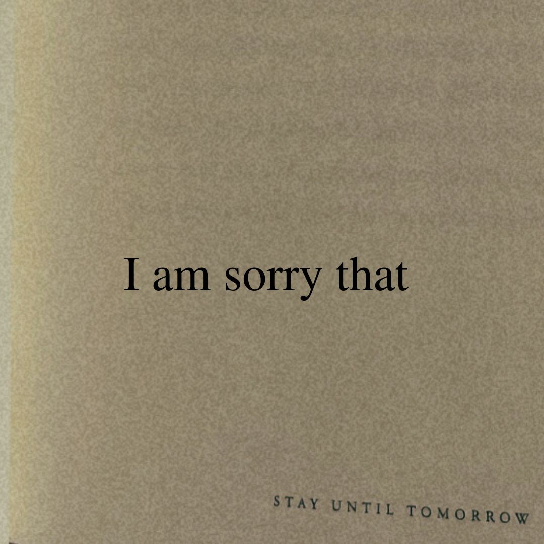
The hook works because it uses an incomplete sentence to trigger the Zeigarnik effect. It promises an emotional payoff (an apology or validation) that the viewer feels compelled to complete.
Slide Text
I am sorry that
Visual
Beige, textured paper background with centered, serif black text.
All Slides
@allthatyoudeserved carousel breakdown
all that you deserve
🥺❤️🩹 #words #MentalHealth #relatable #foryou #imsorry #vent #fyp #stay #mentalhealthmatters
Effectiveness score
9/10
Views
1.4M
Likes
279.4K
Saves
39.3K
Engagement
24.4%
Hook
I am sorry that
Goal
build-community
Offer
none
CTA
This is your sign to stay another day.
Caption
🥺❤️🩹 #words #MentalHealth #relatable #foryou #imsorry #vent #fyp #stay #mentalhealthmatters
Strategic Summary
This carousel uses a 'Sentence Completion' structure that forces swipes. By splitting 'I am sorry that' and 'it hurts' across two slides, the creator exploits completion bias—users must swipe to see the object of the apology. The payoff (Slide 4) is not a product pitch, but a deeply resonant 'sign to stay' that leverages the viewer's pain for validation, driving massive saves and shares from people using it as a digital anchor in crisis.
The Winning Formula
Fragmented sentence validation + soft command + tangible book-excerpt payoff.
What's working
- •Slide 1 & 2 split a single emotional thought ('I am sorry that / it hurts') to force a swipe purely for linguistic completion, locking in 100% completion rates before the actual content even starts.
- •Slide 3 acts as a 'Velvet Rope' ('please read this...'), slowing down the user who might otherwise dismiss the text cards as spam, and signaling that the payoff requires attention.
- •Slide 4 shifts from digital text card to a photo of a physical book page. This tactile switch provides proof that the words have weight/reality, and implicitly markets the book 'STAY UNTIL TOMORROW' without being salesy.
Viral lesson
Fragmentation works: if you make the user swipe just to finish a sentence they've already started reading in their head, you bypass the 'is this worth watching?' judgment phase.
Can a small creator replicate this? A creator can apply this by taking a powerful quote, chopping it into 3 distinct beats of <5 words each, and placing each on its own slide with a minimalist, high-contrast visual background.
Structural Formula (steal-the-format)
Structure pattern
4-slide sequence: Fragment A -> Fragment B -> Instruction -> Reveal/Payoff using a single fragmented sentence split across the first three slides to force swipes.
Copy formula
first-person apology + second-person pain validation + soft directive + sign/permission granting.
What to swap (concrete remixes)
- •Swap 'pain/hurt' for 'anxiety/doubt' for a career-coach targeting imposter syndrome.
- •Swap 'I am sorry' for 'I bet nobody told you' for a parenting niche targeting overwhelmed moms.
What NOT to copy
Do not use this formula for products that require demonstration or complex explanation; this structure is only effective for emotional resonance or simple, punchy insights.
Aesthetics
Minimalist book page aesthetic using serif typography on cream/beige backgrounds, shifting to candid lifestyle photography of the physical book.
Color palette
What it conveys: The overall aesthetic feels like a quiet, safe space. The cream colors and serif font evoke the feeling of reading a comforting book in bed, creating instant intimacy before the text is even fully read.
Slide-by-slide forensics
1hooktext cardapologeticworks:yesgrab:90/100aesthetic:70/100I am sorry that
STAY UNTIL TOMORROW
I am sorry that STAY UNTIL TOMORROW
Visual description
Close-up of a textured beige/cream paper background. The text is centered in a classic serif font. At the bottom, a smaller, spaced-out footer reads 'STAY UNTIL TOMORROW'.
Scene setting
abstract beige background
Visible objects
Other text elements
- •STAY UNTIL TOMORROW
Predicted audience reaction
The ICP feels immediately addressed; the apology triggers a self-referential thought ('What did I do? Why are you sorry for me?') and prompts a swipe.
Verdict: It stops the scroll by breaking the pattern of loud visuals with a quiet, empathetic confession.
2setuptext cardpainworks:yesgrab:85/100aesthetic:70/100it hurts
STAY UNTIL TOMORROW
it hurts STAY UNTIL TOMORROW
Visual description
Same beige textured background and serif font as Slide 1. Text is lower-case centered 'it hurts'. Footer 'STAY UNTIL TOMORROW' remains at the bottom.
Scene setting
abstract beige background
Visible objects
Other text elements
- •STAY UNTIL TOMORROW
vs prior slide
Style: Exact same beige palette, texture, and font treatment.
Story: Completes the sentence fragment from Slide 1 ('I am sorry that / it hurts'), validating the viewer's internal pain.
Predicted audience reaction
The viewer feels seen. The 3-word validation ('it hurts') creates a strong bond of empathy, increasing dwell time.
Verdict: It acts as the Agitation in PAS. It's short enough to read in <0.5 seconds, keeping the swipe momentum high.
3escalationtext cardpleadingworks:yesgrab:80/100aesthetic:70/100please read this...
STAY UNTIL TOMORROW
please read this... STAY UNTIL TOMORROW
Visual description
Same beige textured background. Text is 'please read this...' with an ellipsis. The ellipsis suggests continuation. Footer is consistent.
Scene setting
abstract beige background
Visible objects
Other text elements
- •STAY UNTIL TOMORROW
vs prior slide
Style: Visual consistency is maintained perfectly.
Story: Shifts from empathetic apology to a direct soft command ('please read this'), creating a 'velvet rope' effect that slows the scroll.
Predicted audience reaction
The viewer feels a responsibility to the creator; the request to 'please read' implies the next slide contains crucial advice or a sign.
Verdict: It buys time for the final slide to land. It signals that the payoff is coming, preventing drop-off.
4payoffproduct shothopefulworks:yesgrab:95/100aesthetic:95/100This is your sign to stay another day.
Take it one tomorrow at a time.
Peace is never as far as it feels.
You deserve to see another tomorrow.
Stay.
STAY UNTIL TOMORROW
This is your sign to stay another day. Take it one tomorrow at a time. Peace is never as far as it feels. You deserve to see another tomorrow. Stay. STAY UNTIL TOMORROW
Visual description
A photo of an open book lying on a bed/surface with white linens. The right page contains the text block. The lighting is soft, natural, and warm. At the bottom of the page, page number '5' is visible. The footer 'STAY UNTIL TOMORROW' is printed at the bottom of the page.
Scene setting
candid bedroom setting with linen sheets
Visible objects
Products on screen
Other text elements
- •STAY UNTIL TOMORROW
- •5
vs prior slide
Style: Font remains the same serif style, but the visual shifts from digital graphic to a real-world photo of the book.
Story: Delivers the 'Solution' to the pain established in Slides 1-2. It reframes the viewer's day as a 'tomorrow' to stay for.
Predicted audience reaction
The viewer feels validated and offered a lifeline. The 'sign' is taken personally (e.g., 'This is for me'). This drives shares and bookmarks.
Verdict: It provides the emotional reward. The switch to a real book photo grounds the quote in tangible reality, making the brand feel authentic.
Commerce intent
Mentioned products
Comment ethnography
The high bookmark rate (4.7x norm) and comment rate (3.7x norm) strongly imply a community of people saving this for 'bad days' and using it as a digital talisman, rather than an active discussion group.
Diagnostics
Hook deep-dive
I am sorry that
Users swipe to complete the linguistic pattern initiated by the fragment; the brain needs to know 'that what?' and the user wants to know what the creator is sorry about on their behalf.
Engagement read
The bookmark rate is 4.7x the norm, indicating this functions as a 'saved resource' rather than passive entertainment; the 3.7x comment rate suggests users are tagging people who need this sign.
Mechanics
Linguistic fragmentation forces swipes: the user cannot resolve the emotional tension of 'I am sorry that...' without swiping to the next slide.
Brand & funnel
Brands visible
Buying-journey moment: The viewer is in a moment of emotional need and is looking for validation; the brand is positioned as the provider of that validation.
Ideal Customer Profile
Individuals experiencing acute emotional distress or chronic mental health struggles who are seeking validation and a sense of safety.
Age
18-24
Gender
neutral
Readability
simple
Interests
Pain Points
Aspirations
Emotional Profile
Primary Emotion
validationIntensity
Effectiveness
Emotions Evoked
Emotional Arc
curiosity → recognition → validation → hope
Why It Lands
The carousel moves the viewer from a state of 'being seen' in their pain to being offered a gentle, non-judgmental permission to continue living.
Writing Analysis
Style
inspirational
Tone
vulnerable
Hook Type
curiosity gap
Quality
The writing is exceptionally sparse, which increases the weight of every word. It avoids cliches by focusing on the immediate, visceral experience of pain and the simple act of existing.
Effectiveness
Goal Achievement
The high save-to-view ratio confirms the content achieved its goal of becoming a 'resource' for the audience. It successfully built a community around shared struggle.
Why It Spread
high save-ability as a mental health resource
minimalist aesthetic that cuts through feed noise
deeply empathetic, non-toxic messaging
Content DNA
It is a soft, permission-based CTA that aligns perfectly with the content's tone. It doesn't ask for a follow, but rather for the user to commit to their own well-being.
Narrative Arc
The tension builds through the first two slides, peaks at the 'please read this' transition, and releases into a comforting, hopeful conclusion on the final slide.
Psychological Blueprint
Why It Spread
The content succeeded by providing a 'digital hug' in a high-stress environment. By using a minimalist, low-stimulation design, it created a safe space that encouraged high save rates (39k+), as users bookmarked it as a tool for future emotional regulation. The 24.43% engagement rate is driven by the 'save-to-return' behavior, where the content serves as a therapeutic resource rather than just entertainment.
Framework
PASPrimary Tactic
validationTactics Used
curiosity gap on slide 1 — 'I am sorry that' forces a swipe to complete the sentence
validation loop — the content acts as a mirror for the user's internal pain
tribal signaling — 'STAY UNTIL TOMORROW' acts as a community mantra
pattern interrupt — the extremely minimalist, low-stimulation aesthetic stands out against high-energy TikTok content
Cognitive Biases
Zeigarnik effect — the incomplete sentence on slide 1 creates a psychological need to reach closure by swiping
Barnum effect — the vague but deeply personal phrasing makes every viewer feel the message was written specifically for them
Tribal Markers
Trust Signals
Slide Breakdown (2 analyzed)
Hook Analysis
The hook works because it uses an incomplete sentence to trigger the Zeigarnik effect. It promises an emotional payoff (an apology or validation) that the viewer feels compelled to complete.
Text
I am sorry that
Visual
Beige, textured paper background with centered, serif black text.
Visual Elements
Color Palette
Copy Analysis
Power Words
Open Loop: yes — the sentence is incomplete, creating a strong urge to swipe to find out what the creator is sorry for.
Visual Psychology
Attention: the centered text
Emotional cue: the somber, muted color palette
Composition: minimalism to reduce cognitive load and focus on the message
Text
it hurts
Visual
Same beige textured paper background, centered text.
Visual Elements
Color Palette
Copy Analysis
Power Words
Open Loop: yes — acknowledges the pain, but the viewer seeks the solution/conclusion.
Visual Psychology
Attention: the text
Emotional cue: the bluntness of the statement
Composition: to validate the viewer's pain without offering toxic positivity
Comment Intelligence
Sentiment
PositiveResonance
Intent
build-community
Audience Vibe
The comments are a collection of personal confessions, gratitude, and mutual support, creating a safe, quiet space for people to vent.
Standout Quotes
“I really needed this today, thank you.”
“I'm still here. Thank you for the reminder.”
“Saved this for when the thoughts get too loud.”