Slide Text
eat better
Visual
A collage of four high-quality, vibrant, healthy meal plates featuring salmon, rice, berries, and eggs.
@healthlytips4u carousel breakdown
healthlytips4u
trust me it won’t make things any better #discipline #healthy #fyp #healthylifestyle #FoodTok
Effectiveness score
8/10
Views
2.6M
Likes
442.7K
Saves
65.7K
Engagement
20.2%
Hook
eat better
Goal
grow-following
Offer
none
CTA
none
Caption
trust me it won’t make things any better #discipline #healthy #fyp #healthylifestyle #FoodTok
Strategic Summary
This carousel went viral through an extreme visual contrast mechanism: four appetizing, colorful, nutrient-dense meals (slide 1) juxtaposed against sparse, sad, restrictive plates (slide 2), with minimal text ('eat better' / 'not less.') letting the images do the persuasion. The 4.2×-above-norm bookmark rate (65,657) reveals viewers saving this as both meal inspiration and mindset reinforcement. Low comment rate (0.6× norm) is expected—this is a visual-save-first format with no comment bait.
The Winning Formula
Stark visual contrast between aspirational nourishment and restrictive deprivation + 2-word text payoff = instant save-worthy validation hit.
What's working
- •Slide 1's four vibrant, appetizing meals immediately signal 'this is what good food looks like' — locks in food-aspiration in under 1 second.
- •The two-word copy ('eat better' / 'not less.') is deliberately minimal — forces viewers to derive meaning from the visual contrast themselves, which creates stronger emotional ownership.
- •Slide 2's stark, colorless, minimalist plates are visually uncomfortable — pattern-interrupt that makes diet-culture restriction viscerally unappealing.
- •The 'eat better not less' philosophy taps a massive cultural momentum on TikTok (anti-diet, intuitive eating, body-respect) — pre-existing audience affinity.
- •Two-slide format — no swiping friction, entire message absorbed in one glance. High completion = algorithm favors it.
What's not working
- •Caption 'trust me it won't make things any better' is tonally disconnected from the slide visuals — creates confusion about whether 'it' refers to restricting or eating well. Could cost shares.
- •No explicit CTA or engagement prompt — relying purely on organic save behavior. Adding a soft comment hook ('Save this for your next grocery run' or 'Tag someone who needs to see this') could multiply reach.
- •No text explanation of the 'why' — some viewers unfamiliar with anti-diet messaging may just see pretty food without grasping the core message. A brief subtitle could widen the addressable audience.
Viral lesson
Visual contrast is persuasive faster than text explanation. When you show two opposed realities side-by-side (or consecutive slides), the audience completes the argument in their own mind — and saving behavior spikes because they want to hold that realization.
Can a small creator replicate this? Any small creator can replicate this with a phone camera and four photos per slide — no production budget needed. Prerequisite: you need an existing audience or hashtag momentum in a niche where 'contrast' messaging resonates (health, productivity, finance, relationships, etc.).
Structural Formula (steal-the-format)
Structure pattern
Two-slide comparison: Slide 1 shows aspirational images with a directive phrase, Slide 2 shows the opposite (negative/deprivation) with a counter-statement — the contrast itself delivers the message.
Copy formula
Two-word imperative + two-word negation, both lowercase, minimal punctuation. Copy defers to imagery.
What to swap (concrete remixes)
- •Swap 'healthy meals vs diet-foods' for 'productive work setups vs hustle-culture burnout desks' for productivity/coaching audience.
- •Swap 'nourishing food plates vs restrictive diet plates' for 'self-care rituals vs grind-culture neglect' for wellness/lifestyle audience.
- •Swap 'colorful abundant meals vs sparse sad meals' for 'organized peaceful home vs cluttered stress environment' for home-organization audience.
- •Swap 'balanced nutrition approach vs restriction-mindset visuals' for 'investing growth vs penny-pinching deprivation visuals' for personal-finance audience.
What NOT to copy
The food photography is authentic user-generated style, not studio-grade — copying this with over-produced imagery would feel inauthentic and lose the relatable, real-person vibe that makes the message land.
Aesthetics
Clean overhead food photography with four-quadrant grid layout and minimal centered text overlays — Slide 1 is vibrant and appetizing, Slide 2 is deliberately stark and unappealing.
Color palette
What it conveys: The overall aesthetic makes you feel a swing from desire and nourishment (slide 1) to discomfort and recognition of diet-culture deprivation (slide 2) — the contrast itself is the emotional experience.
Slide-by-slide forensics
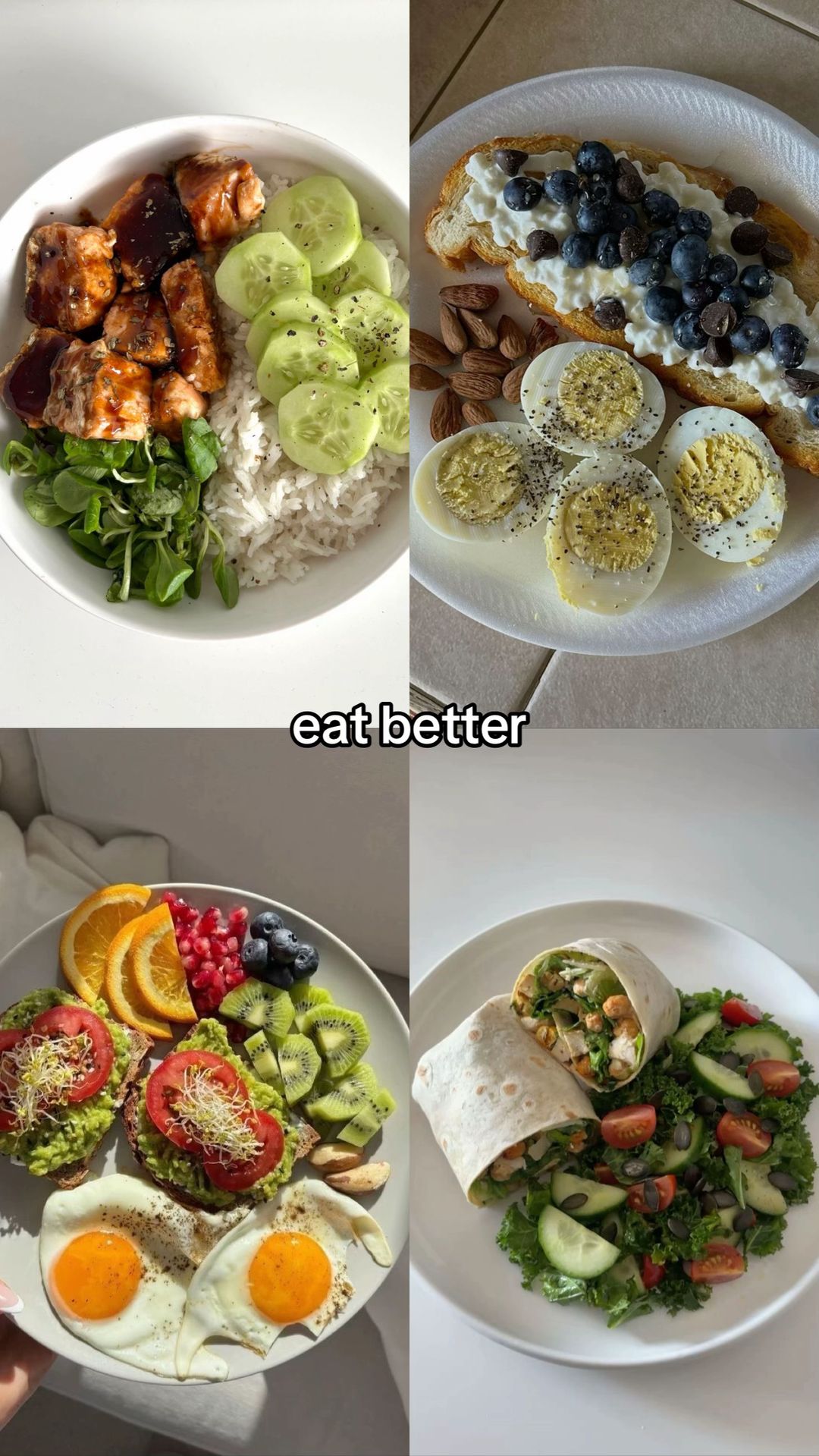
1hookcollageabundance satisfactionworks:yesgrab:85/100aesthetic:88/100eat better
eat better
Visual description
Four-quadrant grid of colorful, appetizing, nutrient-dense meals photographed from overhead on white plates/bowls with natural lighting. Top-left: grilled chicken pieces with dark glaze over white rice, sliced cucumber, and fresh greens. Top-right: toast topped with white cheese (ricotta/cottage cheese), blueberries, and mini chocolate chips, accompanied by whole boiled eggs, halved boiled eggs, and raw almonds. Bottom-left: avocado toast with sliced tomato and microgreens, two fried sunny-side-up eggs, sliced oranges, pomegranate seeds, blueberries, and sliced kiwi. Bottom-right: wrap cut in half revealing chickpea/vegetable filling, served beside a kale salad with cherry tomatoes, cucumber slices, and pumpkin seeds.
Scene setting
Flat-lay overhead food photography on white/light surfaces, natural light
Visible objects
vs prior slide
Predicted audience reaction
Target ICP (anti-diet / food-healing audience) feels immediate aspiration and relief — this shows what nourishment actually looks like. High save intent.
Verdict: The four vibrant food images immediately signal quality, variety, and satisfaction — perfectly embodies the 'eat better' message without needing explanation.
2revealcollagedeprivation restrictionworks:yesgrab:80/100aesthetic:72/100not less.
not less.
Visual description
Four-quadrant grid of sparse, minimal, visually unappetizing portions photographed overhead on white plates with flat/harsh lighting, mimicking classic 'diet culture' meals. Top-left: two egg whites (yolks removed) with chopped cucumber and a fork, very little food on a large plate. Top-right: a handful of blueberries and a single rice cake — almost nothing on the plate. Bottom-left: six tomato wedges with a fork — only tomatoes, no balance or substance. Bottom-right: a small cup of black coffee with four egg whites on a textured white plate — no toast, no nutrition beyond egg whites.
Scene setting
Flat-lay overhead food photography on white plates, flat harsh lighting
Visible objects
vs prior slide
Style: Same four-quadrant grid format and white plates, but deliberately degraded: color palette shifts to pale/white only, portions shrink dramatically, lighting goes flatter/harsher.
Story: Completes the contrast thesis — 'eat better' sets the ideal, 'not less' delivers the anti-restriction punchline.
Predicted audience reaction
Audience feels visceral discomfort recognizing these as 'diet plates' — validates their negative experience of restriction and triggers strong save behavior as a reminder/affirmation.
Verdict: The deliberately sad, sparse images create emotional discomfort that reinforces the core message — viewers save this as validation against restrictive diet culture.
Commerce intent
Comment ethnography
The audience identity is people actively (or recently) healing their relationship with food — anti-diet, intuitive eating, body-neutrality community. The save behavior signals this is reference content for people in that healing journey.
Diagnostics
Hook deep-dive
eat better
The viewer sees four appetizing meals with 'eat better' and instinctively wants to know what the alternative or contrast is — they swipe to complete the comparison and feel the validation payoff.
Engagement read
Bookmark rate is 4.2× above library norm (2.54% vs 0.60%) while comment rate is only 0.6× norm — this is a pure save-driver format with no comment-bait mechanics.
Mechanics
The visual contrast between slide 1 (abundant, colorful, appetizing) and slide 2 (sparse, colorless, sad) is so stark that the viewer must swipe to complete the argument and feel the validation payoff.
Brand & funnel
Buying-journey moment: Viewer is in the awareness stage — realizing diet culture/restriction isn't working and becoming curious about a nourishment-first approach. No purchase intent yet, but high receptivity to future content.
Ideal Customer Profile
Young adults, primarily women, interested in aesthetic health, weight management, and 'that girl' lifestyle optimization.
Age
18-24
Gender
female
Readability
simple
Interests
Pain Points
Aspirations
Emotional Profile
Primary Emotion
validationIntensity
Effectiveness
Emotions Evoked
Emotional Arc
curiosity → recognition → validation
Why It Lands
It validates the viewer's desire to be healthy without the pain of starvation, replacing anxiety about dieting with a sense of empowered control.
Writing Analysis
Style
inspirational
Tone
relatable
Hook Type
contrast
Quality
Extremely concise; uses only four words to convey a complex nutritional philosophy. The rhythm between slide 1 and 2 is punchy and effective.
Effectiveness
Goal Achievement
The massive bookmark count indicates the content is highly valuable for the target audience, successfully driving growth and retention.
Why It Spread
highly shareable aesthetic
counter-intuitive health advice
low cognitive load
high bookmark-to-view ratio
Content DNA
There is no explicit CTA, which actually helps the content feel more organic and less like an ad, contributing to the high shareability.
Narrative Arc
The tension builds from the aspirational 'eat better' to the practical, counter-intuitive 'not less', creating a satisfying loop.
Psychological Blueprint
Why It Spread
The post went viral because it perfectly leverages the 'aesthetic health' trend while providing a counter-intuitive, high-value insight that encourages saving for later. With 65k bookmarks, the content acts as a 'cheat sheet' for portion control that feels aspirational rather than preachy. The 20% engagement rate is driven by the visual satisfaction of the food combined with the 'aha' moment of the contrast between 'better' and 'less'.
Framework
contrast revealPrimary Tactic
contrastTactics Used
contrast on slide 1 vs slide 2 to challenge assumptions
visual pattern interrupt using high-quality food photography
identity-signaling through 'that girl' aesthetic food choices
curiosity gap created by the caption 'trust me it won’t make things any better'
Cognitive Biases
anchoring: the viewer anchors on the 'eat better' text, then is forced to re-evaluate their definition of 'better' on slide 2
framing effect: the caption frames the content as a counter-intuitive secret
Tribal Markers
Trust Signals
Slide Breakdown (2 analyzed)
Text
eat better
Visual
A collage of four high-quality, vibrant, healthy meal plates featuring salmon, rice, berries, and eggs.
Visual Elements
Color Palette
Copy Analysis
Power Words
Open Loop: yes, it implies that 'eating better' is the solution to a problem the viewer is currently facing.
Visual Psychology
Attention: the vibrant colors of the food
Emotional cue: the visual appeal of healthy food triggers a desire for the lifestyle
Composition: symmetrical collage creates a sense of order and health
Text
not less.
Visual
A collage of four plates showing smaller, simpler portions of cucumbers, blueberries, and eggs.
Visual Elements
Color Palette
Copy Analysis
Power Words
Open Loop: no, it provides the resolution to the hook.
Visual Psychology
Attention: the text 'not less'
Emotional cue: the simplicity of the food triggers a feeling of achievable discipline
Composition: the contrast in portion size reinforces the educational message
Comment Intelligence
Sentiment
PositiveResonance
Intent
grow-following
Audience Vibe
The audience feels validated and enlightened, with many users tagging friends to share the 'secret' to healthy eating.
Standout Quotes
“Finally, someone who understands that starving isn't the answer.”
“This is exactly what I needed to see today.”
“Saved this for my grocery list.”