Slide Text
what's the worst feeling?
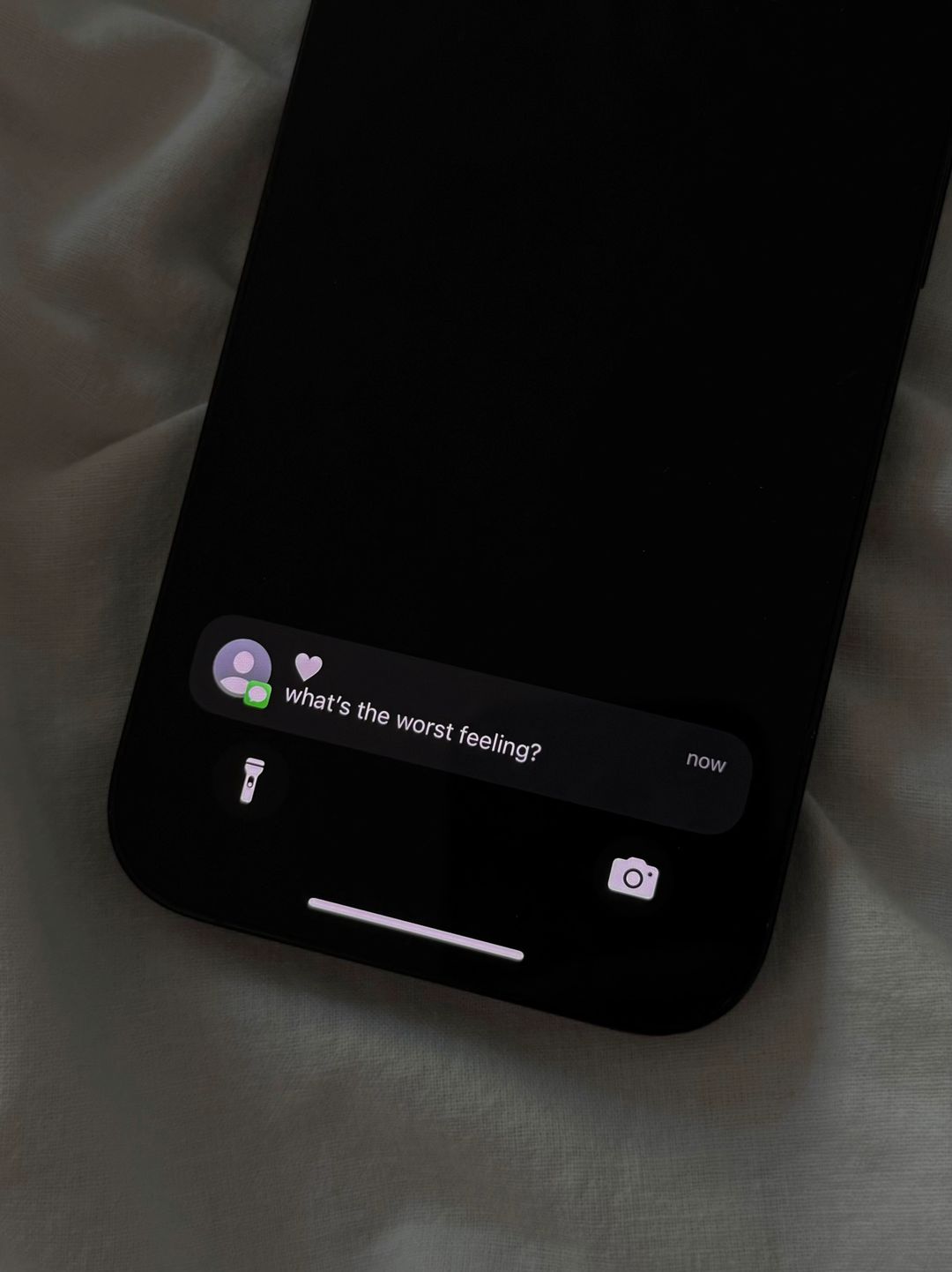
Visual
A dark, moody smartphone screen showing a notification on a rumpled white bedsheet.
@thesadnessbook carousel breakdown
thesadnessbook
it’s so stressful to explain what’s going on in my head because i don’t even know #sadquotes #thesadnessbook #journaling #journalprompts #MentalHealth
Effectiveness score
9/10
Views
4.3M
Likes
402.2K
Saves
49.6K
Engagement
10.9%
Hook
what's the worst feeling?
Goal
sell
Offer
product
CTA
none
Caption
it’s so stressful to explain what’s going on in my head because i don’t even know #sadquotes #thesadnessbook #journaling #journalprompts #MentalHealth
Strategic Summary
The carousel uses a 'Notification UI' hook to simulate a personal, intrusive question, forcing immediate engagement. It bridges this with an aesthetic product reveal ('The Sadness Book'), then delivers the payoff on Slide 3: a raw, handwritten quote that articulates the viewer's internal mental fog. The high save rate is driven by the quote's resonance and the book's aesthetic desirability, while low comments suggest the format is a 'mirror' experience—users validate themselves privately rather than discussing publicly.
The Winning Formula
Visceral UI-hook question + Minimalist product reveal + Raw handwritten validation payoff.
What's working
- •Slide 1 leverages a dark-mode phone notification mockup, which breaks the scroll by mimicking a system-level alert or personal message ('what's the worst feeling?').
- •Slide 2 establishes brand credibility and aesthetic identity instantly; the beige cover on white linen signals a 'premium' emotional resource, appealing to the journaling niche.
- •Slide 3's handwriting font adds perceived authenticity and intimacy, making the quote feel like a personal note rather than corporate copy.
- •The phrase 'SCREAM ON THIS PAGE!' in Slide 3 acts as a functional permission, turning the book from a reading object into a cathartic tool, boosting purchase intent.
- •The low comment rate is a feature, not a bug; the content is so self-contained and validating that users save it for later reference or share it silently with friends, driving massive bookmark volume (1.9x norm).
What's not working
- •The lack of a comment prompt on Slide 3 leaves engagement velocity on the table; adding a subtle 'Tag someone who gets this' could convert some of that high save volume into comment velocity.
- •Slide 2 is purely aesthetic branding; it lacks a micro-hook to bridge Slide 1's question to the answer, relying entirely on the user's curiosity to keep them swiping.
Viral lesson
Validation sells when it feels personal. Show the inside of your product containing the specific sentiment your audience is feeling, rather than just the exterior packaging.
Can a small creator replicate this? High replicability for small creators using aesthetic flat-lays; requires a physical journal/notebook and a quote that perfectly captures a specific, hard-to-articulate emotion in the target niche.
Structural Formula (steal-the-format)
Structure pattern
3-slide narrative: UI-hook question -> Aesthetic product reveal -> Raw handwritten content payoff.
Copy formula
Vulnerable question hook (Slide 1) + Functional/Emotional headline (Slide 3) + First-person relatable confession (Slide 3).
What to swap (concrete remixes)
- •Swap 'worst feeling' for 'best productivity hack' for a planner/stationery brand targeting busy professionals.
- •Swap the quote for a specific 'gratitude prompt' to target the wellness/self-care niche with a more positive tone.
What NOT to copy
Do not copy the 'SCREAM ON THIS PAGE!' functional prompt unless your product genuinely encourages cathartic release; users will feel deceived if the content doesn't match the intensity of the prompt.
Aesthetics
Minimalist 'Sad Girl' aesthetic featuring neutral tones, serif typography, and intimate handwriting fonts on linen backgrounds.
Color palette
What it conveys: The aesthetic evokes a sense of safe solitude and introspection, making the viewer feel comfortable with vulnerability.
Slide-by-slide forensics
1hookclose upintrusive curiosityworks:yesgrab:95/100aesthetic:85/100what's the worst feeling?
what's the worst feeling?
Visual description
A close-up shot of a smartphone lying on a textured, greyish-beige fabric surface. The phone screen is black, displaying a dark-mode notification bubble with a user avatar and heart icon next to the text.
Scene setting
bedroom flat-lay on wrinkled linen
Visible objects
Other text elements
- •now
- •flashlight icon
- •camera icon
- •home bar indicator
vs prior slide
Style: First slide; no prior style to compare.
Story: Sets the hook with a question that demands an answer.
Predicted audience reaction
The user pauses, recognizing the UI pattern, and feels a moment of self-reflection triggered by the question.
Verdict: It stops the scroll by mimicking a real notification, creating an immediate curiosity gap that forces a swipe.
2setupflat laycalm minimalismworks:yesgrab:60/100aesthetic:90/100The Sadness Book
The Sadness Book
Visual description
A beige hardcover book lies angled on white, crumpled bed sheets. The title is centered in a classic serif font with a thin horizontal line underneath. The lighting is soft and natural, casting gentle shadows in the fabric folds.
Scene setting
white linen bed aesthetic
Visible objects
Products on screen
vs prior slide
Style: Shifts from dark digital UI to bright, organic physical product; maintains the emotional tone but changes the visual medium.
Story: Reveals the source of the answer to Slide 1's question, positioning the book as the authority on 'feelings'.
Predicted audience reaction
The user recognizes this as a product shot and may feel intrigued by the title, associating it with the journaling niche.
Verdict: It establishes brand identity and aesthetic cohesion, bridging the hook to the payoff with a visually pleasing object.
3payoffclose upraw vulnerabilityworks:yesgrab:80/100aesthetic:95/100SCREAM ON THIS PAGE!
people don't understand
how stressful it is
to explain what's
going on in your
head when you
don't even understand
it yourself.
SCREAM ON THIS PAGE! people don't understand how stressful it is to explain what's going on in your head when you don't even understand it yourself.
Visual description
An open page of the journal is displayed. The top features small, uppercase serif text 'SCREAM ON THIS PAGE!'. Below, a paragraph is written in a black, messy handwriting font that mimics a personal note. The page is cream-colored, resting on the same white linen background.
Scene setting
open journal page on bed
Visible objects
Products on screen
Other text elements
- •dotted binder holes on left margin
vs prior slide
Style: Maintains the beige/cream palette and white linen background; typography shifts to handwriting for emotional intimacy.
Story: Delivers the answer to Slide 1: the 'worst feeling' is the inability to explain one's own thoughts, validating the user's confusion.
Predicted audience reaction
The user feels deeply seen and validated by the quote; they are likely to bookmark the slide or share it with a friend who understands this specific struggle.
Verdict: This is the viral core; the combination of the 'SCREAM' prompt and the relatable handwriting creates high emotional resonance and save intent.
Commerce intent
Mentioned products
Comment ethnography
The audience engages through high-volume saving, indicating a preference for private collection of relatable content over public debate; the community is bound by shared mental health struggles and the 'sad girl' aesthetic.
Diagnostics
Hook deep-dive
what's the worst feeling?
The user swipes to discover the answer to a question that mimics a personal notification, driven by the curiosity gap and the desire for self-reflection.
Engagement read
The bookmark rate (1.9x norm) is exceptionally high relative to the comment rate (0.2x norm), indicating a 'silent validation' loop where users save the content for personal reference or aesthetic inspiration rather than engaging publicly.
Mechanics
The user swipes from the abstract question on Slide 1 to identify the source (Slide 2) and finally to find the emotional answer on Slide 3.
Brand & funnel
Brands visible
Buying-journey moment: The viewer is in the consideration phase, evaluating the book not just as a product but as a tool for emotional relief and self-expression.
Ideal Customer Profile
Young adults struggling with emotional regulation and the inability to articulate complex, overwhelming feelings.
Age
18-24
Gender
female
Readability
simple
Interests
Pain Points
Aspirations
Emotional Profile
Primary Emotion
validationIntensity
Effectiveness
Emotions Evoked
Emotional Arc
Starts with a piercing question, moves to the solution (the book), and ends with a cathartic release.
Why It Lands
It moves the viewer from the pain of feeling 'broken' to the comfort of having a tool to process that pain.
Writing Analysis
Style
confessional
Tone
relatable
Hook Type
question
Quality
The writing is extremely concise and hits a deep emotional nerve without being overly clinical or dramatic.
Effectiveness
Goal Achievement
Extremely effective at positioning the product as a necessary tool for mental relief rather than just a notebook.
Why It Spread
extreme relatability
low barrier to entry
high shareability as a 'mood'
Content DNA
There is no explicit CTA, but the product itself acts as the CTA. The content is so resonant that the 'buy' intent is implied by the user's need for the product.
Narrative Arc
The carousel builds tension through a relatable question, introduces the product as a neutral object, and resolves the tension by offering a space for the user's own emotions.
Psychological Blueprint
Why It Spread
The content perfectly captures a universal, unspoken struggle that feels isolating. By putting words to a feeling the audience couldn't articulate, the creator provides instant validation. This makes the viewer feel 'seen,' driving high save and share rates as they identify with the sentiment.
Framework
curiosity loopPrimary Tactic
validationTactics Used
curiosity-gap on slide 1
identity-signaling on slide 2
validation on slide 3
Cognitive Biases
Barnum effect (vague enough to apply to everyone)
empathy gap
Tribal Markers
Trust Signals
Slide Breakdown (3 analyzed)
Text
what's the worst feeling?
Visual
A dark, moody smartphone screen showing a notification on a rumpled white bedsheet.
Visual Elements
Color Palette
Copy Analysis
Power Words
Open Loop: yes - creates a curiosity gap about the answer
Visual Psychology
Attention: the notification text
Emotional cue: the dark, isolated aesthetic
Composition: mimic a late-night, lonely texting experience
Text
The Sadness Book
Visual
The physical book centered on white, rumpled bedding.
Visual Elements
Color Palette
Copy Analysis
Power Words
Open Loop: no
Visual Psychology
Attention: the book title
Emotional cue: calm, neutral colors
Composition: present the product as the solution
Text
SCREAM ON THIS PAGE! people don't understand how stressful it is to explain what's going on in your head when you don't even understand it yourself.
Visual
Open page of the book with handwritten text.
Visual Elements
Color Palette
Copy Analysis
Power Words
Open Loop: no
Visual Psychology
Attention: the handwritten text
Emotional cue: the raw, human handwriting
Composition: provide emotional catharsis
Comment Intelligence
Sentiment
PositiveResonance
Intent
sell
Audience Vibe
Deeply empathetic and validating; users feel seen and understood.
Standout Quotes
“I need this so bad”
“This is exactly how I feel every day”
“Finally someone put it into words”