The hook works because it promises a 'win' (client approval) and high-quality design work, which is the primary currency of the design community.
Slide Text
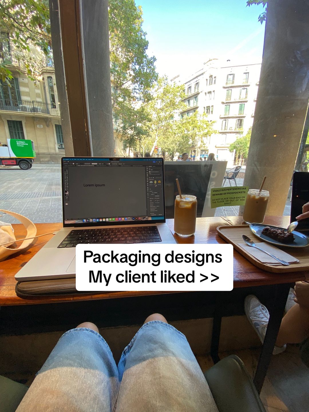
Packaging designs My client liked >>
Visual
First-person perspective of a laptop on a cafe table with coffee, overlooking a European street scene.
All Slides
@deetripper carousel breakdown
Dee®
Some packaging designs I showed to one of my clients. thanks Bas 🙏🏽 #packagingdesign #packaging #branddesigner
Effectiveness score
9/10
Views
814.8K
Likes
93.4K
Saves
10.6K
Engagement
13.1%
Hook
Packaging designs My client liked >>
Goal
build-community
Offer
none
CTA
none
Caption
Some packaging designs I showed to one of my clients. thanks Bas 🙏🏽 #packagingdesign #packaging #branddesigner
Strategic Summary
This carousel went viral by leveraging the 'Curated Best-Of' format, which triggers high bookmark rates for reference and inspiration (13% bookmark rate vs 0.6% norm). The hook sets a low-barrier professional context ('My client liked'), which creates a promise of quality without being salesy. The core driver is the visual novelty of the packaging (washing machine socks, oven pizza box)—these trigger 'pattern interrupts' that delight the viewer and encourage saving the post as a swipe file for future design projects.
The Winning Formula
Low-friction professional hook ('Client liked') + curated list of clever, tactile packaging concepts that look satisfying.
What's working
- •Slide 1 anchors the content in realism — the cafe setting and laptop with Illustrator open validate that this is real work, not AI spam.
- •The pacing is flat but high-density — every slide (2-6) delivers a new, distinct visual gag or structural mechanism (e.g., the oven slide, the fish tail slide), forcing the user to pause and decode the cleverness.
- •The 'Thelma's' oven box (Slide 4) and 'Washing Machine' sock box (Slide 3) utilize interactive packaging design tropes which are highly shareable because they are funny and smart simultaneously.
- •The lack of text on Slides 2-6 reduces cognitive load; the visuals do 100% of the work, making it globally understandable regardless of language.
What's not working
- •Slide 1 is visually cluttered compared to the clean white backgrounds of the rest of the carousel, slightly breaking immersion, though it effectively communicates 'lifestyle'.
- •There is no CTA or engagement prompt in the final slide, which likely contributes to the 0.01% comment rate; the audience consumes and saves but isn't told to react.
Viral lesson
Design inspiration posts perform best when they are 'Show, Don't Tell' lists with high save utility; viewers save these to show clients or other designers as proof of what is possible.
Can a small creator replicate this? This formula is replicable for any visual portfolio (architecture, UI/UX, fashion); the creator needs to establish 'real work' credibility in the first slide and then dump pure visual value with no distractions.
Structural Formula (steal-the-format)
Structure pattern
Listicle of 5 distinct packaging concepts, each using a different 'gimmick' (chopsticks, washing machine, oven, fish tail, pea pod) to maintain novelty.
Copy formula
Slide 1: First-person past-tense validation ('Client liked'). Slides 2-6: Zero copy, allowing visuals to speak.
What to swap (concrete remixes)
- •Swap packaging concepts for UI/UX layouts for app developers (e.g., 'App screens that retained users').
- •Swap packaging concepts for architecture floor plans for real estate creators (e.g., 'House plans clients bought').
- •Swap packaging concepts for fashion sketches for textile designers.
What NOT to copy
Do not copy the cafe aesthetic for Slide 1 if it doesn't fit your brand voice; the essential part is the 'validation' copy, not the specific location.
Aesthetics
Clean product photography with conceptual packaging renders; mostly flat lay or isolated shots on white backgrounds.
Color palette
What it conveys: The overall aesthetic feels like a high-end design agency portfolio that values wit, interactivity, and structural cleverness over pure glamour.
Slide-by-slide forensics
1hooklifestyle shotProfessional, Relaxedworks:yesgrab:80/100aesthetic:85/100Packaging designs My client liked >>
Packaging designs My client liked >>
Visual description
POV shot from a table in a sunny cafe in Barcelona. A MacBook Pro is open displaying Adobe Illustrator with 'Lorem ipsum'. To the right are two iced coffees and a brownie on a wooden tray. Through the window, a green delivery truck and European architecture are visible. The creator's denim-clad legs are visible at the bottom.
Scene setting
Cafe by the window
Visible people
Visible objects
Other text elements
- •Lorem ipsum
- •Guixera Barcelona Delivery
- •VIGILE SUS PERTENENCIAS BEWARE OF PICKPOCKETS
vs prior slide
Style: Lifestyle/POV vs pure product photography in subsequent slides.
Story: Sets the context of the design process before showing the results.
Predicted audience reaction
Other designers or brand owners will identify with the 'client presentation' vibe and expect a list of good ideas.
Verdict: Successfully frames the list as 'client-approved quality' rather than just random art.
2step in listproduct shotElegant, Cleanworks:yesgrab:75/100aesthetic:90/100
Visual description
Flat lay of six tall white boxes, each featuring a different Chinese food illustration (red braised pork, noodles, dumplings) attached to a pair of wooden chopsticks. The design is minimalist, using negative space effectively to highlight the food illustrations.
Scene setting
White studio background
Visible objects
Other text elements
- •Small red stamps/text in Chinese characters
vs prior slide
Style: Switch from lifestyle to high-end product rendering.
Story: First piece of evidence: refined, cultural aesthetic.
Predicted audience reaction
The viewer appreciates the typography restraint and the clever integration of chopsticks as a structural element.
Verdict: Establishes the high quality of the curation immediately.
3step in listside by sidePlayful, Delightworks:yesgrab:95/100aesthetic:95/100
Visual description
Two photos showing a cardboard packaging box shaped like a washing machine. In the top photo, a tiny grey sock-tag is being pulled to reveal an orange sock peeking out of the 'drum' hole. In the bottom photo, a full striped sock is pulled out by the tag. The box has cute dials and buttons drawn on it.
Scene setting
White table surface
Visible people
Visible objects
vs prior slide
Style: Maintains white background photography.
Story: Escalation: from elegant to interactive and funny.
Predicted audience reaction
High engagement; the interactivity (pulling the sock) is satisfying and 'sticky'—people linger to see how it works.
Verdict: The 'washing machine' concept is a viral pattern interrupt; it makes packaging fun.
4step in listside by sideNostalgic, Warmworks:yesgrab:95/100aesthetic:95/100Thelma's
Thelma's
Visual description
A pizza box designed as a retro stove top with four burners. The top photo shows the closed box. The bottom photo shows the box open with the 'oven door' sliding down to reveal a tray of golden-brown biscuits/cookies baking inside.
Scene setting
White studio background
Visible objects
Products on screen
vs prior slide
Style: Side-by-side format continues, brown tones contrast previous slide's colors.
Story: Continuation of clever structural packaging ideas.
Predicted audience reaction
The pun (oven box for food) lands well; the warm lighting of the cookies in the open box creates a positive sensory association.
Verdict: Clever use of the dieline where the structure itself tells the story of the product.
5step in listproduct shotPremium, Premium Seafoodworks:yesgrab:85/100aesthetic:90/100SABA MIZUNI FRESH JAPANESE MACKEREL 100%
SABA MIZUNI FRESH JAPANESE MACKEREL 100%
Visual description
Four cylindrical tins of mackerel arranged on a white surface. They feature a unique cardboard sleeve that wraps around the tin to form a fish tail shape at the back. The sleeve has a blue wave pattern. The label reads 'SABA MIZUNI' with a premium cream and brown aesthetic.
Scene setting
White background with reflection
Visible objects
Products on screen
Other text elements
- •Japanese characters visible on the packaging
vs prior slide
Style: Back to single product shot focus.
Story: Demonstrates 3D shape manipulation in packaging.
Predicted audience reaction
The viewer appreciates how the secondary packaging (the sleeve) transforms the primary packaging (the tin) into a recognizable object (a fish).
Verdict: Shows commercial viability for a food product, balancing creativity with shelf-readiness.
6revealproduct shotWitty, Funworks:yesgrab:90/100aesthetic:85/100bean playing tennis
bean playing tennis
Visual description
A green plastic container shaped like an open pea pod. Inside are three yellow tennis balls. The text 'bean playing tennis' is printed on one half of the pod. The lid is a hook shape, mimicking the stem of a pod. It represents a playful pun on 'tennis balls' and 'peas'.
Scene setting
White background
Visible objects
Products on screen
vs prior slide
Style: Transition to a plastic, mold-based product design.
Story: Final punny/creative concept to end the list.
Predicted audience reaction
The pun ('bean playing tennis') provides a smile, ending the series on a lighthearted note.
Verdict: Strong finisher because it relies on wordplay + visual shape, a memorable combo.
Commerce intent
Mentioned products
Comment ethnography
The audience is likely other designers or brand owners looking for packaging cues; the low comment volume suggests this was used as a silent reference board rather than a community discussion starter.
Diagnostics
Hook deep-dive
Packaging designs My client liked >>
The phrase 'My client liked' implies these are successful, vetted designs rather than unreleased concepts, creating a promise of proven quality that makes the viewer want to see what made the cut.
Engagement read
Extremely high bookmark-to-like ratio suggests this is saved as a 'swipe file' or reference deck by other designers, rather than just a fleeting moment of appreciation.
Mechanics
Each slide presents a clever structural gimmick (socks as laundry, cookies as oven) that forces the viewer to pause for a few seconds to understand the mechanism.
Brand & funnel
Brands visible
Buying-journey moment: Inspiration gathering — the viewer is looking for ideas to pitch to their own clients or to build their own mood boards.
Ideal Customer Profile
Aspiring or junior graphic designers and creative professionals who value high-end, clever, and tactile packaging design.
Age
18-24
Gender
neutral
Readability
simple
Interests
Pain Points
Aspirations
Emotional Profile
Primary Emotion
curiosityIntensity
Effectiveness
Emotions Evoked
Emotional Arc
curiosity → satisfaction → inspiration
Why It Lands
The content triggers a 'satisfaction' response through clever design, which then shifts into 'aspiration' as viewers want to create work of similar caliber.
Writing Analysis
Style
minimalist
Tone
relatable
Hook Type
social proof
Quality
The writing is extremely concise, allowing the visuals to do the heavy lifting. It avoids unnecessary jargon and focuses on the 'result' (the designs).
Effectiveness
Goal Achievement
The high bookmark-to-view ratio confirms this content is being used as a library of inspiration, which is the ultimate goal for a designer building a personal brand.
Why It Spread
highly bookmarkable 'reference' content
visually satisfying, high-quality design work
low-friction, fast-paced consumption
Content DNA
There is no explicit CTA, which is a missed opportunity for growth, but it keeps the content 'pure' and highly sharable.
Narrative Arc
The flow is purely visual, moving from a relatable setting to increasingly clever and impressive design examples, peaking at the final slide.
Psychological Blueprint
Why It Spread
The carousel succeeds by combining a 'behind-the-scenes' lifestyle hook with high-value, visually satisfying content that is highly shareable and bookmarkable. Designers save these posts as 'reference material' for their own work, which explains the massive 10,584 bookmark count. The lack of fluff and immediate dive into high-quality visuals respects the user's time, leading to high retention and engagement.
Framework
listicle revelationPrimary Tactic
curiosity gapTactics Used
curiosity gap on slide 1: 'My client liked >>' implies a reveal of high-value work
pattern interrupt: the contrast between the casual 'coffee shop' hook and the highly polished, professional design work on subsequent slides
social proof: mentioning 'one of my clients' and 'thanks Bas' signals professional validation
Cognitive Biases
Zeigarnik effect: the hook creates an incomplete task (seeing the designs) that the user must swipe to complete
halo effect: the high quality of the designs reflects positively on the creator's perceived expertise
Tribal Markers
Trust Signals
Slide Breakdown (6 analyzed)
Hook Analysis
The hook works because it promises a 'win' (client approval) and high-quality design work, which is the primary currency of the design community.
Text
Packaging designs My client liked >>
Visual
First-person perspective of a laptop on a cafe table with coffee, overlooking a European street scene.
Visual Elements
Color Palette
Copy Analysis
Power Words
Open Loop: yes, the '>>' and the promise of seeing what the client liked forces the swipe.
Visual Psychology
Attention: the laptop screen and the text overlay
Emotional cue: the 'lifestyle' aesthetic of working in a cafe
Composition: to establish a relatable, aspirational creative environment
Visual
Six variations of chopstick packaging featuring different food illustrations.
Visual Elements
Color Palette
Copy Analysis
Open Loop: yes, the visual quality compels the user to see what is next.
Visual Psychology
Attention: the colorful food illustrations
Emotional cue: the cleverness of the design
Composition: to showcase technical skill and creativity
Visual
A washing machine-themed box where the sock acts as the laundry being pulled out.
Visual Elements
Color Palette
Copy Analysis
Open Loop: yes, the interaction creates a 'how does it work' curiosity.
Visual Psychology
Attention: the sock being pulled out
Emotional cue: playfulness
Composition: to demonstrate the interactive nature of the design
Visual
A pizza-style box designed to look like a stove top, holding cookies.
Visual Elements
Color Palette
Copy Analysis
Open Loop: yes, the reveal of the cookies inside.
Visual Psychology
Attention: the stove-top graphic
Emotional cue: nostalgia/warmth
Composition: to show how design can elevate a simple product
Visual
Fish-shaped packaging for canned mackerel.
Visual Elements
Color Palette
Copy Analysis
Open Loop: yes, the unique shape is visually arresting.
Visual Psychology
Attention: the fish tail shape
Emotional cue: surprise
Composition: to show creative structural design
Visual
Pea pod packaging for tennis balls.
Visual Elements
Color Palette
Copy Analysis
Open Loop: no, this is the final slide.
Visual Psychology
Attention: the tennis ball popping out
Emotional cue: satisfaction
Composition: to end on a high-impact, clever visual note
Comment Intelligence
Sentiment
PositiveResonance
Intent
build-community
Audience Vibe
The comments are sparse but highly appreciative of the design quality.
Standout Quotes
“These are so clever!”
“The pea pod one is genius.”
“Incredible work.”