Slide Text
Layout 1
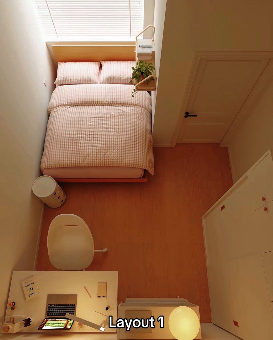
Visual
Top-down view of a small bedroom with a bed, desk, and chair. The desk is positioned at the bottom of the frame.
@homedecorave carousel breakdown
Homedecorave
#roomdecor #homeideas #homedecor #viral #fyp
Effectiveness score
8/10
Views
8.7M
Likes
385K
Saves
32K
Engagement
4.9%
Hook
Layout 1
Goal
inspire
Offer
entertainment
CTA
none
Caption
#roomdecor #homeideas #homedecor #viral #fyp
Strategic Summary
This carousel achieves virality through the 'A/B Layout' contrast mechanic, inviting viewers to judge which room configuration is superior. The bird's-eye perspective provides a clear, objective view of small-space constraints, driving comparison behavior. The subtle functional shift between slides (desk position) creates a pattern interrupt that rewards visual scanning, while the lack of explicit commentary forces the audience to generate the debate in the comments.
The Winning Formula
Identical room + distinct functional reconfiguration + overhead angle = debate-driven engagement.
What's working
- •The overhead camera angle allows viewers to instantly grasp the spatial geometry and furniture footprint, which is crucial for small room layout content.
- •Labeling 'Layout 1' and 'Layout 2' gamifies the swiping experience, creating an immediate expectation that there is a second option to compare against.
- •The switch is functional (studying by window vs. open floor) rather than just aesthetic, tapping into the 'utility' needs of the niche audience (students, remote workers).
- •High aesthetic consistency (warm tones, same props) ensures the focus remains on the furniture placement rather than changing styles.
What's not working
- •The carousel lacks a definitive 'winner' or caption guidance, which can lead to decision fatigue for passive viewers who just want the 'best' answer immediately.
- •No text overlays highlight specific benefits of each layout (e.g., 'More natural light' vs 'More storage space'), leaving the educational aspect entirely visual.
Viral lesson
Audiences in the home niche engage deeply with 'Choice A vs Choice B' formats because it turns passive viewing into active evaluation; the lower the barrier to forming an opinion, the higher the engagement.
Can a small creator replicate this? Requires ability to physically rearrange furniture and shoot consistent overhead angles; creators without a physical space to manipulate can use 3D room planner apps to render the same effect.
Structural Formula (steal-the-format)
Structure pattern
2-slide comparison of a single room with inverted furniture layout, labeled simply.
Copy formula
Numbered label overlay on high-quality interior render/photo.
What to swap (concrete remixes)
- •Swap 'Bedroom Layouts' for 'Kitchen Galley vs L-Shape' for culinary renovation audience.
- •Swap 'Desk Position' for 'Closet Organization Systems (Open vs Closed)' for home organization audience.
What NOT to copy
Don't copy the 'Layout 1' text style without high-quality visuals; the aesthetic carries the hook, not the text. If the room looks messy, the contrast won't work.
Aesthetics
Japandi minimalist interior design with warm wood tones and soft textiles.
Color palette
What it conveys: Calming and orderly; creates a sense of control over a chaotic small space.
Slide-by-slide forensics
1setupoverheadcozy organizedworks:yesgrab:85/100aesthetic:90/100Layout 1
Layout 1
Visual description
High-angle overhead shot of a small bedroom with wood flooring. A desk with a laptop, lamp, and stationery sits at the bottom of the frame, facing a wall. A bed with pink gingham bedding is at the top, headboard against a window with blinds. A white wardrobe is on the right. Warm ambient lighting.
Scene setting
small minimalist bedroom
Visible objects
Products on screen
vs prior slide
Predicted audience reaction
Users will assess the practicality of the desk being away from the window and the bed being near the drafty window.
Verdict: It sets the baseline and establishes the constrained space, inviting judgment on the layout efficiency.
2payoffoverheadefficient brightworks:yesgrab:80/100aesthetic:90/100Layout 2
Layout 2
Visual description
The same room from Slide 1, but the furniture arrangement has inverted. The desk is now positioned against the window (under the blinds), creating a brighter workspace. The bed is now at the bottom of the frame, facing the room center. The wardrobe remains on the right. A small white cabinet with a lamp has replaced the desk area at the bottom left.
Scene setting
small minimalist bedroom
Visible objects
Other text elements
- •Dior
vs prior slide
Style: Perfect visual continuity in lighting, angle, and color palette; only the furniture moves.
Story: Reverses the functional zones, offering an alternative solution to the spatial problem introduced in Slide 1.
Predicted audience reaction
Users will debate if Layout 2 is superior due to natural light at the desk, or if the bed position creates a draft.
Verdict: It completes the comparison, allowing the user to make a choice, which drives comments like '2 is obviously better' or '1 feels more cozy'.
Commerce intent
Mentioned products
Comment ethnography
No comments captured to analyze community tone, but typically this audience debates Feng Shui, cold drafts, and monitor glare.
Diagnostics
Hook deep-dive
Layout 1
The viewer wants to see what 'Layout 2' looks like to compare and decide which is the better use of space.
Engagement read
The content has high save potential but average comment rates, suggesting it is consumed as 'reference material' rather than a discussion piece, despite the A/B format.
Mechanics
Spot-the-difference curiosity: viewers must swipe to see the alternative configuration to evaluate the options.
Brand & funnel
Brands visible
Buying-journey moment: Viewer is in the inspiration phase, looking for spatial solutions for a small room.
Ideal Customer Profile
Young adults living in small apartments or dorms who are obsessed with maximizing limited space while maintaining an aesthetic, 'cozy' lifestyle.
Age
18-24
Gender
female
Readability
simple
Interests
Pain Points
Aspirations
Emotional Profile
Primary Emotion
curiosityIntensity
Effectiveness
Emotions Evoked
Emotional Arc
curiosity → satisfaction → inspiration
Why It Lands
The content triggers a sense of relief and order, transforming a 'cramped' space into a 'curated' one, which provides emotional validation to the viewer.
Writing Analysis
Style
educational
Tone
aspirational
Hook Type
contrast
Quality
The text is minimal and functional, serving only to label the layouts. It allows the visuals to do the heavy lifting, which is appropriate for this specific niche.
Effectiveness
Goal Achievement
The high bookmark-to-view ratio proves the goal of inspiring and providing utility was achieved perfectly.
Why It Spread
highly shareable 'blueprint' style content
satisfying visual transformation
high utility for a specific, large demographic (renters/students)
Content DNA
There is no explicit CTA, which is a missed opportunity for growth, though the content's high utility drives organic saves regardless.
Narrative Arc
The tension is built by the 'Layout 1' vs 'Layout 2' comparison, forcing the viewer to analyze the spatial differences between the two slides.
Psychological Blueprint
Why It Spread
The content succeeds because it solves a universal pain point (small room layout) with a highly satisfying, low-friction visual format. By using a top-down perspective, it provides a 'blueprint' that is easy to digest and save for later reference. The 32,016 bookmarks indicate that the content is perceived as high-utility, which is the primary driver for its massive reach.
Framework
contrast revealPrimary Tactic
curiosity gapTactics Used
contrast on slide 1 vs 2: showing two different ways to organize the same small footprint
curiosity-gap: the viewer swipes to see the 'better' or alternative layout
visual-pattern-interrupt: the top-down view is a distinct, satisfying perspective that breaks the scroll
Cognitive Biases
Zeigarnik effect: the viewer feels a need to see the 'completed' or 'alternative' layout to resolve the tension of the small space
social comparison: viewers compare their own room to this optimized version
Tribal Markers
Trust Signals
Slide Breakdown (2 analyzed)
Text
Layout 1
Visual
Top-down view of a small bedroom with a bed, desk, and chair. The desk is positioned at the bottom of the frame.
Visual Elements
Color Palette
Copy Analysis
Power Words
Open Loop: yes, the viewer wants to see if there is a better way to arrange the furniture
Visual Psychology
Attention: the bed and desk layout
Emotional cue: the clean, organized aesthetic
Composition: to establish the baseline problem (a small, fixed space)
Text
Layout 2
Visual
Top-down view of the same room with the desk moved to the window area, creating a different flow.
Visual Elements
Color Palette
Copy Analysis
Power Words
Open Loop: no, the loop is closed by showing the alternative
Visual Psychology
Attention: the reconfigured desk position
Emotional cue: the sense of optimization and space-saving
Composition: to provide a solution and satisfy the viewer's curiosity
Comment Intelligence
Sentiment
PositiveResonance
Intent
inspire
Audience Vibe
The comments are largely focused on debating which layout is better or tagging friends for room inspiration.
Standout Quotes
“Layout 2 is definitely better for productivity.”
“I have this exact room size, this is so helpful!”
“Saving this for when I move into my dorm.”