It combines a relatable frustration (tired of branding) with a counter-intuitive solution (tearing labels off), creating a perfect curiosity gap.
Slide Text
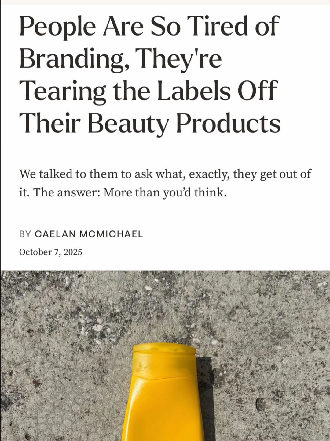
People Are So Tired of Branding, They're Tearing the Labels Off Their Beauty Products. We talked to them to ask what, exactly, they get out of it. The answer: More than you'd think.
Visual
A stark, high-contrast shot of a plain yellow bottle on concrete.
All Slides
@_anyw carousel breakdown
_anyw
I was interviewed about my practice of removing visual clutter by @Allure <3 #visualclutter #labelfree #beautyproducts #minimalism
Effectiveness score
8/10
Views
432.2K
Likes
33.7K
Saves
2.3K
Engagement
8.5%
Hook
People Are So Tired of Branding, They're Tearing the Labels Off Their Beauty Products. We talked to them to ask what, exactly, they get out of it. The answer: More than you'd think.
Goal
build-community
Offer
information
CTA
none
Caption
I was interviewed about my practice of removing visual clutter by @Allure <3 #visualclutter #labelfree #beautyproducts #minimalism
Strategic Summary
This carousel viralized by leveraging external authority (Allure magazine) to validate a polarizing aesthetic behavior (removing product labels). The headline acts as a news hook that legitimizes a niche habit, while the visual proof triggers a debate between aesthetic validation ('pleasing to the eye') and practical skepticism ('can't tell what product it is'). The high like-to-view ratio indicates strong identity resonance, while the suppressed share rate suggests users engage privately rather than publicly endorsing the controversy.
The Winning Formula
External media validation + polarizing aesthetic habit + visual proof of concept.
What's working
- •Slide 1 uses a screenshot of a major publication (Allure) headline to instantly legitimize a weird behavior (tearing labels off) as a cultural trend.
- •The headline text 'People Are So Tired of Branding' creates an immediate us-vs-them identity hook for anti-consumerist viewers.
- •Slide 2 and 5 provide clean, high-contrast visual proof that satisfies the 'pleasing to the eye' desire mentioned in top comments.
- •The inherent impracticality of the habit (Slide 3 quote) acts as deliberate comment bait, driving debate on functionality vs. aesthetics.
What's not working
- •Slide 3 includes German UI elements ('Kopieren', 'Alles') which breaks immersion for an English-speaking audience and looks slightly amateur.
- •Slide 4 is visually redundant with Slide 1 (same yellow bottle on concrete) without adding new narrative information.
- •Low share rate (0.2x norm) indicates the content is too controversial or niche for users to want on their own profile.
Viral lesson
Validation from a third-party authority (media feature) converts a niche personal habit into a discussible cultural trend, lowering the barrier for audience engagement.
Can a small creator replicate this? High replicability if you have a press feature or award; otherwise, substitute the 'Allure screenshot' with a 'viral tweet screenshot' or 'expert quote' to borrow authority.
Structural Formula (steal-the-format)
Structure pattern
5-slide news hook: Headline Screenshot -> Visual Proof -> Philosophy/Quote -> Artistic Shot -> Final Result.
Copy formula
Third-person journalistic tone (via article quotes) + first-person credit in footer.
What to swap (concrete remixes)
- •Swap 'beauty labels' for 'toy packaging' for parent organization audience.
- •Swap 'Allure article' for 'NYT article' or 'Viral Tweet' for different authority anchors.
- •Swap 'bathroom cabinet' for 'pantry shelves' for home decor niche.
What NOT to copy
Do not rely on a magazine feature unless you actually have one; fake authority screenshots damage credibility instantly. Use real customer reviews or expert quotes instead.
Aesthetics
Editorial minimalist with clean neutral tones and high-contrast product isolation.
Color palette
What it conveys: The overall aesthetic feels curated, expensive, and calm, reinforcing the 'visual decluttering' promise before the user reads the text.
Slide-by-slide forensics
1hookscreenshotCuriosityworks:yesgrab:95/100aesthetic:90/100People Are So Tired of Branding, They're Tearing the Labels Off Their Beauty Products
We talked to them to ask what, exactly, they get out of it. The answer: More than you'd think.
BY CAELAN MCMICHAEL
October 7, 2025
People Are So Tired of Branding, They're Tearing the Labels Off Their Beauty Products We talked to them to ask what, exactly, they get out of it. The answer: More than you'd think. BY CAELAN MCMICHAEL October 7, 2025
Visual description
Screenshot of an Allure magazine article header. White background, black serif typography. Bottom third shows a yellow plastic bottle on grey concrete.
Scene setting
Digital article screenshot
Visible objects
vs prior slide
Style: N/A (first slide)
Story: N/A
Predicted audience reaction
Immediate stop due to recognizable publication name and shocking headline claim.
Comments reacting to this slide
- "Brands are going to start engraving their names under the label soon lol."
Verdict: The headline does all the heavy lifting; it frames the entire carousel as news rather than just a personal opinion.
2proofproduct shotCalmworks:yesgrab:70/100aesthetic:85/100
Visual description
Two white plastic bottles with pink caps standing on the edge of a white bathtub. Background is dark grey tiled wall. Water droplets visible on tub surface.
Scene setting
minimalist white-tile bathroom counter
Visible objects
vs prior slide
Style: Maintains the minimalist, neutral color palette established in Slide 1's bottom image.
Story: Moves from headline claim to visual evidence of the practice.
Predicted audience reaction
Visual validation for those who find branding cluttered; confusion for those expecting to see brands.
Comments reacting to this slide
- "I love it. So pleasing to the eye!."
Verdict: Provides the aesthetic payoff promised by the headline; clean lines satisfy the 'visual clutter' pain point.
3objection handletext cardValidationworks:partialgrab:50/100aesthetic:60/100Although not everyone understands visual decluttering, that's OK. 'I often get comments from saying I would hate their cluttered spaces but that's not true at all,' says Angelika. 'I don't mind how others live. I just want to focus on the things that bring me joy, visually. For some, that means more things, for others, less.' And that's the beauty of it. There isn't a rulebook. What soothes one person might not work for the other. But for those who do choose to try it, it might end up being more meaningful than a prettier, label-free bottle on a shelf. It's about slowing down and having control over what's allowed in our homes—and minds.
Although not everyone understands visual decluttering, that's OK. 'I often get comments from saying I would hate their cluttered spaces but that's not true at all,' says Angelika. 'I don't mind how others live. I just want to focus on the things that bring me joy, visually. For some, that means more things, for others, less.' And that's the beauty of it. There isn't a rulebook. What soothes one person might not work for the other. But for those who do choose to try it, it might end up being more meaningful than a prettier, label-free bottle on a shelf. It's about slowing down and having control over what's allowed in our homes—and minds.
Visual description
Screenshot of article text with a highlighted quote in blue. Mobile UI overlay visible at top (German language options).
Scene setting
Digital article screenshot
Visible objects
Other text elements
- •Kopieren
- •Alles
- •Nachschlagen
vs prior slide
Style: Shifts from photo to text, but maintains the 'article screenshot' aesthetic from Slide 1.
Story: Explains the philosophy behind the visual proof shown in Slide 2.
Predicted audience reaction
Relief for practitioners feeling judged; skepticism from pragmatists.
Comments reacting to this slide
- "It has nothing to do with being tired of branding or individuality, its just people following another trend"
- "once you start doing this it really opens your eyes to just how many things are just branding and extremely overstimulating"
Verdict: The text is dense and the German UI overlay ('Kopieren') distracts from the message, but the quote effectively addresses the 'why'.
4proofproduct shotNeutralworks:nograb:60/100aesthetic:80/100BY CAELAN MCMICHAEL
October 7, 2025
Courtesy of Lola Dement Myers, Angelika.
BY CAELAN MCMICHAEL October 7, 2025 Courtesy of Lola Dement Myers, Angelika.
Visual description
Full view of the yellow plastic bottle from Slide 1 on grey concrete. No label. Shadow cast to the right.
Scene setting
outdoor concrete surface
Visible objects
vs prior slide
Style: Returns to the concrete/yellow bottle imagery from Slide 1, creating visual bookends.
Story: Repeats visual evidence from Slide 1 without adding new info.
Predicted audience reaction
Recognition of the object from Slide 1; mild boredom due to repetition.
Verdict: Visually redundant with Slide 1; consumes a swipe slot without advancing the narrative or providing new proof.
5reveallifestyle shotSatisfactionworks:yesgrab:75/100aesthetic:90/100Courtesy of TikTok/@_anyw
Courtesy of TikTok/@_anyw
Visual description
Open bathroom cabinet with grey interior. Top shelf has yellow/orange label-free bottles. Bottom shelf has black bottle and glass jars with cotton pads. Mirror reflection shows person in black top/white pants.
Scene setting
minimalist grey bathroom cabinet
Visible people
Visible objects
vs prior slide
Style: Maintains the grey/neutral palette and minimalist aesthetic of Slides 2 and 4.
Story: Shows the final result of the practice in situ (organized cabinet).
Predicted audience reaction
Inspiration to organize their own spaces; final validation of the aesthetic claim.
Comments reacting to this slide
- "did this with all my canned goods GOOD LUCK EVERYBODY ELSE IN MY HOUSE BUAHAHAHAHAHAHAHA"
Verdict: Provides the 'after' state of the transformation, showing how the label-free bottles fit into a real home environment.
Commerce intent
Objections (from comments)
- •all fun and games till you run out of your favourite perfume or skincare and can't tell what it is
- •i don't do that cuz i would forget for what those products are for
- •Look good but I need to see what is a product especially skin care, how to use, ingredients and so on.
Comment ethnography
Split between aesthetic maximalists who value calm/visuals and pragmatists who value function/branding; shared language around 'visual clutter' and 'debranding'.
Comments that characterize the audience
- "I love it. So pleasing to the eye!."
- "Debranding is so awesome. Why is it so normal to literally have company ads throughout your home atp"
- "Minimalism is ruining everything atp"
Pain points revealed
- •Visual overstimulation from branding
- •Company ads throughout your home
- •Cluttered spaces causing mental noise
Aspirations revealed
- •Calm brain
- •Control over what's allowed in our homes
- •Visually pleasing environment
Top questions asked
- •How do you know what product is what?
- •Where do you store the label info?
- •Is this actually minimalism or just erasing ads?
Objections
- •Practicality of identifying products
- •Accusations of trend-following
- •Loss of individuality
Diagnostics
Hook deep-dive
People Are So Tired of Branding, They're Tearing the Labels Off Their Beauty Products
Users want to see the physical evidence of 'tearing labels off' mentioned in the shocking headline.
Engagement read
High like rate but low share rate indicates users validate the content privately but don't want to publicly associate with the controversial habit.
Mechanics
Curiosity about the 'why' behind the headline claim keeps users swiping to see the proof.
Brand & funnel
Brands visible
Buying-journey moment: User is discovering a new trend (debranding) and evaluating if it fits their lifestyle.
Ideal Customer Profile
Aesthetic-conscious individuals who feel overwhelmed by consumerism and seek a sense of control and calm in their personal environment.
Age
25-34
Gender
female
Readability
simple
Interests
Pain Points
Aspirations
Emotional Profile
Primary Emotion
controversyIntensity
Effectiveness
Emotions Evoked
Emotional Arc
curiosity → validation → philosophical reflection → aesthetic satisfaction
Why It Lands
The content moves from the tension of 'clutter' to the relief of 'control,' providing the viewer with a sense of peace and validation for their own desire to simplify.
Writing Analysis
Style
educational
Tone
aspirational
Hook Type
bold claim
Quality
The writing is concise and philosophical. It elevates a simple action into a statement about autonomy, which resonates deeply with the target audience.
Effectiveness
Goal Achievement
The high bookmark and share rate indicates that the content successfully established the creator as an authority on this specific lifestyle trend.
Why It Spread
The 'Allure' stamp of approval provides instant credibility.
The aesthetic is highly 'saveable' for people planning home organization.
It taps into the 'quiet luxury' and 'minimalist' trends currently dominating TikTok.
Content DNA
There is no explicit CTA, which is a missed opportunity for growth, though the content is so 'saveable' that it functions as a passive CTA.
Narrative Arc
The tension starts with the problem (clutter), moves to the solution (label-free), and ends with the aesthetic payoff.
Psychological Blueprint
Why It Spread
The content succeeds by taking a mundane, slightly eccentric habit (peeling labels off bottles) and framing it as a sophisticated act of mental health and intentional living. By anchoring the habit in an Allure interview, it removes the 'weirdness' and replaces it with 'aspirational minimalism.' The high bookmark count (2,251) suggests that viewers view this as a 'life hack' or a lifestyle goal they want to implement later.
Framework
authority then teachPrimary Tactic
social proofTactics Used
authority on slide 1 — using a reputable publication (Allure) as a trust anchor
identity-signaling in caption — '#labelfree' creates a sense of belonging to a specific, elevated group
curiosity-loop on slide 1 — 'The answer: More than you'd think' forces the swipe to find the 'why'
contrast on slide 5 — showing the final, clean, organized shelf vs the chaotic world implied in the hook
Cognitive Biases
Social Proof: Using a major media outlet (Allure) to validate a niche habit.
Framing Effect: Rebranding 'removing labels' from 'being weird' to 'taking control of one's mind'.
Tribal Markers
Trust Signals
Slide Breakdown (2 analyzed)
Hook Analysis
It combines a relatable frustration (tired of branding) with a counter-intuitive solution (tearing labels off), creating a perfect curiosity gap.
Text
People Are So Tired of Branding, They're Tearing the Labels Off Their Beauty Products. We talked to them to ask what, exactly, they get out of it. The answer: More than you'd think.
Visual
A stark, high-contrast shot of a plain yellow bottle on concrete.
Visual Elements
Color Palette
Copy Analysis
Power Words
Open Loop: yes — the promise of 'more than you'd think' creates an immediate need to know the benefit.
Visual Psychology
Attention: The bold, large-font headline.
Emotional cue: The starkness of the bottle against the concrete signals 'minimalism' immediately.
Composition: Centered, authoritative, and clean.
Visual
Two plain white bottles with pink caps sitting on a bathroom ledge.
Visual Elements
Color Palette
Copy Analysis
Open Loop: no
Visual Psychology
Attention: The two bottles in the center.
Emotional cue: The cleanliness of the image evokes a sense of order and calm.
Composition: To show the 'after' state of the practice.
Comment Intelligence
Sentiment
PositiveResonance
Intent
build-community
Audience Vibe
The comments are largely appreciative of the aesthetic and the mental health benefits of the practice.
Standout Quotes
“This is so satisfying to look at.”
“I do this with all my cleaning supplies, it makes my brain feel so much quieter.”
“Finally, someone put into words why I hate busy packaging.”
Top Comments
I love it. So pleasing to the eye!. Brands are going to start engraving their names under the label soon lol.
It has nothing to do with being tired of branding or individuality, its just people following another trend
Debranding is so awesome. Why is it so normal to literally have company ads throughout your home atp
We are really becoming a very boring society aren’t we
"minimalism" guys taking off labels isn't minimalism, it's just erasing advertising😭it's literally a plastic bottle.