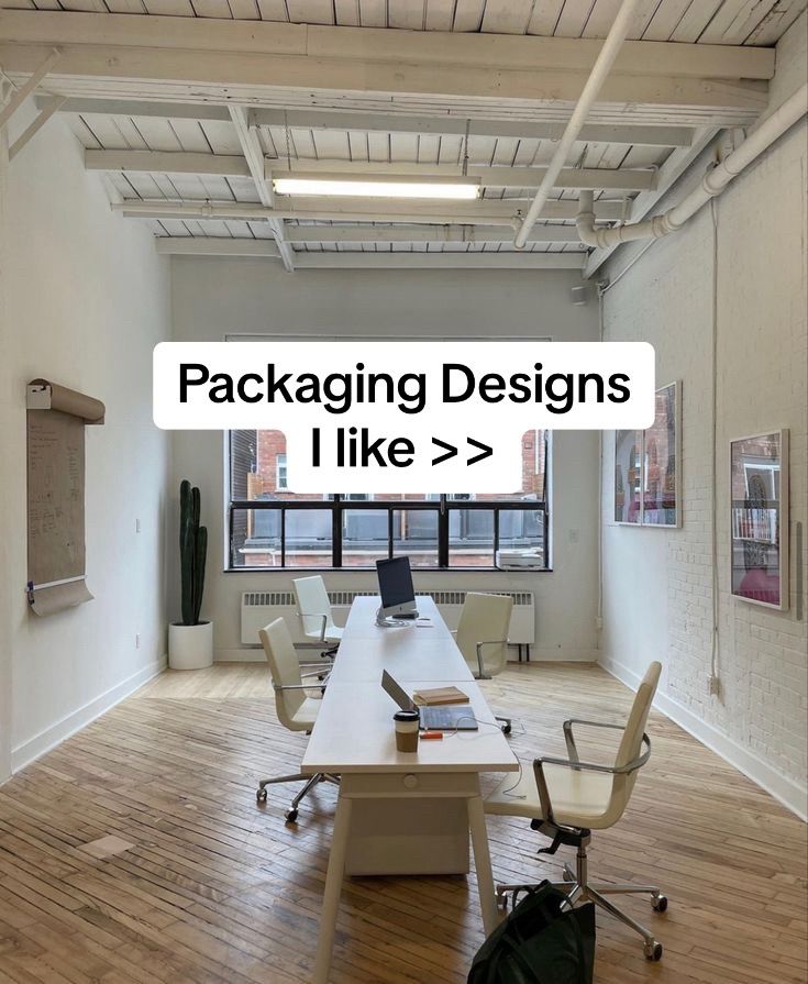
The hook is simple and direct. It promises a curated list, which appeals to the user's desire for efficiency and inspiration.
Slide Text
Packaging Designs I like >>
Visual
A clean, modern, white-walled studio office with a long desk and cactus.
All Slides
@deetripper carousel breakdown
Dee®
Another day, another batch of designs. #packaging #brandingdesign #packagingdesign
Effectiveness score
9/10
Views
2.7M
Likes
282.7K
Saves
24.5K
Engagement
11.5%
Hook
Packaging Designs I like >>
Goal
grow-following
Offer
entertainment
CTA
What could this be the package of?
Caption
Another day, another batch of designs. #packaging #brandingdesign #packagingdesign
Strategic Summary
This carousel succeeds by positioning itself as a curated mood board for designers and creatives, leveraging a high-browse, 'silent-save' format. Instead of dense education, it relies on highly aesthetic, innovative packaging concepts overlaid with short, relatable commentary that validates the viewer's taste. The massive bookmark rate (1.5x norm) against a very low comment rate (0.2x norm) confirms its utility as a visual reference library rather than a conversation starter.
The Winning Formula
Curated visual inspiration + short relatable commentary + massive save-value for creative reference.
What's working
- •Slide 1 establishes a high-status aesthetic environment (minimalist loft office) that signals 'designer lifestyle', instantly attracting the target creative demographic.
- •Text overlays on Slides 2-6 are remarkably concise (under 15 words) and conversational ('This is cute', 'So simple, yet super clean'), making it easy to digest rapidly.
- •Slide 2's hexagonal honey bottle and Slide 7's mystery foldable box create visual curiosity peaks that force swiping.','The consistent white-background product shots in Slides 2-6 create a rhythm that feels professional and gallery-like, encouraging screenshotting and saving.
What's not working
- •Slide 1's text 'Packaging Designs I like >>' is slightly weak compared to a more specific promise like '7 Packaging Designs That Changed The Game', which could improve click-through.
- •Slide 7 breaks the visual pattern by returning to a complex flat-lay of a single object rather than a polished product shot, which slightly dips the momentum before the end.
- •Lack of a strong comment-bait or CTA means the engagement is almost entirely bookmarks; adding a question like 'Which one would you buy?' could unlock higher comment virality.
Viral lesson
When targeting creative professionals, prioritize high-aesthetic visual density with minimal, conversational framing to trigger massive save behavior. 'Silent-saving' often outperforms debating for niche inspiration accounts.
Can a small creator replicate this? Highly replicable for any design, architecture, or curation niche. Requires only a collection of 5-7 visually distinct pieces and a consistent, clean overlay style.
Structural Formula (steal-the-format)
Structure pattern
7-slide list, 1 lifestyle hook slide followed by 5 polished product shots + 1 mystery flat-lay, using short conversational text overlays to guide emotional reaction.
Copy formula
first-person declarative or reaction statements ('Love this concept', 'This is cute', 'Haha I like this idea') + double-arrow prompt in the hook.
What to swap (concrete remixes)
- •Swap packaging designs for 'Interior Design Corners' for an architecture or home-decor audience.
- •Swap packaging concepts for 'UX Micro-interactions' for a digital product design audience.
- •Swap physical packaging for 'Typography Pairings' for a graphic design audience.
What NOT to copy
Avoid mimicking the exact conversational, slightly detached tone ('This is cute') if you are selling a service. This detached curation works for aggregation, but if you are the creator of the designs, you need to shift to 'How I designed this' to build authority rather than just sharing a mood board.
Aesthetics
High-key, minimalist product photography with structural focus, overlaid with conversational black text on white pill backgrounds.
Color palette
What it conveys: The aesthetic evokes a sense of quiet professionalism and tactile satisfaction. It feels like walking into a high-end design agency's mood board room, making the viewer feel inspired and culturally curated.
Slide-by-slide forensics
1hookwide shotcalm inspirationworks:yesgrab:85/100aesthetic:95/100Packaging Designs
I like >>
Packaging Designs I like >>
Visual description
A wide, symmetrical shot of a bright, high-ceilinged creative space with white walls, exposed pipes, and light wooden floors. A long white desk sits in the center with matching white chairs and a laptop, flanked by a tall cactus and framed art on the wall.
Scene setting
minimalist creative loft office
Visible objects
vs prior slide
Predicted audience reaction
Designers and creatives immediately identify with the workspace aesthetic and pause to see what specific designs are being showcased.
Verdict: The aesthetic environment perfectly filters the intended audience (designers/creatives) and sets a premium tone for the curated list.
2payoffproduct shotdelightworks:yesgrab:90/100aesthetic:95/100Love this concept, very
smart as well. As you're
almost forced to buy more
Love this concept, very smart as well. As you're almost forced to buy more
Visual description
A split image showing a close-up of geometric, hexagonal honey jars in amber and red tones with wooden caps (top), and a bottom shot of the same jars arranged in a honeycomb pattern on a wooden base (bottom).
Scene setting
studio white backdrop
Visible objects
Products on screen
Other text elements
- •MADE BY BEES
- •HONEY WILDFLOWER
vs prior slide
Style: Shifts from lifestyle environment to high-key product photography, fulfilling the hook's promise to show specific packaging.
Story: Delivers the first 'smart' packaging example, validating the 'designs I like' premise with a clever structural concept.
Predicted audience reaction
Audience appreciates the structural ingenuity of the honeycomb concept and the relatable comment about being 'forced to buy more'.
Verdict: High visual impact and a clever product concept (collectible shapes) strongly resonate with design lovers.
3payoffproduct shotplayfulnessworks:yesgrab:80/100aesthetic:90/100This is cute
This is cute
Visual description
A medium shot of three brown glass beer bottles against a white background. They demonstrate progressive stages of a paper label that folds out from the bottle into an origami flower shape.
Scene setting
studio white backdrop
Visible objects
Products on screen
Other text elements
- •ORIGAMI
vs prior slide
Style: Maintains the clean white studio product-shot aesthetic, focusing on clever label mechanics.
Story: Introduces a tactile, interactive packaging element (the unfolding label), adding variety to the 'clever' theme.
Predicted audience reaction
Designers love the tactile, interactive nature of the packaging, finding joy in the kinetic transformation of the label.
Verdict: The concise overlay 'This is cute' perfectly matches the charming, delicate unfolding mechanism without over-explaining it.
4payoffproduct shotamusementworks:yesgrab:90/100aesthetic:95/100Haha I like this idea, making
it multi functional
Haha I like this idea, making it multi functional
Visual description
A dark, moody shot featuring a light wooden wine box and a wine bottle. The box has a circular cutout with an owl eye, and a small twig branch protrudes from it, turning the box into a birdhouse structure that mimics the owl face on the wine label.
Scene setting
studio black/dark backdrop
Visible objects
Products on screen
Other text elements
- •Tyto alba PORTUGAL VINHAS PROTEGIDAS COMPANHIA DAS LEZÍRIAS
vs prior slide
Style: Maintains product photography but shifts to a dark, moody backdrop for higher contrast and drama.
Story: Escalates to a highly multi-functional concept, explicitly calling out the utility aspect in the copy overlay.
Predicted audience reaction
The audience reacts strongly to the multi-functionality (birdhouse packaging), appreciating the blend of humor and sustainability/repurposing.
Verdict: The dark background creates a visual break from the white slides, and the multi-functional gimmick is highly shareable.
5payoffcollagesatisfactionworks:yesgrab:85/100aesthetic:95/100So simple, yet super clean
So simple, yet super clean
Visual description
A three-panel collage showing a minimalist, origami-style paper egg carton. It displays the carton from the top (closed), a macro angle showing the structural folds holding the eggs, and a side angle showing the eggs protruding through the clean slits.
Scene setting
studio white backdrop
Visible objects
Products on screen
Other text elements
- •FRISS BIOTOJÁS
vs prior slide
Style: Returns to a bright, white studio aesthetic but focuses on structural engineering and minimalism.
Story: Shifts the theme to 'clean and simple' structural design, appealing to minimalists.
Predicted audience reaction
Minimalist designers strongly resonate with the zero-waste, structural simplicity, likely triggering saves for structural reference.
Verdict: The extreme simplicity appeals to a different segment of the design audience, broadening the carousel's appeal.
6payoffcollagedesireworks:yesgrab:90/100aesthetic:90/100Honestly, this would make
me buy the sushi
Honestly, this would make me buy the sushi
Visual description
A collage of conceptual sushi packaging that mimics the sushi rolls themselves. The packaging is cylindrical and black with cross-sections showing the ingredients, complete with chopsticks resting on top of the tube.
Scene setting
studio white backdrop
Visible objects
Products on screen
Other text elements
- •MAKI PEPINO
- •CALIFORNIA ROLL
vs prior slide
Style: Continues the collage format on a white background, focusing on illustrative, product-mimicking packaging.
Story: Moves from structural utility to playful, literal interpretation of the product, tapping into pure consumer desire.
Predicted audience reaction
The literal 'sushi roll' packaging evokes a strong purchasing impulse, as noted in the overlay, making it highly relatable.
Verdict: The overlay directly taps into purchase intent ('make me buy the sushi'), bridging the gap between design appreciation and consumer desire.
7comment baitflat laycuriosityworks:partialgrab:80/100aesthetic:85/100What could this be the
package of?
What could this be the package of?
Visual description
A four-panel flat-lay showing a foldable cardboard package with large, debossed Asian characters. It shows the compact square form, the folding process, and the fully opened interior which reveals detailed product photography and text inside the flaps.
Scene setting
studio white backdrop
Visible objects
vs prior slide
Style: Maintains the studio aesthetic but shifts to a detailed, unfolding mechanism shot.
Story: Breaks the statement format to ask a direct, open-ended question, attempting to drive comments.
Predicted audience reaction
Designers try to guess the product based on the interior cues, but the abrupt shift from declarative to interrogative slows the flow.
Verdict: While the question attempts to drive comments, the slide is visually dense and breaks the rhythmic pattern, slightly dragging the ending.
Commerce intent
Mentioned products
Comment ethnography
Diagnostics
Hook deep-dive
Packaging Designs I like >>
The combination of the highly aspirational designer workspace and the double arrow '>>' creates an immediate expectation of a curated, premium list that the viewer feels they need to see to stay culturally relevant in design.
Engagement read
Disproportionately low comment volume (0.2x library norm) paired with exceptionally high bookmark volume (1.5x norm), indicating the content is consumed as a quiet reference tool rather than a conversation starter.
Mechanics
A rapid, visual 'show-and-tell' rhythm where each slide delivers a novel packaging concept within 2 seconds, preventing fatigue.
Brand & funnel
Brands visible
Buying-journey moment: The viewer is in the inspiration and ideation phase, looking for novel structural or graphic packaging concepts to apply to their own work.
Ideal Customer Profile
Aspiring or professional graphic designers, creative directors, and packaging enthusiasts who value aesthetic minimalism and functional innovation.
Age
18-34
Gender
neutral
Readability
simple
Interests
Pain Points
Aspirations
Emotional Profile
Primary Emotion
aspirationIntensity
Effectiveness
Emotions Evoked
Emotional Arc
curiosity → satisfaction → appreciation → wonder
Why It Lands
The content triggers a 'satisfaction' response through visual symmetry and clever problem-solving, making the viewer feel inspired and intellectually stimulated.
Writing Analysis
Style
educational
Tone
relatable
Hook Type
listicle
Quality
The writing is minimal, acting as a caption to the visual, which is appropriate for a design-heavy carousel. It focuses on personal reaction rather than technical critique.
Effectiveness
Goal Achievement
The massive bookmark count proves the goal of building a following through high-value, shareable content was achieved.
Why It Spread
highly visual and 'satisfying' content
high utility for designers (saveable)
fast-paced, low-friction consumption
Content DNA
The CTA is a question that encourages comments, which is a great way to boost engagement, though it doesn't explicitly ask for a follow.
Narrative Arc
The carousel maintains a consistent rhythm of 'visual reveal' followed by a 'personal reaction', keeping the viewer engaged until the final question.
Psychological Blueprint
Why It Spread
The post hit a perfect intersection of high-value visual stimulation and low-effort consumption. By curating unique, 'satisfying' packaging designs, it triggered a high save rate (24k+ bookmarks) as users wanted to reference these for their own work. The 11.5% engagement rate is driven by the 'saveable' nature of the content, which signals to the algorithm that this is high-utility, evergreen inspiration.
Framework
curiosity loopPrimary Tactic
aspiration stackTactics Used
curiosity-gap on slide 1 with '>>' implying more to come
pattern-interrupt by showing high-end, non-standard packaging designs
social-proof via high save/share counts signaling 'this is high-value content'
aesthetic-anchoring using clean, high-quality photography
Cognitive Biases
mere exposure effect: repeated exposure to high-quality design builds brand affinity
aesthetic-usability effect: viewers perceive the designs as more functional because they are beautiful
Tribal Markers
Trust Signals
Slide Breakdown (7 analyzed)
Hook Analysis
The hook is simple and direct. It promises a curated list, which appeals to the user's desire for efficiency and inspiration.
Text
Packaging Designs I like >>
Visual
A clean, modern, white-walled studio office with a long desk and cactus.
Visual Elements
Color Palette
Copy Analysis
Power Words
Open Loop: yes, the '>>' creates a need to see what follows
Visual Psychology
Attention: centered text overlay
Emotional cue: cleanliness and professional atmosphere
Composition: establishes a professional, aspirational tone
Text
Love this concept, very smart as well. As you're almost forced to buy more
Visual
Hexagonal honey jars that interlock like a honeycomb.
Visual Elements
Color Palette
Copy Analysis
Power Words
Open Loop: yes, keeps the viewer curious about the next design
Visual Psychology
Attention: the interlocking honey jars
Emotional cue: satisfaction through symmetry
Composition: shows utility and aesthetic appeal
Text
This is cute
Visual
Beer bottles with origami-style paper labels.
Visual Elements
Color Palette
Copy Analysis
Power Words
Open Loop: yes
Visual Psychology
Attention: the origami flower
Emotional cue: playfulness
Composition: highlights the interactive element
Text
Haha I like this idea, making it multi functional
Visual
Wine bottle with a box that doubles as an owl house.
Visual Elements
Color Palette
Copy Analysis
Power Words
Open Loop: yes
Visual Psychology
Attention: the owl face
Emotional cue: surprise/delight
Composition: demonstrates cleverness
Text
So simple, yet super clean
Visual
Minimalist egg carton design.
Visual Elements
Color Palette
Copy Analysis
Power Words
Open Loop: yes
Visual Psychology
Attention: the geometric structure
Emotional cue: calmness
Composition: emphasizes minimalism
Text
Honestly, this would make me buy the sushi
Visual
Hexagonal sushi packaging that looks like a sushi roll.
Visual Elements
Color Palette
Copy Analysis
Power Words
Open Loop: yes
Visual Psychology
Attention: the sushi roll shape
Emotional cue: desire
Composition: shows product-market fit
Text
What could this be the package of?
Visual
Complex, folding paper packaging.
Visual Elements
Color Palette
Copy Analysis
Power Words
Open Loop: yes
Visual Psychology
Attention: the center of the fold
Emotional cue: intrigue
Composition: encourages engagement
Comment Intelligence
Sentiment
PositiveResonance
Intent
grow-following
Audience Vibe
The comments are filled with appreciation for the designs and users tagging friends to share ideas.
Standout Quotes
“The honey one is genius.”
“I need that sushi packaging in my life.”
“So satisfying to look at.”