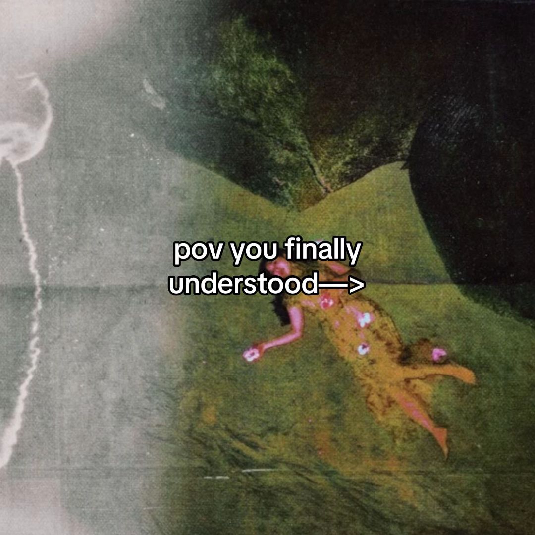
The 'POV' format is a proven TikTok staple that forces the viewer to identify with the creator's experience immediately.
Slide Text
pov you finally understood—>
Visual
A vintage-style painting of a woman lying in a field, overlaid with a grainy, dreamlike filter.
All Slides
@222earthyy carousel breakdown
222
#selflovejourney #HealingJourney #healingtiktok #loveyou #spiritualtiktok #foryoupagе #motivation #universe #selfworth #selfacceptance #acceptance #mindsetmotivation
Effectiveness score
9/10
Views
556.4K
Likes
83.8K
Saves
23.5K
Engagement
20.1%
Hook
pov you finally understood—>
Goal
build-community
Offer
information
CTA
Feed the mind, body, and soul as one cannot function without the other.
Caption
#selflovejourney #HealingJourney #healingtiktok #loveyou #spiritualtiktok #foryoupagе #motivation #universe #selfworth #selfacceptance #acceptance #mindsetmotivation
Strategic Summary
The carousel leverages highly aesthetic, abstract visual metaphors (auras/orbs) to represent complex emotional and spiritual states, making the content feel profound yet easily digestible. The exceptionally high save rate is driven by its use as a quick-reference guide for mindset shifting and meditation, rather than driving comment debate.
The Winning Formula
Ethereal visual metaphors for mindset shifts + binary contrast framing + reference-ready spiritual affirmations.
What's working
- •Slide 1's 'pov you finally understood' creates an instant curiosity gap and signals a breakthrough moment the audience wants to experience.
- •Slides 2-6 use a consistent 'dark vs bright orb' visual language to make abstract concepts like 'worrying vs acceptance' or 'hate vs love' instantly recognizable and emotionally resonant.
- •Slide 3 provides the central actionable thesis ('Switch your mentality from...') which anchors the emotional payoff.
- •The extremely high bookmark rate (4.2%) proves the audience treats this as a saved reference library for their healing journey, not just passive consumption.
- •Slide 7's 'Breathe Out' provides a tactile, somatic call-to-action that grounds the visual sequence in a physical feeling of relief.
What's not working
- •Slide 5's phrasing 'I am better than I was' breaks the binary contrast pattern of the other slides, which might cause a slight cognitive stumble as it introduces a linear progression instead of a state comparison.
- •The lack of a comment-driving question or controversial take keeps engagement confined to saves and shares, missing out on the algorithmic boost of a heated comment section.
Viral lesson
Abstract emotional concepts perform exceptionally well when paired with consistent, high-contrast visual metaphors (like light vs dark orbs) that allow users to quickly self-diagnose their current state and visualize their desired state.
Can a small creator replicate this? Any creator in the wellness, therapy, or self-help space can replicate this by pairing simple binary text shifts with a single, repeating aesthetic asset (like a color gradient or abstract shape) to create a 'save-able' mindset toolkit.
Structural Formula (steal-the-format)
Structure pattern
8-slide sequence starting with a POV hook, followed by 5 binary comparison slides using visual metaphors, a 9-item grid diagnostic, and a final holistic diagram.
Copy formula
minimalist text overlays using second-person directives and binary 'from/to' or 'vs' structures.
What to swap (concrete remixes)
- •Swap emotional states for productivity habits (e.g., 'procrastination vs deep work') for a business-coach audience.
- •Swap aura metaphors for relationship dynamics (e.g., 'codependent vs secure attachment') for a dating-therapy audience.
- •Swap negative orbs for healthy vs processed ingredients for a nutrition-education audience.
What NOT to copy
Do not copy the 'spiritual/aura' visual language unless your brand is explicitly in the metaphysical wellness space; otherwise, the aesthetic will feel inauthentic and mismatched to your audience.
Aesthetics
Ethereal digital abstraction using glowing orbs and vintage film grain photography to represent spiritual and emotional states.
Color palette
What it conveys: The overall aesthetic feels calming, mystical, and scientifically abstract, making emotional concepts feel tangible and safe to explore.
Slide-by-slide forensics
1hooklifestyle shotpeaceful aspirationworks:yesgrab:95/100aesthetic:90/100pov you finally understood->
pov you finally understood->
Visual description
A woman in a floral dress lying relaxed in a lush green field, shot with a heavy vintage/film grain filter to evoke nostalgia and dreaminess. The composition is slightly tilted, enhancing the candid, ethereal feeling.
Scene setting
outdoor field with vintage film treatment
Visible people
Predicted audience reaction
The target audience stops scrolling immediately, feeling seen in their desire for spiritual awakening and clicking through to find out 'what' was understood.
Verdict: The combination of the dreamy aesthetic and the 'pov' text creates an irresistible curiosity gap that perfectly qualifies the viewer.
2step in listinfographiccontrastworks:yesgrab:80/100aesthetic:85/100Constant worrying
It is what it is
Constant worrying It is what it is
Visual description
A side-by-side comparison of two floating orbs against a soft gray-blue gradient background. The left orb is dark red/black representing negativity, while the right orb is a radiant white/yellow/blue mix representing peace.
Scene setting
abstract gradient background
vs prior slide
Style: Visual shifts entirely from the vintage photo to digital abstract art, but maintains the soft, spiritual tone.
Story: Moves from the hook's promise of understanding to the first example of a mindset shift.
Predicted audience reaction
Users instantly relate to the 'constant worrying' bubble and feel the relief visually represented by the 'it is what it is' bubble.
Verdict: It establishes the visual language (orbs) that the rest of the carousel will rely on, making the consumption experience frictionless.
3setupinfographicempowermentworks:yesgrab:90/100aesthetic:85/100Switch your mentality from
Why is this happening to me
to
What is this trying to teach me
and watch your life change for the better.
Switch your mentality from Why is this happening to me to What is this trying to teach me and watch your life change for the better.
Visual description
Similar side-by-side orb layout against a muted gray background. The left orb is a stark black void, while the right is a vibrant, glowing green sphere. Text frames the orbs as an instruction.
Scene setting
abstract gray background
vs prior slide
Style: Maintains the side-by-side orb comparison and sans-serif typography on a neutral background.
Story: Acts as the core thesis statement, explaining the mechanism of the mindset shift introduced in slide 2.
Predicted audience reaction
This is the slide users likely screenshot most often to use as a mantra when they are feeling victimized by circumstances.
Verdict: It provides the highest value statement in the carousel, serving as the anchor for the user's spiritual reframing process.
4step in listinfographicvalidationworks:yesgrab:95/100aesthetic:90/100Your aura on hate
Your aura on love
Your aura on hate Your aura on love
Visual description
A dramatic comparison on a pure black background. The 'hate' orb is small, blurry, and dark with a faint red center. The 'love' orb is massive, sharp, and radiates with white, yellow, and pink light.
Scene setting
studio black backdrop
vs prior slide
Style: Keeps the orb comparison but switches to a starker black background to heighten the contrast between the two states.
Story: Continues the binary contrast theme, moving from general mentality to the specific spiritual concept of 'aura'.
Predicted audience reaction
This highly visualizes the spiritual benefit of love, reinforcing the user's identity as someone who wants to cultivate a 'bright' aura.
Verdict: The stark size difference between the orbs creates a powerful visual argument that love is expansive while hate is limiting.
5step in listinfographicprogressworks:partialgrab:75/100aesthetic:80/100I am
better than
I was
I am better than I was
Visual description
A linear progression of three orbs against a dark blue background. They move from a black orb ('I am') to a white orb ('better than') to a glowing green orb ('I was'), representing personal growth over time.
Scene setting
dark blue solid background
vs prior slide
Style: Maintains the orb visual motif but breaks the binary side-by-side layout for a three-step horizontal layout.
Story: Shifts the narrative from state-comparison to a temporal progression of self-improvement.
Predicted audience reaction
Users nod in agreement, feeling validated in their healing journey, though the text is slightly less immediately punchy than the prior slides.
Verdict: The text phrasing is slightly confusing as a stand-alone phrase ('I am better than I was' reads awkwardly split across three orbs), which slightly disrupts the flow.
6step in listinfographicprotectionworks:yesgrab:85/100aesthetic:90/100Protect your energy
Protect your peace
Protect your energy Protect your peace
Visual description
Two large, saturated orbs on a black background. The left is a fiery yellow/orange representing 'energy', while the right is a calm, cool blue representing 'peace'.
Scene setting
studio black backdrop
vs prior slide
Style: Returns to the side-by-side binary comparison format used in slides 2, 3, and 4, restoring visual rhythm.
Story: Offers a protective directive, shifting from internal growth to external boundary setting.
Predicted audience reaction
This acts as a strong affirmation, reminding the user of the importance of boundaries in their spiritual practice.
Verdict: It taps directly into a buzzphrase in the wellness community ('protect your peace'), ensuring high cultural resonance.
7ctainfographicreleaseworks:yesgrab:90/100aesthetic:95/100Negative Self-Talk
Low Energy
Insecurity
Guilt
Grief
Chaos
Frustration
Anger
Tension
Breathe Out
Negative Self-Talk Low Energy Insecurity Guilt Grief Chaos Frustration Anger Tension Breathe Out
Visual description
A 3x3 grid of nine distinct orbs, each with different colors, textures, and radiating effects representing various negative emotional states (red for anger, grey for frustration, etc.). The text 'Breathe Out' appears in large serif font at the bottom.
Scene setting
studio black backdrop
vs prior slide
Style: Drastically increases visual complexity by moving from single pairs to a dense grid of nine items.
Story: Serves as a comprehensive diagnostic tool, allowing the user to identify multiple negative states they are currently carrying.
Predicted audience reaction
Users pause here to scan the grid, identifying multiple orbs that match their feelings, effectively performing a quick emotional inventory.
Verdict: The 'Breathe Out' copy provides a necessary somatic release, turning a visual list of problems into an actionable moment of relief.
8revealinfographicholistic balanceworks:yesgrab:70/100aesthetic:85/100SOUL
BODY
MIND
Feed the mind, body, and soul
as one cannot function without the other.
SOUL BODY MIND Feed the mind, body, and soul as one cannot function without the other.
Visual description
Three large circles arranged in a triangle on a light textured background. Each circle contains a glowing silhouette representing the Soul (top), Body (bottom left), and Mind (bottom right), with a tiny color legend and summary text at the bottom.
Scene setting
light paper-textured background
vs prior slide
Style: Abandons the dark orb aesthetic entirely for a lighter, diagrammatic style using silhouettes and circles.
Story: Zooms out from the micro-states to a macro-holistic view, concluding that all these elements must work together.
Predicted audience reaction
Readers feel a sense of completion and philosophical grounding, understanding that their healing journey requires a balanced approach.
Verdict: It provides a satisfying, high-level conclusion that validates the complexity of the human experience, encouraging a full save of the carousel.
Commerce intent
Comment ethnography
Diagnostics
Hook deep-dive
pov you finally understood->
The arrow and the phrase 'finally understood' creates a powerful psychological itch to see the specific realization that leads to peace.
Engagement read
The save rate (4.2%) is massively higher than the library norm (0.60%), indicating this is consumed primarily as a saved reference tool rather than for social signaling or debate.
Mechanics
Visual consistency of the 'orb' metaphor creates a pattern where users swipe to see what the next color/state comparison will be.
Brand & funnel
Buying-journey moment: The viewer is likely in the 'seeking' phase of their healing journey, looking for vocabulary and frameworks to understand their internal emotional shifts.
Ideal Customer Profile
Young adults, primarily women, navigating personal growth, anxiety, or spiritual awakening who value aesthetic, bite-sized wisdom.
Age
18-24
Gender
female
Readability
simple
Interests
Pain Points
Aspirations
Emotional Profile
Primary Emotion
reassuranceIntensity
Effectiveness
Emotions Evoked
Emotional Arc
curiosity → recognition → validation → calm
Why It Lands
The carousel moves the viewer from a state of questioning (hook) to a state of resolution (final slide), providing a sense of emotional closure.
Writing Analysis
Style
inspirational
Tone
calm
Hook Type
curiosity gap
Quality
The writing is extremely concise, relying on minimalist phrasing that allows the viewer to project their own experiences onto the text.
Effectiveness
Goal Achievement
The massive bookmark count indicates the content successfully achieved its goal of being a 'saveable' resource for the target audience.
Why It Spread
highly shareable 'aesthetic' format
low cognitive load makes it easy to consume and save
taps into the 'that girl' spiritual wellness trend
Content DNA
It's more of a concluding statement than a direct call to action, but it encourages a 'mindful' pause which aligns with the brand.
Narrative Arc
The tension peaks at the hook and resolves into a steady, calming rhythm of 'this vs that' comparisons, ending in a holistic summary.
Psychological Blueprint
Why It Spread
The carousel leverages the 'aesthetic healing' trend, where complex emotional regulation is simplified into high-contrast, visually pleasing graphics. By using a 'POV' hook, it invites the viewer into an exclusive club of those who 'get it.' The high bookmark-to-view ratio suggests the content is seen as a 'digital resource' for emotional grounding, making it highly shareable for those wanting to signal their own spiritual growth.
Framework
contrast revealPrimary Tactic
identity signalingTactics Used
curiosity gap on slide 1 — 'pov you finally understood' creates an immediate need to know what the 'secret' is
contrast on slides 2, 3, 5, 6, 7 — visually pairing 'negative' states with 'positive' states to anchor the viewer's desired identity
pattern-interrupt on slide 9 — the shift from abstract circles to a specific 'Breathe Out' instruction
Cognitive Biases
confirmation bias — the content validates the viewer's existing desire to be 'healed' or 'enlightened'
framing effect — presenting complex emotional states as simple binary choices (e.g., 'hate' vs 'love') makes them feel manageable
Tribal Markers
Trust Signals
Slide Breakdown (2 analyzed)
Hook Analysis
The 'POV' format is a proven TikTok staple that forces the viewer to identify with the creator's experience immediately.
Text
pov you finally understood—>
Visual
A vintage-style painting of a woman lying in a field, overlaid with a grainy, dreamlike filter.
Visual Elements
Color Palette
Copy Analysis
Power Words
Open Loop: yes — the viewer must swipe to see what the 'understanding' is.
Visual Psychology
Attention: the central text
Emotional cue: the dreamy, nostalgic aesthetic
Composition: to create a sense of mystery and personal revelation
Text
Constant worrying / It is what it is
Visual
Two glowing spheres side-by-side: one dark/red, one bright/yellow.
Visual Elements
Color Palette
Copy Analysis
Power Words
Open Loop: no
Visual Psychology
Attention: the glowing sphere
Emotional cue: the color contrast between dark and light
Composition: to visually represent the shift from anxiety to acceptance
Comment Intelligence
Sentiment
PositiveResonance
Intent
build-community
Audience Vibe
The comments are sparse but reflect deep personal resonance, with users tagging friends or expressing gratitude for the reminder.
Standout Quotes
“needed this today”
“the shift in perspective is everything”
“saving this for when i feel overwhelmed”