The hook works because it combines a high-emotion visual with a curiosity-driven text overlay that promises a 'revelation' about love.
Slide Text
i thought i knew love— until I read this reminder
Visual
A close-up, high-contrast portrait of a woman crying, bathed in warm, golden-hour sunlight.
@andthenichosemyself carousel breakdown
andthenichosemyself
#lifelesson #deepthoughts #quotesthathitdifferent #motivationalvideo #growingup
Effectiveness score
9/10
Views
651.3K
Likes
32.8K
Saves
5.3K
Engagement
6.0%
Hook
i thought i knew love— until I read this reminder
Goal
sell
Offer
product
CTA
none
Caption
#lifelesson #deepthoughts #quotesthathitdifferent #motivationalvideo #growingup
Strategic Summary
This carousel functions as a soft-sell funnel for a self-help book by front-loading emotional validation before revealing the product. It leverages a high-arousal negative emotion (sadness/crying) in Slide 1 to stop the scroll, then immediately offers a tangible solution (the book) in Slide 2, and proves value with a specific, relatable excerpt in Slide 3. The high bookmark rate (1.4x norm) indicates users are saving this as a reference or purchase reminder, while the low share rate suggests the content feels too personal/intimate to broadcast publicly.
The Winning Formula
Emotional pain hook + Physical product proof + Specific value excerpt = High purchase intent.
What's working
- •Slide 1 uses a crying face + 'I thought I knew love' text to instantly filter for an audience feeling relationship pain.
- •Slide 2 shows a physical book held in a hand, creating tangible social proof that this isn't just an Instagram quote account—it's a real resource.
- •Slide 3 gives away a high-value 'reminder' (#49) for free, which lowers resistance to buying the full 101 reminders.
- •The footer on Slide 3 explicitly links the quote back to the book title, reinforcing the brand name without a hard sell.
What's not working
- •Slide 2 is a standard flat-lay that doesn't add new information beyond 'a book exists'; a flip-through of pages might increase dwell time.
- •The text on Slide 3 is dense; users might skim the middle paragraphs and miss the core 'dignity' reframe.
Viral lesson
Don't just quote your product; show the emotional problem the product solves first, then present the product as the vessel for the solution.
Can a small creator replicate this? Any creator with a physical or digital product can replicate this by leading with a customer pain point image, showing the product as the 'key', and giving one free sample of the transformation.
Structural Formula (steal-the-format)
Structure pattern
3-slide funnel: Emotional Hook (Face + Text) -> Product Reveal (Book Cover) -> Value Sample (Quote Card).
Copy formula
First-person confessional hook + Second-person directive payoff.
What to swap (concrete remixes)
- •Swap relationship pain for career burnout for a productivity planner brand.
- •Swap 'giving too much' for 'spending too much' for a budgeting app.
- •Swap book for digital course or workshop.
What NOT to copy
Do not use a crying face if your brand is high-energy or corporate; match the emotional intensity of the image to your specific niche's pain point.
Aesthetics
Warm, intimate, 'sad-girl' therapeutic aesthetic with serif typography and cream/pink tones.
Color palette
What it conveys: The overall aesthetic feels like a warm hug for someone who is hurting; it signals safety and understanding before selling anything.
Slide-by-slide forensics
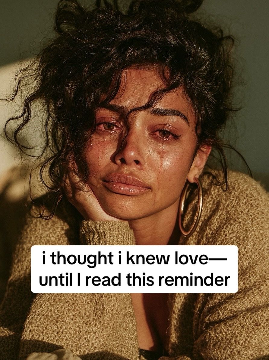
1hookclose upsadness, vulnerabilityworks:yesgrab:95/100aesthetic:90/100i thought i knew love— until I read this reminder
i thought i knew love— until I read this reminder
Visual description
Close-up of a woman with dark curly hair, tears visible on her cheeks, resting her chin on her hand. Warm, golden-hour lighting. She wears a textured beige sweater and large gold hoop earrings.
Scene setting
intimate indoor portrait
Visible people
Visible objects
vs prior slide
Style: N/A - First slide
Story: N/A - First slide
Predicted audience reaction
Immediate identification; users feeling relationship pain will stop scrolling because the image mirrors their internal state.
Comments reacting to this slide
- "its an arrow straight to my heart😢"
- "damn"
- "I don't what to say cuz it is me🌑"
Verdict: The crying face is a universal signal for emotional pain, and the text promises a solution ('reminder'), creating an open loop.
2revealproduct shothope, calmworks:yesgrab:70/100aesthetic:85/100Chiara Mercurio
and then I chose myself
101 reminders to heal, rise, and shine
Chiara Mercurio and then I chose myself 101 reminders to heal, rise, and shine
Visual description
A paperback book held by a hand with white manicured nails and gold rings. The background is a fluffy white blanket or rug. The book cover is off-white with black serif text and a simple line drawing of a hand holding a pink flower.
Scene setting
cozy bedroom flat-lay
Visible people
Visible objects
Products on screen
vs prior slide
Style: Shifts from emotional portrait to clean product shot, but maintains warm/cozy color palette.
Story: Reveals the source of the 'reminder' promised in Slide 1.
Predicted audience reaction
Recognition that this is a purchasable item; shifts mindset from 'relating' to 'shopping'.
Comments reacting to this slide
- "How do I get this book?"
- "where can I find this book"
- "how can I order the hard copy of this book ?"
Verdict: It validates the hook by showing a physical product, triggering the purchase intent seen in the comments.
3payofftext cardempowerment, clarityworks:yesgrab:60/100aesthetic:80/100reminder #49: In giving too much, you've stopped expecting what's fair
At first you call it love, generosity, strength.
Then you realize that giving without limits doesn't fill you — it drains you.
You get used to receiving so little that you start thinking it's normal, that asking for more is selfish.
But wanting what you give isn't selfishness — it's dignity.
And if a relationship leaves you empty-handed every time, it isn't love: it's an illusion that makes you smaller.
inspired by the book
reminder #49: In giving too much, you've stopped expecting what's fair At first you call it love, generosity, strength. Then you realize that giving without limits doesn't fill you — it drains you. You get used to receiving so little that you start thinking it's normal, that asking for more is selfish. But wanting what you give isn't selfishness — it's dignity. And if a relationship leaves you empty-handed every time, it isn't love: it's an illusion that makes you smaller. inspired by the book
Visual description
A text card with a cream background. Black serif typography. Certain phrases are highlighted with a soft pink marker effect. A small line icon of a hand holding a heart with rays is in the top right.
Scene setting
digital graphic
Visible objects
Other text elements
- •inspired by the book
vs prior slide
Style: Shifts from photo to graphic, but uses same serif font and cream/pink palette as the book cover.
Story: Delivers the actual value/quote promised in the hook.
Predicted audience reaction
High save rate; users will bookmark this to read later or remind themselves of their boundaries.
Comments reacting to this slide
- "the bitter truth 🥺"
- "I will rather stay single then be hurt again..."
- "Boundaries are self-respect.I gave until I forgot what fairness felt like."
Verdict: It provides the 'value' that justifies the follow/save, reinforcing the book's authority.
Commerce intent
Mentioned products
Buy-intent phrases (from comments)
- •Please take pictures for me and send it to me please can't afford it at Amazon
- •How do I get this book?
- •where can I find this book
- •how can I order the hard copy of this book ?
- •Can I get it in a book shop?
- •I need this book
Objections (from comments)
- •can't afford it at Amazon
Comment ethnography
A community of people healing from over-giving; they validate each other's pain in the comments rather than debating the content.
Comments that characterize the audience
- "I will rather stay single then be hurt again, I can't give my all and receive nothing like I don't have feelings.."
- "at some point I just chose myself ,my happiness and my peace because of the pain of always giving ,giving and no one knows how much it's draining me"
- "Boundaries are self-respect.I gave until I forgot what fairness felt like."
Pain points revealed
- •giving too much in relationships
- •feeling drained by love
- •fear of being hurt again
- •confusing draining oneself with love
Aspirations revealed
- •choosing myself
- •finding peace
- •setting boundaries
- •healing
Top questions asked
- •How do I get this book?
- •where can I find this book
- •how can I order the hard copy of this book ?
- •Can I get it in a book shop?
- •the name of song plz
Objections
- •price affordability (Amazon)
Diagnostics
Hook deep-dive
i thought i knew love— until I read this reminder
The contradiction between 'knew love' and 'reminder' creates curiosity about what was misunderstood, while the crying face promises emotional resonance.
Engagement read
Bookmark rate (0.81%) is significantly higher than Like rate (5.03% vs 8% norm), indicating high utility/reference value over pure entertainment.
Mechanics
Emotional resonance on Slide 1 forces a swipe to see what the 'reminder' actually says.
Brand & funnel
Brands visible
Buying-journey moment: The viewer is emotionally primed and actively seeking the source of the wisdom (the book) to solve their pain.
Ideal Customer Profile
Women aged 18-34 who are currently navigating the emotional aftermath of a difficult breakup or toxic relationship and are seeking validation and healing.
Age
18-24
Gender
female
Readability
simple
Interests
Pain Points
Aspirations
Emotional Profile
Primary Emotion
validationIntensity
Effectiveness
Emotions Evoked
Emotional Arc
sorrow → curiosity → realization → empowerment
Why It Lands
The content moves the viewer from a state of shared pain (the crying image) to a state of cognitive reframing (the quote), providing a sense of relief and clarity that makes the viewer feel seen.
Writing Analysis
Style
inspirational
Tone
vulnerable
Hook Type
curiosity gap
Quality
The writing is concise, rhythmic, and highly empathetic. It avoids fluff, focusing on the transition from 'generosity' to 'dignity', which is a powerful emotional pivot.
Effectiveness
Goal Achievement
The post effectively uses the emotional hook to drive interest in the book. The high bookmark-to-like ratio indicates that the content is being treated as a resource, which is the primary goal for book marketing.
Why It Spread
highly shareable emotional truth
aesthetic visual consistency
low barrier to entry (only 3 slides)
Content DNA
There is no explicit call to action, which is a missed opportunity. While the content is highly shareable, adding a 'Save this for when you need a reminder' or 'Link in bio to read more' would likely increase conversion.
Narrative Arc
The carousel builds tension through the emotional hook, transitions to the product, and concludes with a high-value 'payoff' quote that encourages saving.
Psychological Blueprint
Why It Spread
The post succeeds because it perfectly matches the 'sad girl' aesthetic prevalent on TikTok with a high-value, relatable emotional insight. By pairing a visceral image of crying with a profound, validating quote about self-worth, it triggers an immediate 'this is me' response. The 6.02% engagement rate is driven by the high bookmark count, as users save the content as a personal mantra for their own healing.
Framework
PASPrimary Tactic
validationTactics Used
curiosity gap on slide 1 — 'until I read this reminder' creates an open loop
validation of pain on slide 3 — naming the feeling of being 'drained' creates immediate rapport
identity-signaling in the book title 'and then I chose myself' — appeals to the viewer's desire to be the protagonist of their own healing
authority-then-teach on slide 3 — using 'reminder #49' implies a larger body of wisdom
Cognitive Biases
Barnum effect — the statement on slide 3 is broad enough to apply to almost anyone who has felt unappreciated, making it feel deeply personal
Zeigarnik effect — the 'reminder' format compels the user to finish reading to close the loop on the emotional tension
Tribal Markers
Trust Signals
Slide Breakdown (3 analyzed)
Hook Analysis
The hook works because it combines a high-emotion visual with a curiosity-driven text overlay that promises a 'revelation' about love.
Text
i thought i knew love— until I read this reminder
Visual
A close-up, high-contrast portrait of a woman crying, bathed in warm, golden-hour sunlight.
Visual Elements
Color Palette
Copy Analysis
Power Words
Open Loop: yes, the phrase 'until I read this reminder' forces the user to swipe to see what the reminder is.
Visual Psychology
Attention: the eyes of the woman, which convey raw, relatable pain.
Gaze: the woman is looking directly at the camera, creating an immediate, intense connection with the viewer.
Emotional cue: the tears and the warm, soft lighting evoke empathy and vulnerability.
Composition: the centered, tight crop forces the viewer to confront the emotion before reading the text.
Text
and then I chose myself: 101 reminders to heal, rise, and shine
Visual
A clean, aesthetic shot of the book cover held by a hand with manicured nails.
Visual Elements
Color Palette
Copy Analysis
Power Words
Open Loop: yes, it introduces the product as the source of the wisdom promised in the hook.
Visual Psychology
Attention: the book title, which is centered and clearly legible.
Emotional cue: the soft, clean aesthetic signals peace and self-care.
Composition: the minimalist design establishes authority and professionalism.
Text
reminder #49: In giving too much, you've stopped expecting what's fair. At first you call it love, generosity, strength. Then you realize that giving without limits doesn't fill you — it drains you. You get used to receiving so little that you start thinking it's normal, that asking for more is selfish. But wanting what you give isn't selfishness — it's dignity. And if a relationship leaves you empty-handed every time, it isn't love: it's an illusion that makes you smaller.
Visual
A clean, light-beige background with black serif text and a small heart icon.
Visual Elements
Color Palette
Copy Analysis
Power Words
Open Loop: no, this is the payoff slide.
Visual Psychology
Attention: the highlighted text phrases, which guide the reader through the core argument.
Emotional cue: the clean, uncluttered layout allows the reader to focus entirely on the emotional weight of the words.
Composition: designed to be highly readable and shareable as a standalone quote.
Comment Intelligence
Sentiment
PositiveResonance
Intent
sell
Audience Vibe
The comments section is a space for quiet, deep reflection, with users tagging friends or expressing personal resonance.
Standout Quotes
“This hit way too close to home.”
“I needed to hear this today, thank you.”
“Saving this for the next time I feel like I'm being 'too much'.”
Top Comments
Please take pictures for me and send it to me please can’t afford it at Amazon
its an arrow straight to my heart😢
the name of song plz,😭😭😭
I will rather stay single then be hurt again, I can’t give my all and receive nothing like I don’t have feelings.. I’m gonna make myself happ and care for myself more
the bitter truth 🥺