Slide Text
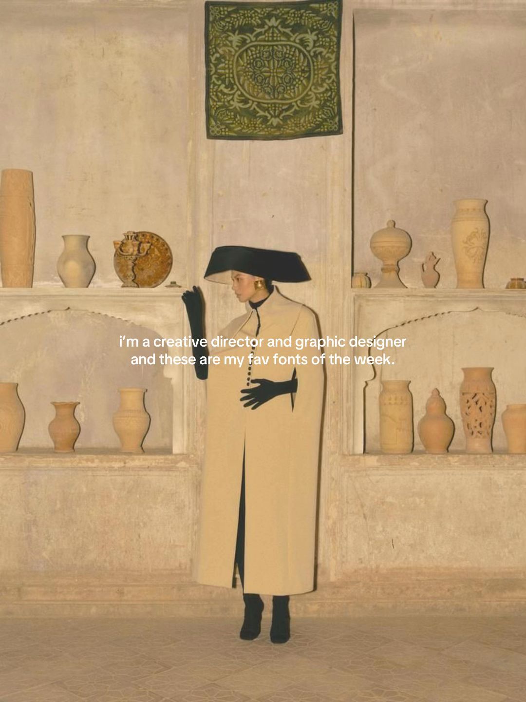
i'm a creative director and graphic designer and these are my fav fonts of the week.
Visual
A woman in a high-fashion, beige cape and black hat standing in a room with arched alcoves filled with pottery.
All Slides
@fusioncreativestudio carousel breakdown
Fusion Creative Studio
#branding #graphicdesign #font #brandidentity #designstudio
Effectiveness score
9/10
Views
113K
Likes
19K
Saves
10K
Engagement
26.4%
Hook
i'm a creative director and graphic designer and these are my fav fonts of the week.
Goal
build-community
Offer
information
CTA
none
Caption
#branding #graphicdesign #font #brandidentity #designstudio
Strategic Summary
This carousel went viral primarily due to an extreme bookmark rate (14.7x norm), driven by positioning specific, hard-to-find font names as exclusive 'creative director' knowledge. The hook establishes immediate authority ('I'm a creative director'), which validates the curation on subsequent slides. The high-aesthetic visuals match the promised taste, creating a 'save for later reference' impulse among designers who want to replicate this level of sophistication.
The Winning Formula
Authority credentialing + curated high-end aesthetic examples + specific font names = high-save resource.
What's working
- •Slide 1 establishes immediate credibility ('creative director and graphic designer') which makes the subsequent recommendations feel vetted and valuable.
- •Every slide (2-6) provides actionable utility by naming specific fonts or close alternatives (e.g., 'Franklin Gothic', 'Sweetmaroon'), triggering the 'save for later' utility instinct.
- •The visual aesthetic (warm tones, vintage textures, luxury products) reinforces the 'high taste' claim, making the account itself aspirational.
- •Slide 5 and 6 admit uncertainty ('i think this is actually handwritten') which builds trust through honesty rather than pretending to know everything.
What's not working
- •Slide 6 lacks a explicit Call-to-Action (follow/subscribe); it ends on a resource note ('maybe Prosa?') which is useful but misses a conversion opportunity.
- •Slide 3 is visually plainer than the others (solid brown background), risking a drop in aesthetic engagement compared to the object photography on slides 2, 4, 5.
Viral lesson
Specificity drives saves; giving exact names (fonts, products, tools) transforms content from 'inspiration' to 'resource', which algorithms weight heavily via bookmark metrics.
Can a small creator replicate this? Highly replicable for any expertise-based niche (coding, cooking, fitness) provided the creator can offer specific, named resources rather than general advice, and maintains visual consistency.
Structural Formula (steal-the-format)
Structure pattern
6-slide list, identity hook on slide 1, 4 examples with font names, last slide example without explicit CTA.
Copy formula
first-person lowercase ('i think', 'i found') + specific font names + aesthetic context
What to swap (concrete remixes)
- •Swap fonts→color palettes for interior design niche.
- •Swap fonts→camera settings for photography niche.
- •Swap fonts→ingredient staples for culinary niche.
What NOT to copy
Do not copy the lack of CTA on the final slide; this viral post succeeded despite that weakness, not because of it.
Aesthetics
Curated vintage-modern mood board with warm earth tones and serif typography.
Color palette
What it conveys: The overall aesthetic feels expensive, calm, and curated, signaling 'high taste' before the user reads a single word.
Slide-by-slide forensics
1hookwide shotsophisticated authorityworks:yesgrab:90/100aesthetic:95/100i'm a creative director and graphic designer and these are my fav fonts of the week.
i'm a creative director and graphic designer and these are my fav fonts of the week.
Visual description
A full-body shot of a model wearing a beige coat and large black hat, standing in a museum-like room with shelves of pottery and a green tapestry on the wall. The lighting is warm and natural.
Scene setting
museum or gallery interior with pottery shelves
Visible people
Visible objects
Predicted audience reaction
Immediate recognition of high-end taste, validating the creator's authority to recommend fonts.
Comments reacting to this slide
- "That first photo though 👌👌"
Verdict: Perfectly sets the visual tone and credentials before delivering value.
2step in listclose upluxury calmworks:yesgrab:85/100aesthetic:90/100Kindred Black
i think this one's close to Graceful by Alcode
Augustin by Ludwig type, i believe
SLOW BEAUTY—A HISTORICALLY ROOTED COLLECTION OF ENVIRONMENTALLY FOCUSED ARTISAN SKINCARE, COSMETICS, AND BOTANICAL PERFUMES.
Kindred Black i think this one's close to Graceful by Alcode Augustin by Ludwig type, i believe SLOW BEAUTY—A HISTORICALLY ROOTED COLLECTION OF ENVIRONMENTALLY FOCUSED ARTISAN SKINCARE, COSMETICS, AND BOTANICAL PERFUMES.
Visual description
A close-up product shot of a glass perfume bottle sitting on a pearlescent shell-like base. White script text overlays the image diagonally.
Scene setting
studio product photography
Visible objects
Products on screen
vs prior slide
Style: Maintains warm, muted color palette and high-end aesthetic.
Story: Moves from identity claim to first specific example.
Predicted audience reaction
Saving the font names 'Graceful' and 'Augustin' for future projects.
Comments reacting to this slide
- "Kindred Black's vibes are always immaculate"
Verdict: Combines brand inspiration with actionable font data.
3step in listtext cardinformativeworks:partialgrab:60/100aesthetic:70/100Hermès
Milan
Design Week
2024
April 16 to 21
Franklin Gothic by URW Type Foundry is the closest i found!
Hermès Milan Design Week 2024 April 16 to 21 Franklin Gothic by URW Type Foundry is the closest i found!
Visual description
A textured brown background with white sans-serif text stacked vertically. Looks like a close-up of printed material or signage.
Scene setting
printed signage or invite
vs prior slide
Style: Color palette matches (brown/earth), but lacks the object photography of Slide 2.
Story: Continues the list of font examples.
Predicted audience reaction
Quick scan for the font name, less dwell time than image-heavy slides.
Verdict: Valuable info (Hermès font), but visually the least engaging slide in the deck.
4step in listflat laynostalgicworks:yesgrab:80/100aesthetic:85/100W. E. LOGAN
GROWERS AND SHIPPER OF
ORANGES AND GRAPE FRUIT
CITRA, FLA.,
Plate Gothic
Mrs. Olive Logan Fitzgerald
Sackers Script
W. E. LOGAN GROWERS AND SHIPPER OF ORANGES AND GRAPE FRUIT CITRA, FLA., Plate Gothic Mrs. Olive Logan Fitzgerald Sackers Script
Visual description
Vintage cream-colored letterhead or invoice with typewritten text and a handwritten card overlay. Black text on off-white paper.
Scene setting
vintage stationery flat-lay
Visible objects
Other text elements
- •WINTER CITRA
vs prior slide
Style: Returns to textured paper aesthetic, consistent with overall vintage mood.
Story: Provides two font examples instead of one.
Predicted audience reaction
Appreciation for the vintage pairing of serif and script.
Verdict: Strong visual texture makes it more engaging than Slide 3.
5step in listproduct shotwarmworks:yesgrab:85/100aesthetic:88/100Langan's Brasserie
i think this is actually handwritten but i found Sweetmaroon that can be a good alternative!
Langan's Brasserie i think this is actually handwritten but i found Sweetmaroon that can be a good alternative!
Visual description
A yellow matchbox on a white background. Black script text on the matchbox label.
Scene setting
studio product shot
Visible objects
vs prior slide
Style: Consistent minimal product photography style.
Story: Adds honesty element ('actually handwritten').
Predicted audience reaction
Trust building due to creator admitting uncertainty but offering solution.
Verdict: The honesty increases credibility for the other recommendations.
6resource listtext cardinvitingworks:partialgrab:70/100aesthetic:80/100Manning & Willie's
Emily in White can be a good dupe!
APPLE CIDER
BERRY PIES
CORN ON THE COB
FRESH SOURDOUGH
CHURNED BUTTER
MARKET PRODUCE
maybe Prosa?
TOM FORK PLACE
VILLAGE PLAZA
THE NEIGHBORHOOD PLACE TO SHOP
Manning & Willie's Emily in White can be a good dupe! APPLE CIDER BERRY PIES CORN ON THE COB FRESH SOURDOUGH CHURNED BUTTER MARKET PRODUCE maybe Prosa? TOM FORK PLACE VILLAGE PLAZA THE NEIGHBORHOOD PLACE TO SHOP
Visual description
A folded cream-colored menu card with black serif and script text. Minimalist layout with plenty of whitespace.
Scene setting
restaurant menu
Visible objects
vs prior slide
Style: Consistent paper texture and typography focus.
Story: Final example, closes the list.
Predicted audience reaction
Saving the font names, then scrolling past as there is no CTA.
Comments reacting to this slide
- "Last one is Prarie by Old City Mailroom"
- "Wow I love the last one sm 😍"
Verdict: Good content, but misses the opportunity to convert the high engagement into a follow.
Commerce intent
Mentioned products
Comment ethnography
A niche community of designers ('Font Tok') who share specific typeface knowledge and validate each other's taste levels.
Comments that characterize the audience
- "you have such a good taste✨"
- "now your work is one of my inspirations✨"
- "Kindred Black's vibes are always immaculate"
Pain points revealed
- •Finding fonts that match specific high-end vibes
- •Identifying fonts from real-world branding
Aspirations revealed
- •Having 'immaculate vibes' like Kindred Black
- •Being seen as having 'good taste' professionally
Top questions asked
- •Do you have a portfolio of your work?
- •What font is the last one?
Objections
- •Correction on font identification ('Last one is Prarie by Old City Mailroom')
Diagnostics
Hook deep-dive
i'm a creative director and graphic designer and these are my fav fonts of the week.
The viewer wants to know what fonts a 'creative director' uses to achieve this level of aesthetic.
Engagement read
Bookmark rate is 14.7x the library norm, indicating this is treated as a reference tool rather than entertainment.
Mechanics
Users must swipe to see the specific font name recommendation hidden on each aesthetic slide.
Brand & funnel
Brands visible
Buying-journey moment: The viewer is in the inspiration phase, looking for tools to elevate their own design work.
Ideal Customer Profile
Aspiring or junior graphic designers and creative professionals who value high-end, editorial aesthetics and are constantly hunting for the 'perfect' font.
Age
18-24
Gender
female
Readability
simple
Interests
Pain Points
Aspirations
Emotional Profile
Primary Emotion
aspirationIntensity
Effectiveness
Emotions Evoked
Emotional Arc
curiosity → discovery → satisfaction
Why It Lands
The content makes the viewer feel like they are gaining access to a professional's 'secret stash,' which triggers a sense of professional validation and aspirational growth.
Writing Analysis
Style
educational
Tone
aspirational
Hook Type
identity statement
Quality
The writing is extremely concise and functional. It avoids fluff, focusing entirely on delivering the value (the font names) while maintaining a cool, detached, professional persona.
Effectiveness
Goal Achievement
The massive bookmark-to-view ratio (nearly 10%) proves the content is highly effective as a utility-based resource, which is the gold standard for design-niche growth.
Why It Spread
high utility (saveable font list)
aesthetic consistency that fits the 'design-tok' trend
low-friction consumption (short, visual-heavy slides)
Content DNA
There is no explicit CTA, which is a missed opportunity for conversion, though it keeps the content feeling 'organic' and 'un-salesy'.
Narrative Arc
The flow is a steady stream of value, keeping the viewer engaged by alternating between different visual styles and typography examples.
Psychological Blueprint
Why It Spread
The post succeeded by combining high-value, 'saveable' utility (font names) with an aspirational, high-fashion aesthetic that signals 'insider' status. By positioning the fonts as 'favs of the week' rather than a generic list, it created a sense of ongoing, exclusive access. The 10,000+ bookmarks indicate that the content serves as a permanent reference library for designers, which is the ultimate driver of long-term algorithm performance.
Framework
authority then teachPrimary Tactic
authorityTactics Used
curiosity gap on slide 1 — 'fav fonts' implies a secret list the viewer needs to see
authority signaling — 'creative director' title establishes immediate credibility
pattern interrupt — using high-fashion, non-design imagery to frame design content
reciprocity — providing free, high-value design resources (font names) to build goodwill
Cognitive Biases
Zeigarnik effect — the list format compels the viewer to finish the carousel to see all the 'secrets'
authority bias — viewers trust the font recommendations because the creator identifies as a 'creative director'
Tribal Markers
Trust Signals
Slide Breakdown (2 analyzed)
Text
i'm a creative director and graphic designer and these are my fav fonts of the week.
Visual
A woman in a high-fashion, beige cape and black hat standing in a room with arched alcoves filled with pottery.
Visual Elements
Color Palette
Copy Analysis
Power Words
Open Loop: yes — the viewer must swipe to see the specific fonts mentioned.
Visual Psychology
Attention: the woman in the center
Gaze: looking off-camera, creating an air of mystery
Emotional cue: the high-fashion aesthetic signals luxury and expertise
Composition: centered symmetry creates a sense of calm, professional authority
Text
i think this one's close to Graceful by Alcode. Augustin by Ludwig type, i believe. SLOW BEAUTY—A HISTORICALLY ROOTED COLLECTION OF ENVIRONMENTALLY FOCUSED ARTISAN SKINCARE, COSMETICS, AND BOTANICAL PERFUMES.
Visual
A glass perfume bottle sitting on a rounded, iridescent object.
Visual Elements
Color Palette
Copy Analysis
Power Words
Open Loop: yes — the viewer continues to see if the next font is better.
Visual Psychology
Attention: the glass bottle
Emotional cue: minimalist luxury
Composition: clean, high-end product photography
Comment Intelligence
Sentiment
PositiveResonance
Intent
build-community
Audience Vibe
Professional, appreciative, and collaborative.
Standout Quotes
“The aesthetic is so clean.”
“Saving this for my next project.”
“Love these font choices.”
Top Comments
yes I made it on font tok!
Last one is Prarie by Old City Mailroom
Kindred Black’s vibes are always immaculate
That first photo though 👌👌👌
Love it!