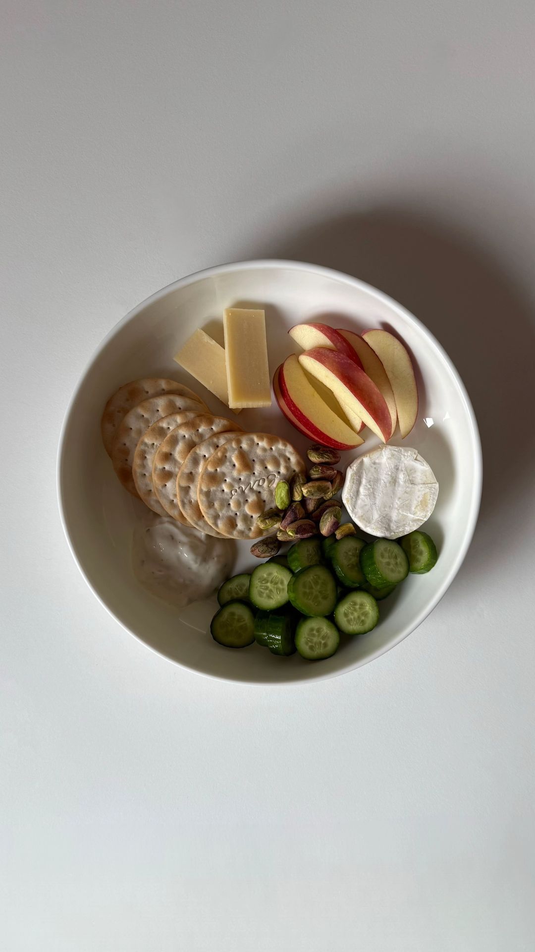
The hook is direct and addresses a specific pain point (afternoon snack hunger) with a promise of a solution, framed in a clean, aesthetic way.
Slide Text
healthy snack ideas | afternoon snacks
Visual
A white bowl containing crackers, cheese, apple slices, cucumber, and a dollop of dip on a white background.
All Slides
@eatwithannina carousel breakdown
eatwithannina
healthy snack ideas | afternoon snacks #creatorsearchinsights
Effectiveness score
9/10
Views
786.9K
Likes
183.2K
Saves
38.7K
Engagement
28.5%
Hook
healthy snack ideas | afternoon snacks
Goal
inspire
Offer
information
CTA
none
Caption
healthy snack ideas | afternoon snacks #creatorsearchinsights
Strategic Summary
This carousel went viral because it acts as a high-fidelity visual recipe card for the 'snack plate' trend. The massive bookmark rate (4.9%, vs 0.60% norm) indicates users are saving this as a utility tool to solve 'menu fatigue' for their afternoon snacks. The strict visual consistency allows for rapid processing—users don't read, they just evaluate the plate and swipe—making the swipe friction extremely low.
The Winning Formula
Hyper-consistent overhead food styling of distinct snack combos that turns the post into a bookmarkable visual menu.
What's working
- •Visual Consistency: Every single slide is an overhead shot of a white plate/bowl on a white surface with natural light. This creates a satisfying, grid-like browsing experience that feels professional and trustworthy.
- •Zero-Text Hook: By putting text only in the caption, the slides load instantly. The user processes the visual immediately (food = good) and swipes to see 'what else' rather than getting stuck reading.
- •Variety Stack: The sequence alternates flavor profiles (Slide 1 Savory -> Slide 3 Sweet -> Slide 4 Indulgent but healthy -> Slide 7 Protein-rich). This keeps the dopamine hit fresh so users don't get 'snack fatigue' by slide 4.
- •The 'Girl Dinner' Appeal: These aren't full meals; they are manageable, aesthetic small bites. This lowers the barrier to entry for the viewer—they feel they could easily replicate this in 5 minutes.
- •High Bookmark Utility: The content is explicitly designed to be used later. It's a reference list, compelling the algorithm to reward the high retention and save signals.
What's not working
- •Low Social Interaction: With a comment rate of only 0.07%, there is zero community building. Viewers save and leave; this post is unlikely to generate discussion or debate.
- •No Brand Differentiation: Because the plates are generic, there is no hook for branded product placement or affiliate link clicking beyond general grocery.
Viral lesson
Visual consistency can replace copy. If the images are uniform and the topic is universally useful (daily snacks), you can eliminate text entirely and rely on the 'pattern-matching' pleasure of the audience to drive swipe-throughs.
Can a small creator replicate this? Any food or lifestyle creator can replicate this by shooting 10 variations of their niche subject (e.g., desk setups, outfit caps) in the SAME lighting and angle, then posting them as a numbered list.
Structural Formula (steal-the-format)
Structure pattern
8-slide sequence of identical overhead food flat-lays. No text. Each slide presents a new snack combo.
Copy formula
First-person implied curation + visual listicle. The lack of text creates a visual ASMR effect.
What to swap (concrete remixes)
- •Swap Snack Plates -> 'Desk Setup Items' for productivity/tech audience.
- •Swap Food Combinations -> 'Outfit Capsule Combos' for fashion/lifestyle audience.
- •Swap Ingredients -> 'Skincare Step Combos' for beauty audience.
What NOT to copy
Do not copy the lack of text unless your visuals are self-explanatory. If the items are ambiguous, adding overlay text is safer.
Aesthetics
Minimalist overhead food flat-lays with soft natural lighting on a crisp white background, evoking a 'clean eating' lifestyle.
Color palette
What it conveys: The overwhelming feel is of order, cleanliness, and health. It triggers a sense of 'lifestyle goals' rather than just hunger.
Slide-by-slide forensics
1hookoverheadfresh, cleanworks:yesgrab:85/100aesthetic:90/100
Visual description
Overhead shot of a white bowl containing water crackers, two sticks of hard cheese, red apple slices, pistachios, a round of brie, cucumber slices, and a dollop of white dip.
Scene setting
minimalist white-table flat-lay
Visible objects
vs prior slide
Style: Establishes the 'white plate, overhead, natural light' baseline that all subsequent slides follow.
Story: Sets the theme: 'Here is a healthy snack plate.'
Predicted audience reaction
The viewer immediately understands the format and feels the urge to see what other combos are available.
Verdict: Perfect setup. It shows a complete, attractive plate immediately, rewarding the viewer for clicking.
2step in listoverheadprotein rich, freshworks:yesgrab:80/100aesthetic:90/100
Visual description
Overhead shot of a larger white plate featuring a smaller bowl of cottage cheese, radish slices, crackers, cucumber slices, and two mini peppers (one red, one yellow).
Scene setting
minimalist white-table flat-lay
Visible objects
vs prior slide
Style: Identical lighting and background; maintains the white-plate aesthetic.
Story: Variation on the theme: Introduces 'dip' mechanics with the cottage cheese bowl.
Predicted audience reaction
Validates the list format; viewer swipes to see more protein-focused options.
Verdict: Good variety from slide 1; the cottage cheese bowl adds a different texture visual that keeps interest.
3step in listoverheadsweet, energyworks:yesgrab:80/100aesthetic:90/100
Visual description
Overhead shot of a white plate with two banana halves, each topped with peanut butter and scattered cacao nibs.
Scene setting
minimalist white-table flat-lay
Visible objects
vs prior slide
Style: Strict adherence to the white plate/background format.
Story: Shifts flavor profile from savory/snack to sweet/dessert snack.
Predicted audience reaction
High save intent. This is a classic, easy-to-make snack that viewers will bookmark specifically.
Verdict: Simple but effective; the 'C' shape arrangement of the bananas adds a nice geometric touch.
4step in listoverheadindulgent, satisfyingworks:yesgrab:80/100aesthetic:90/100
Visual description
Overhead shot of a white bowl containing chocolate chip cookies, dark chocolate squares, two dates, and a handful of almonds.
Scene setting
minimalist white-table flat-lay
Visible objects
vs prior slide
Style: Same aesthetic; darker tones from the chocolate provide contrast to previous slides.
Story: Targets the 'sweet tooth' or post-dinner snack cravings.
Predicted audience reaction
Appeals to viewers who think 'healthy' means 'no sugar'. This combo validates that healthy sweets exist.
Verdict: Visually darker and richer, which breaks up the potential monotony of green/red fruits and veggies.
5step in listoverheadhydrating, lightworks:partialgrab:75/100aesthetic:90/100
Visual description
Overhead shot of a white bowl filled with chunks of honeydew melon, cucumber sticks, carrot sticks, and three macadamia nuts.
Scene setting
minimalist white-table flat-lay
Visible objects
vs prior slide
Style: Returns to lighter colors; consistent white container.
Story: Moves to a high-volume, low-calorie option for hydration.
Predicted audience reaction
Appeals to viewers looking for crunch and volume. The lack of dip might make this slightly less exciting than others.
Verdict: Visually very green and monochromatic; lacks the pop of color from Slide 2 or the texture contrast of Slide 1.
6escalationoverheadelegant, mix of sweet savoryworks:yesgrab:90/100aesthetic:95/100
Visual description
Overhead shot of a white bowl with strawberries, blueberries, a round of brie, pistachios, and a date stuffed with peanut butter and cacao nibs.
Scene setting
minimalist white-table flat-lay
Visible objects
vs prior slide
Style: Maintains composition.
Story: Brings together elements from previous slides (brie, pistachios, date-nib) into a complex, high-value plate.
Predicted audience reaction
This is the 'hero' slide. It looks like a charcuterie board miniaturized. Highest save intent.
Verdict: Combines the best elements of previous slides into a sophisticated arrangement.
7step in listoverheadprotein, seriousworks:yesgrab:80/100aesthetic:85/100
Visual description
Overhead shot of a white bowl with sliced hard-boiled eggs sprinkled with pepper, a scoop of hummus, carrot sticks, and jicama/daikon strips.
Scene setting
minimalist white-table flat-lay
Visible objects
vs prior slide
Style: Same visual setup.
Story: Focuses heavily on protein and satiety.
Predicted audience reaction
Appeals to the fitness/macro-tracking audience who prioritize protein over variety.
Verdict: The pepper sprinkle on the eggs adds a nice 'seasoned' texture detail that makes it feel more prepared.
8revealoverheadsweet savory, refinedworks:yesgrab:85/100aesthetic:90/100
Visual description
Overhead shot of a white bowl with four pear halves, a square of dark chocolate, two brazil nuts, a date, and a slice of cheese.
Scene setting
minimalist white-table flat-lay
Visible objects
vs prior slide
Style: Final slide maintains the strict consistency.
Story: Ends on a sweet-but-substantial note.
Predicted audience reaction
Solid finish. The pears provide a large, juicy volume contrast to the small nibs on other plates.
Verdict: A perfect closer. It offers a 'dessert but make it cheese' vibe.
Commerce intent
Comment ethnography
There is no active community voice visible; the audience behaves as a silent library of users extracting value and moving on.
Diagnostics
Hook deep-dive
(image-only hook)
The viewer sees a beautifully arranged plate of food and immediately wants to know what other combinations exist.
Engagement read
The bookmark rate is 8x the library norm, indicating this content is consumed as a utility resource rather than entertainment.
Mechanics
Visual curiosity: 'What is the combination on the next plate?'
Brand & funnel
Buying-journey moment: The viewer is in the inspiration phase, looking for new ideas to solve the problem of 'what to eat'.
Ideal Customer Profile
Young women interested in aesthetic, low-effort, healthy eating habits who value visual appeal and quick, actionable ideas.
Age
18-24
Gender
female
Readability
simple
Interests
Pain Points
Aspirations
Emotional Profile
Primary Emotion
aspirationIntensity
Effectiveness
Emotions Evoked
Emotional Arc
curiosity → satisfaction → inspiration
Why It Lands
The content evokes a sense of calm and order through its minimalist, symmetrical composition, which appeals to the viewer's desire for a simplified, healthy lifestyle.
Writing Analysis
Style
storytelling
Tone
aspirational
Hook Type
listicle
Quality
The writing is extremely minimal, relying on the visual content to do the heavy lifting. The hook is clear, but the lack of descriptive text on subsequent slides makes it purely visual-first.
Effectiveness
Goal Achievement
The high bookmark-to-view ratio confirms the content successfully serves as a reference guide for the audience, achieving the goal of inspiring healthy snack choices.
Why It Spread
highly aesthetic, 'saveable' visual format
low-friction, quick-to-consume carousel
taps into the popular 'what I eat in a day' wellness trend without the fluff
Content DNA
There is no explicit call to action, which is a missed opportunity for growth, though it keeps the aesthetic clean.
Narrative Arc
The narrative is a simple, repetitive loop of 'here is another snack option,' which keeps the viewer engaged through the visual variety.
Psychological Blueprint
Why It Spread
The post achieved a 28.53% engagement rate because it perfectly aligns with the 'clean girl' aesthetic, making healthy eating feel effortless and aspirational. By removing text and focusing purely on high-quality, minimalist food photography, it creates a 'satisfying' viewing experience that encourages high save rates (38,685 bookmarks) as users treat it as a digital recipe book. The lack of commentary allows the visuals to speak for themselves, reducing cognitive load and making it highly shareable.
Framework
listicle revelationPrimary Tactic
aspiration stackTactics Used
pattern-interrupt: the minimalist, high-contrast visual style breaks the typical busy, text-heavy TikTok feed
aesthetic-signaling: the 'clean girl' food aesthetic signals membership in a specific aspirational tribe
curiosity-gap: the lack of text on most slides forces the viewer to pause and analyze the ingredients to understand the 'snack'
low-friction-consumption: the carousel format allows for rapid, satisfying scrolling
Cognitive Biases
mere-exposure: the repetitive, consistent composition makes the snacks feel familiar and attainable
anchoring: the first slide sets the standard for 'healthy snack' which the subsequent slides reinforce
aesthetic-usability effect: users perceive the snacks as 'better' or 'healthier' because they are presented beautifully
Tribal Markers
Trust Signals
Slide Breakdown (2 analyzed)
Hook Analysis
The hook is direct and addresses a specific pain point (afternoon snack hunger) with a promise of a solution, framed in a clean, aesthetic way.
Text
healthy snack ideas | afternoon snacks
Visual
A white bowl containing crackers, cheese, apple slices, cucumber, and a dollop of dip on a white background.
Visual Elements
Color Palette
Copy Analysis
Power Words
Open Loop: yes, the title promises ideas, and the viewer must swipe to see the full list.
Visual Psychology
Attention: the bright red apple slices against the white bowl
Emotional cue: the clean, organized layout suggests health and simplicity
Composition: centered symmetry creates a sense of calm and order
Text
none
Visual
A bowl with cottage cheese, red and yellow bell peppers, cucumber, and crackers.
Visual Elements
Color Palette
Copy Analysis
Open Loop: no, it is a continuation of the list.
Visual Psychology
Attention: the bright yellow and red peppers
Emotional cue: vibrant colors suggest freshness
Composition: the circular arrangement of ingredients keeps the eye moving
Comment Intelligence
Sentiment
PositiveResonance
Intent
inspire
Audience Vibe
The comments are sparse but appreciative, focusing on the visual appeal and the simplicity of the ideas.
Standout Quotes
“These look so refreshing.”
“Love how simple these are.”
“Saving this for my next grocery run.”