The hook works by immediately establishing a 'this or that' scenario. The clean, high-quality visual is enough to stop the scroll.
Slide Text
Layout 1
Visual
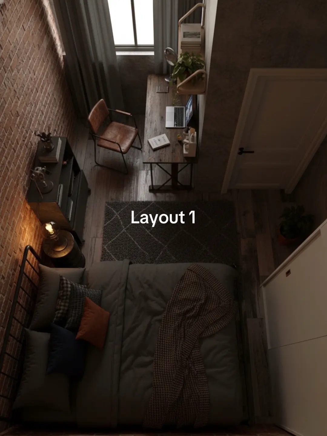
A top-down 3D render of a small bedroom with a brick wall, a bed, and a desk setup.
@homedecorave carousel breakdown
Homedecorave
#roomdecor #homedecor #bedroom
Effectiveness score
9/10
Views
6.9M
Likes
394.7K
Saves
25.5K
Engagement
6.3%
Hook
Layout 1
Goal
inspire
Offer
none
CTA
none
Caption
#roomdecor #homedecor #bedroom
Strategic Summary
This carousel leverages the 'A/B testing' cognitive trigger by presenting two distinct furniture arrangements for the exact same small bedroom space. The high-fidelity overhead perspective allows users to instantly comprehend the spatial utility, prompting a binary choice ('Which is better?') that drives the comment volume. The 'save' utility is high as the designs serve as blueprints for viewers with similarly sized rooms.
The Winning Formula
Same room, two options: High-fidelity overhead renders of small bedroom layouts invite the audience to vote on the best configuration.
What's working
- •Slide 1 establishes a 'standard' layout with the desk by the window, anchoring the viewer in a relatable problem (fitting a workspace in a bedroom).
- •Slide 2 flips the arrangement, creating immediate tension and curiosity as the viewer mentally maps the new flow against the old one.
- •The 'Layout 1' / 'Layout 2' text overlay is minimal, forcing the eye to scan the furniture placement rather than reading paragraphs.
- •High save rate driven by the 'blueprint' utility; viewers save to reference the exact furniture dimensions and positioning for their own small spaces.
What's not working
- •The text overlay lacks a direct question (e.g., 'Which layout saves more space?'), relying entirely on the audience to infer they should vote.
- •Without comments captured, it's hard to verify if the 'Dior' product placement in Slide 2 was a conversion driver or just aesthetic clutter, but it's subtle enough to be missed.
Viral lesson
Reduce complex spatial problems to a binary choice between two high-quality visual examples to trigger instant comparison and debate.
Can a small creator replicate this? High replicability for creators with 3D rendering skills (SketchUp/Blender) or access to a staged room; success depends on the 'coziness' and realism of the render to build trust in the layout's feasibility.
Structural Formula (steal-the-format)
Structure pattern
2-slide comparison: Slide 1 shows Option A, Slide 2 shows Option B in the same environment.
Copy formula
Minimalist labeling ('Layout 1', 'Layout 2') centered on the image.
What to swap (concrete remixes)
- •Swap bedroom layouts for kitchen work-triangle optimizations for home-cooking audiences.
- •Swap furniture arrangement for closet organization systems for fashion-organization audiences.
What NOT to copy
Do not use low-quality photos; the 'blueprint' value relies entirely on the clarity and realism of the overhead perspective.
Aesthetics
Photorealistic 3D architectural visualization with warm, moody lighting.
Color palette
What it conveys: The aesthetic feels attainable yet elevated, offering a 'dream small room' vibe that comforts users with limited square footage.
Slide-by-slide forensics
1setupoverheadcozy efficiencyworks:yesgrab:85/100aesthetic:90/100Layout 1
Layout 1
Visual description
Overhead, photorealistic 3D render of a small, narrow bedroom. A double bed is placed at the bottom with grey bedding and accent pillows. A wooden desk with a laptop is positioned along the right wall under a window, illuminated by natural light. A leather chair sits next to the desk. A dark dresser is on the left brick wall. A rug anchors the center space.
Scene setting
narrow urban bedroom with brick wall
Visible objects
vs prior slide
Style: Identical camera angle, lighting, and room shell; only furniture placement changes.
Story: Shows the 'control' layout where workspace is prioritized near natural light.
Predicted audience reaction
Users identify with the small space constraint and evaluate if the desk placement works for their needs.
Verdict: It sets a high-quality visual baseline that makes the comparison in Slide 2 meaningful.
2revealoverheadspacious flowworks:yesgrab:85/100aesthetic:90/100Layout 2
Layout 2
Visual description
Same room, rearranged. The bed is now pushed against the left brick wall under a wall-mounted lamp. The wooden desk has moved to the foreground bottom, creating a larger open floor space in the center. The leather chair is replaced by a sleek office chair. A Dior box is visible on a surface in the bottom right foreground.
Scene setting
narrow urban bedroom with brick wall
Visible objects
Products on screen
vs prior slide
Style: Identical rendering style and palette.
Story: Reveals the 'variant' layout that prioritizes open floor space over window-light for the desk.
Predicted audience reaction
Users debate whether the open space in Layout 2 is worth losing the natural light at the desk.
Verdict: It provides the contrast necessary to trigger the 'vote' behavior in the comments.
Commerce intent
Mentioned products
Comment ethnography
Diagnostics
Hook deep-dive
Layout 1
The viewer swipes to see 'Layout 2' to understand what the alternative configuration is and to judge which one is better.
Engagement read
High absolute volume with slightly below-average rate metrics suggests broad appeal reaching beyond the core niche.
Mechanics
The user swipes to see the alternative immediately to compare the utility of the second layout against the first.
Brand & funnel
Brands visible
Buying-journey moment: The viewer is in the inspiration phase, looking for spatial solutions before buying furniture.
Ideal Customer Profile
Young adults living in small apartments or dorms who are obsessed with interior design aesthetics and optimizing limited space.
Age
18-24
Gender
female
Readability
simple
Interests
Pain Points
Aspirations
Emotional Profile
Primary Emotion
curiosityIntensity
Effectiveness
Emotions Evoked
Emotional Arc
curiosity → comparison → decision
Why It Lands
The content triggers a desire for order and beauty. By presenting two distinct ways to organize a small space, it makes the viewer feel empowered to improve their own environment.
Writing Analysis
Style
educational
Tone
aspirational
Hook Type
contrast
Quality
The text is minimal, serving only as a label for the layouts. It is effective because it doesn't distract from the visual, but it lacks a strong hook or call to action.
Effectiveness
Goal Achievement
The high number of saves and shares indicates that the content successfully inspired viewers to save the ideas for later, which is the primary goal of home decor content.
Why It Spread
highly shareable 'this or that' format
top-down aesthetic view is visually satisfying
addresses a universal pain point of small room layouts
Content DNA
There is no explicit CTA, which is a missed opportunity to drive comments by asking 'Which layout do you prefer?'
Narrative Arc
The tension builds through the comparison of the two layouts, peaking when the viewer decides which one they prefer.
Psychological Blueprint
Why It Spread
The post went viral because it gamified interior design by presenting a 'this or that' choice in a highly aesthetic, low-friction format. The top-down 3D render provides a satisfying, clean visual that triggers the 'organization' itch, leading to high save and share rates as users bookmark it for their own future room makeovers. The lack of text allows the visual to speak for itself, making it universally appealing across language barriers.
Framework
contrast revealPrimary Tactic
contrastTactics Used
contrast reveal on slide 2 — showing a superior layout immediately after the first
visual pattern interrupt — the top-down view is a unique perspective compared to standard eye-level room tours
curiosity gap — the lack of context forces the user to swipe to see if the second layout is better
Cognitive Biases
choice-supportive bias — viewers feel compelled to pick a favorite layout, increasing engagement
framing effect — presenting the room as a 'problem to be solved' makes the viewer feel like an interior designer
Tribal Markers
Trust Signals
Slide Breakdown (2 analyzed)
Hook Analysis
The hook works by immediately establishing a 'this or that' scenario. The clean, high-quality visual is enough to stop the scroll.
Text
Layout 1
Visual
A top-down 3D render of a small bedroom with a brick wall, a bed, and a desk setup.
Visual Elements
Color Palette
Copy Analysis
Power Words
Open Loop: yes, the label 'Layout 1' implies there is a 'Layout 2' to compare.
Visual Psychology
Attention: the bed and desk setup
Emotional cue: warm lighting creates a sense of comfort
Composition: symmetry and organization
Text
Layout 2
Visual
A top-down 3D render of the same room with the furniture rearranged.
Visual Elements
Color Palette
Copy Analysis
Power Words
Open Loop: no, this is the final slide.
Visual Psychology
Attention: the rearranged desk position
Emotional cue: the change in layout triggers a 'problem solved' feeling
Composition: comparison and contrast
Comment Intelligence
Sentiment
PositiveResonance
Intent
inspire
Audience Vibe
The comments are filled with people debating which layout is more functional and tagging friends to show them the ideas.
Standout Quotes
“Layout 2 feels way more spacious.”
“I'm definitely saving this for when I move into my new apartment.”
“Layout 1 is better for gaming, but Layout 2 is better for sleeping.”