Slide Text
Some packaging Designs I like >>
Visual
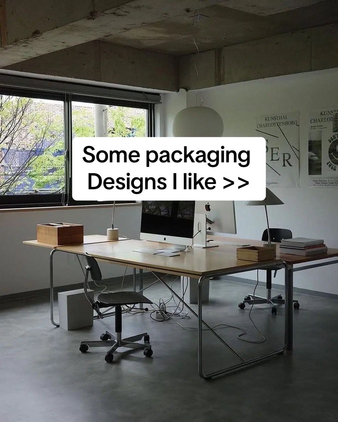
A clean, modern office workspace with a large wooden desk, Apple computer, and minimalist decor.
All Slides
@deetripper carousel breakdown
Dee®
Some packaging designs I like #packagingdesign #packaging #branding
Effectiveness score
8/10
Views
304.7K
Likes
30.4K
Saves
3.9K
Engagement
11.5%
Hook
Some packaging Designs I like >>
Goal
inspire
Offer
none
CTA
none
Caption
Some packaging designs I like #packagingdesign #packaging #branding
Strategic Summary
This carousel went viral due to its high utility as a visual reference library, triggering a 2.2x normal bookmark rate. The hook establishes designer authority through a clean studio aesthetic, while subsequent slides deliver specific, critique-driven examples rather than just pretty pictures. The low comment count relative to views indicates passive consumption—users are saving this for moodboards rather than debating it.
The Winning Formula
Curated Visual List + Specific Design Critique = Saveable Asset
What's working
- •Slide 1 uses a 'designer studio' background (concrete, iMac, minimalism) to silently signal authority before showing any products.
- •Slides 2-6 pair high-res product photography with a single sentence of specific design critique (e.g., 'Love the use of material'), adding educational value beyond just visuals.
- •The '>>' symbol on Slide 1 creates a subtle open loop, implying there is more value coming if they swipe.
- •High contrast visuals (black Nike box, textured cork, pink perfume) keep visual interest fresh across the 6 slides.
- •The bookmark rate (1.29%) is double the norm, proving the content is being treated as a reference tool, not just entertainment.
What's not working
- •Slide 6 contains typos ('compleet', 'blackground') which slightly undermines the professional authority established in Slide 1.
- •No explicit Call-to-Action (CTA) on the final slide—adding a 'Follow for more design inspo' could convert the high save rate into follower growth.
- •Comment engagement is extremely low (0.01%), suggesting the content doesn't provoke enough debate or questions to trigger algorithmic conversation boosts.
Viral lesson
In visual niches, utility (save-ability) often outperforms engagement (comments). If you make content people want to reference later, the algorithm rewards the dwell time and saves even without comments.
Can a small creator replicate this? Any creator in a visual niche (interior design, fashion, UI/UX) can replicate this by curating 5-6 high-quality examples and adding one sentence of expert critique to each, focusing on 'why' it works rather than just showing it.
Structural Formula (steal-the-format)
Structure pattern
6-slide carousel. Slide 1: Authority Hook (Studio shot + Title). Slides 2-6: Example (Product Shot + 1 Sentence Critique). No explicit CTA slide.
Copy formula
First-person opinion ('I like', 'Love the use') + Specific design attribute ('material', 'shape', 'multifunctional').
What to swap (concrete remixes)
- •Swap packaging designs for UI/UX screenshots for a web design audience.
- •Swap packaging designs for outfit details for a fashion stylist audience.
- •Swap packaging designs for room corners for an interior design audience.
What NOT to copy
Do not copy the typos on the final slide; maintain the professional tone established in the hook to preserve authority.
Aesthetics
Minimalist studio product photography with neutral backgrounds and sans-serif overlay text.
Color palette
What it conveys: The overall aesthetic feels curated, expensive, and calm. It signals 'good taste' immediately, making the viewer feel like an insider by saving it.
Slide-by-slide forensics
1hookwide shotprofessional calmworks:yesgrab:85/100aesthetic:90/100Some packaging Designs I like >>
Some packaging Designs I like >>
Visual description
A minimalist office space with concrete walls and floor. A light wood desk with chrome legs holds an iMac, a wooden box, and books. Large window on the left shows greenery outside. Posters on the wall read 'KUNSTHAL CHARLOTTENBORG'.
Scene setting
minimalist designer studio office
Visible objects
Products on screen
Predicted audience reaction
Designers feel immediately aligned with the aesthetic; signals this is a serious curation, not random clips.
Verdict: Sets the tone and authority instantly without needing to show a face.
2step in listproduct shoteco conscious appreciationworks:yesgrab:80/100aesthetic:85/100Love the use of material. Looks super clean yet environmentally friendly
Love the use of material. Looks super clean yet environmentally friendly
Visual description
Product shot of a brown kraft paper pouch with a silver cap next to a matching cardboard box. A dark blue paper band wraps around the box. Background is plain off-white.
Scene setting
studio product photography
Visible objects
Products on screen
Other text elements
- •B1 SUN SCREEN
- •FOR DRY SKIN
- •TOUN28
- •WE DON'T JUST THINK ABOUT THE ENVIRONMENT. WE ACT FOR THE ENVIRONMENT.
vs prior slide
Style: Maintains clean, minimalist photography style with neutral backgrounds.
Story: Moves from the creator's space to the first specific example of work.
Predicted audience reaction
Saves for sustainable packaging reference.
Comments reacting to this slide
- "@bygradesign: the first one is breathtaking"
Verdict: High utility for brands looking for eco-friendly packaging ideas.
3step in listproduct shotinnovative curiosityworks:yesgrab:85/100aesthetic:88/100I like how they played around with the shape
I like how they played around with the shape
Visual description
Two black shoe boxes with a unique cutout design. One box is open, revealing a shoe resting on a cardboard triangular stand. The other box is closed showing the geometric cutout. Grey background.
Scene setting
studio product photography
Visible objects
Products on screen
Other text elements
- •Nike Swoosh logo
vs prior slide
Style: Consistent studio lighting and neutral background.
Story: Shifts focus from material (Slide 2) to structural shape (Slide 3).
Predicted audience reaction
Appreciation for structural design innovation.
Verdict: Demonstrates a different design lever (structure vs material), keeping the list diverse.
4step in listcollagedelightworks:yesgrab:80/100aesthetic:82/100Making it multifunctional, love
Making it multifunctional, love
Visual description
Split image. Top shows a cork box designed to look like a stove. Bottom shows the box disassembled into coasters, a mug, and a stirrer. Dark grey background.
Scene setting
studio product photography
Visible objects
Products on screen
Other text elements
- •COASTER BOX
- •OPEN HERE
- •KAFEEC MEISTER
vs prior slide
Style: Same clean product photography style.
Story: Introduces functionality as a design criterion.
Predicted audience reaction
High save potential for gift packaging ideas.
Verdict: Multifunctional packaging is a high-value niche for e-commerce brands.
5step in listproduct shotluxury tactileworks:yesgrab:88/100aesthetic:90/100Once again, love the use of material.
Once again, love the use of material.
Visual description
A glass bottle with gold liquid sits in a textured, stone-like beige cube holder. Next to it is a matching textured cube box with 'rebel' cut out. White background.
Scene setting
studio product photography
Visible objects
Products on screen
Other text elements
- •rebel
- •to rebel
vs prior slide
Style: Consistent lighting, though texture is more pronounced here.
Story: Returns to material focus but with a luxury texture vs eco paper.
Predicted audience reaction
Strong desire to touch/hold; high inspiration value.
Verdict: The texture is visually distinct, preventing carousel fatigue.
6step in listproduct shotnostalgic chicworks:partialgrab:80/100aesthetic:85/100Its giving me 90's vibe, with a blue blackground it would've compleet the look
Its giving me 90's vibe, with a blue blackground it would've compleet the look
Visual description
A collection of matte pink/terracotta cosmetic boxes and cylinders stacked in a pyramid shape. Some lids are off. Script typography on the boxes. White background.
Scene setting
studio product photography
Visible objects
Products on screen
Other text elements
- •LES PARFUMS DE RIEMANN
- •PARIS - FRANCE
vs prior slide
Style: Consistent product shot style.
Story: Final example adds a critique element (what could be better).
Predicted audience reaction
Appreciation for the critique, validates the creator's expertise.
Verdict: Good content, but typos ('compleet', 'blackground') slightly reduce perceived professionalism.
Commerce intent
Mentioned products
Objections (from comments)
- •are you getting ip on them...or can someone borrow the idea
Comment ethnography
The audience consists of fellow designers and brand owners who view the creator as a curator of high-tier aesthetics. Language is reactive ('IN LOVE', 'breathtaking') rather than analytical.
Comments that characterize the audience
- "@aya.thinking.out.loud: EXCUSE ME! IM IN LOVE"
- "@bygradesign: the first one is breathtaking"
- "@itsi.d.r.i.s: are you getting ip on them...or can someone borrow the idea"
Pain points revealed
- •need for original packaging ideas
- •concern over intellectual property usage
Aspirations revealed
- •wanting to create 'breathtaking' designs
- •seeking clean, environmentally friendly aesthetics
Top questions asked
- •are you getting ip on them...or can someone borrow the idea
Objections
- •uncertainty about copying ideas
Diagnostics
Hook deep-dive
Some packaging Designs I like >>
The '>>' arrow and the promise of a list compel the user to see the first example to judge the quality of the curation.
Engagement read
Bookmark rate is 2.2x the library norm while comments are 0.1x the norm, indicating silent utility consumption.
Mechanics
Visual variety—each slide introduces a completely different texture and color palette (brown pouch, black box, cork, stone, pink metal).
Brand & funnel
Brands visible
Buying-journey moment: Viewer is in the inspiration/gathering phase of a branding project, not the buying phase.
Ideal Customer Profile
Aspiring or professional graphic designers, branding enthusiasts, and creative professionals who value minimalism and aesthetic innovation.
Age
18-24
Gender
neutral
Readability
simple
Interests
Pain Points
Aspirations
Emotional Profile
Primary Emotion
aspirationIntensity
Effectiveness
Emotions Evoked
Emotional Arc
curiosity → appreciation → inspiration → reflection
Why It Lands
The content triggers a sense of aesthetic satisfaction and professional envy, motivating the viewer to save the post for their own creative reference.
Writing Analysis
Style
conversational
Tone
relatable
Hook Type
listicle
Quality
The writing is sparse and minimalist, which complements the visual-heavy nature of the post. It avoids over-explaining, letting the images do the heavy lifting.
Effectiveness
Goal Achievement
The post achieved massive bookmark counts, which is the primary metric for 'inspiration' content. It successfully positioned the creator as a curator of good taste.
Why It Spread
high-quality, 'saveable' visual assets
minimalist, low-effort consumption format
niche appeal to the design community
Content DNA
There is no explicit CTA, which is a missed opportunity to drive followers, but it keeps the content feeling organic and non-salesy.
Narrative Arc
The flow is a steady stream of visual dopamine, keeping the viewer swiping to see the next 'cool' design, ending on a nostalgic note.
Psychological Blueprint
Why It Spread
The carousel succeeded because it serves as a 'saveable' resource for designers. With 3,940 bookmarks, the high-quality, niche-specific imagery acts as a mood board that users want to reference later. The low-friction, high-value visual format allows for rapid consumption and easy sharing within design circles.
Framework
listicle revelationPrimary Tactic
aspiration stackTactics Used
curiosity gap on slide 1 with '>>' implying more to come
pattern interrupt via high-quality, non-standard product photography
social comparison by sharing 'what I like' to establish taste authority
Cognitive Biases
mere exposure effect through repeated exposure to high-quality design
aesthetic-usability effect where beautiful designs are perceived as more functional
Tribal Markers
Trust Signals
Slide Breakdown (6 analyzed)
Text
Some packaging Designs I like >>
Visual
A clean, modern office workspace with a large wooden desk, Apple computer, and minimalist decor.
Visual Elements
Color Palette
Copy Analysis
Power Words
Open Loop: yes, the '>>' creates an immediate urge to see the rest of the list.
Visual Psychology
Attention: the centered white text box
Emotional cue: the clean, organized workspace suggests professional success
Composition: to establish a 'creative professional' persona
Text
Love the use of material. Looks super clean yet environmentally friendly
Visual
A brown paper sunscreen pouch and box with blue branding.
Visual Elements
Color Palette
Copy Analysis
Power Words
Open Loop: yes, the viewer wonders what other materials are featured.
Visual Psychology
Attention: the blue label on the product
Emotional cue: the eco-friendly aesthetic triggers positive environmental sentiment
Composition: to highlight product texture and sustainability
Text
I like how they played around with the shape
Visual
A black Nike shoebox with a unique triangular cutout design.
Visual Elements
Color Palette
Copy Analysis
Power Words
Open Loop: yes, curiosity about what other shapes are shown.
Visual Psychology
Attention: the unique triangular cutout
Emotional cue: the clever design triggers intellectual curiosity
Composition: to emphasize structural innovation
Text
Making it multifunctional, love
Visual
A cork box that unfolds into coasters.
Visual Elements
Color Palette
Copy Analysis
Power Words
Open Loop: yes, curiosity about the final slide.
Visual Psychology
Attention: the unfolded coasters
Emotional cue: the utility of the design triggers a 'want' response
Composition: to demonstrate functionality
Text
Once again, love the use of material.
Visual
A perfume bottle inside a textured, stone-like cube container.
Visual Elements
Color Palette
Copy Analysis
Power Words
Open Loop: yes, anticipation of the final slide.
Visual Psychology
Attention: the perfume bottle
Emotional cue: the tactile texture triggers sensory interest
Composition: to show premium packaging
Text
Its giving me 90's vibe, with a blue background it would've compleet the look
Visual
A stack of pink and red perfume boxes.
Visual Elements
Color Palette
Copy Analysis
Power Words
Open Loop: no, end of carousel.
Visual Psychology
Attention: the central stack of boxes
Emotional cue: nostalgia for 90s aesthetic
Composition: to create a visually satisfying conclusion
Comment Intelligence
Sentiment
PositiveResonance
Intent
inspire
Audience Vibe
The comments are sparse but appreciative, reflecting a community of designers who prefer to save rather than talk.
Top Comments
EXCUSE ME! IM IN LOVE
the first one is breathtaking
@notcinderella
fy page🥰
amo tu trabajo