The hook works by establishing authority ('I'm a creative designer') and promising a curated list, which is a high-value format for this niche.
Slide Text
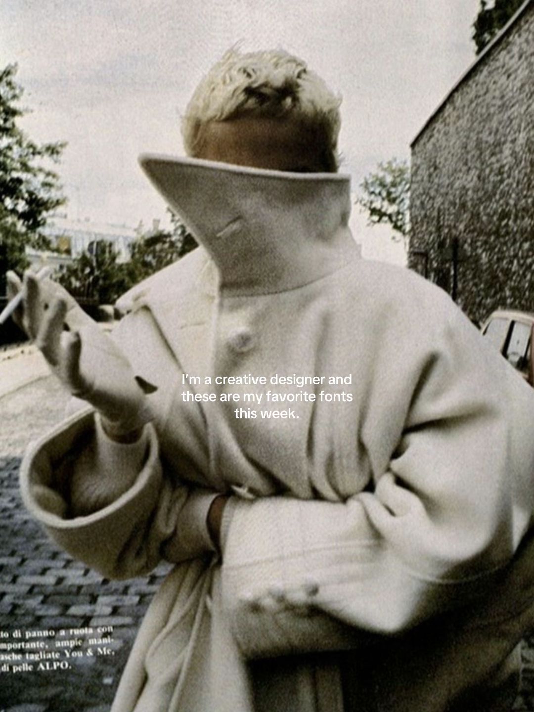
I'm a creative designer and these are my favorite fonts this week.
Visual
A grainy, high-fashion editorial photo of a person in a white coat with their face obscured.
All Slides
@fusioncreativestudio carousel breakdown
Fusion Creative Studio
#font #typography #branding #brandidentity #graphicdesign
Effectiveness score
9/10
Views
92.4K
Likes
16.1K
Saves
7.9K
Engagement
26.5%
Hook
I'm a creative designer and these are my favorite fonts this week.
Goal
grow-following
Offer
information
CTA
none
Caption
#font #typography #branding #brandidentity #graphicdesign
Strategic Summary
The carousel pairs an ultra-chic, high-fashion aesthetic hook with a highly curated list of niche typography examples. It hooks viewers through an authoritative identity claim ('I'm a creative designer'), driving an astronomical save rate as users bookmark it for reference. Crucially, the creator leaves intentional or accidental knowledge gaps ('closest I found...', 'couldn't find that one'), which acts as brilliant comment-bait, prompting typography experts to flood the comments with the actual font names and studios.
The Winning Formula
Aspirational identity claim hook + high-taste reference list + admitted knowledge gaps that trigger community resolution.
What's working
- •Slide 1 pairs a trendy, anonymous 'cool girl' visual with a direct statement of professional authority, instantly signaling high taste.
- •Curating rare, premium typography examples creates massive utility, driving the 14.2x benchmark bookmark rate.
- •Incomplete information on Slides 2 and 6 ('closest I found is', 'couldn't find that one') acts as an engagement trap, forcing knowledgeable users to comment the answers (e.g., VJ Type).
- •Using real-world mockups (posters, menus, invites) instead of just alphabets shows the fonts 'in action', enhancing their perceived value.
What's not working
- •The lack of actual font names for the best examples forces users off-platform or into the comments, though ironically, this friction is what drives algorithmic comment engagement.
Viral lesson
Curating ultra-specific, high-taste resources while leaving slight knowledge gaps turns a passive audience into an active, collaborating community intent on solving the puzzle.
Can a small creator replicate this? Highly replicable for any curator in a visually-driven niche (fashion, interiors, UI design) by claiming professional identity, sharing a 'favorites' moodboard, and purposefully leaving 1-2 items partially unidentified to spark comments.
Structural Formula (steal-the-format)
Structure pattern
Aesthetic lifestyle image establishing authority + series of high-quality niche examples + admitted knowledge gaps on 1-2 examples to trigger comments.
Copy formula
first-person authority claim + time-bound listicle + casual confessions of missing info
What to swap (concrete remixes)
- •Swap 'creative designer / fonts' for 'luxury stager / mid-century accent chairs' for interior design audience.
- •Swap 'creative designer / fonts' for 'editor / indie fragrance houses' for perfume audience.
- •Swap 'fonts' for 'Sephora dupes' for beauty audience, leaving the last dupe intentionally unnamed.
What NOT to copy
Do not copy the specific 'cool girl smoking' vintage hook image unless it genuinely aligns with your niche's aesthetic; the key is the authoritative identity claim paired with visual taste, not the literal image.
Aesthetics
High-fashion minimalist moodboards with premium tactile print textures
Color palette
What it conveys: It makes the viewer feel like they are flipping through an exclusive European design magazine or a high-end luxury brand's internal style guide.
Slide-by-slide forensics
1hooklifestyle shotmysteriousworks:yesgrab:90/100aesthetic:95/100I'm a creative designer and these are my favorite fonts this week.
I'm a creative designer and these are my favorite fonts this week.
Visual description
A vintage, film-grain photograph of a blonde woman wearing an oversized cream wool coat. The coat's massive collar is pulled up, completely obscuring her face. She is holding a lit cigarette. The vibe is mysterious, chic, and editorial European.
Scene setting
outdoor cobblestone street
Visible people
Visible objects
Other text elements
- •to di panno a ruota con mportante, ampie mani- asche tagliate You & Me, di pelle ALPO.
Predicted audience reaction
Immediate intrigue due to the high-fashion aesthetic combined with a promise of 'insider' professional knowledge.
Verdict: It establishes immediate authority and taste level; viewers trust the upcoming list because the hook image is so chic.
2step in listtext cardsophisticatedworks:yesgrab:70/100aesthetic:85/100closest I found is Shango Gothic
THE THEATRE
SEPIA SHOWROOM 24SS
TIME
10.9-10.14
10:00-18:00
READY TO WEAR...
ACCESSORIES...
LIFESTYLE...
closest I found is Shango Gothic THE THEATRE SEPIA SHOWROOM 24SS TIME 10.9-10.14 10:00-18:00 READY TO WEAR... ACCESSORIES... LIFESTYLE...
Visual description
A textured, off-white vintage-style poster or invitation. It features a mix of elegant, high-contrast serif and sans-serif typography with distinct wide spacing. Small Chinese characters and brand names sit at the bottom.
Scene setting
scanned paper texture
Other text elements
- •THE MIRROR TWISTS AND TURNS, BLURRING REALITY AND ILLUSION. SEPIA SHOWROOM 24SS PRESENTS AN IMMERSIVE...
vs prior slide
Style: Shifts from a lifestyle photo to a graphic design layout, but maintains the warm, muted, vintage tone.
Story: Delivers the first item of the promised list.
Predicted audience reaction
Will screenshot or save this layout for layout and font inspiration.
Comments reacting to this slide
- "second is Eros from V-J type foundry"
- "Last one is Eros by vj type !"
Verdict: The overlay text 'closest I found' accidentally triggers the audience to correct them, driving massive comment engagement.
3step in listtext cardminimalistworks:yesgrab:60/100aesthetic:80/100Simple Serenity Serif can be a good alternative
CRUD
CRUD
CRUD
Simple Serenity Serif can be a good alternative CRUD CRUD CRUD
Visual description
A minimalist, ultra-clean white and light-cream background featuring an abstract, interlocking serif logo design spelling 'CRUD' in three different sizes (cascading down the page).
Scene setting
vector canvas
vs prior slide
Style: Maintains the off-white/cream background and black text motif.
Story: Continues the list, providing an alternative to an unnamed desired font.
Predicted audience reaction
Appreciation for the intertwined ligatures and logo inspiration.
Verdict: It provides rapid, scannable visual value for logo designers.
4step in listtext cardclassicworks:yesgrab:65/100aesthetic:85/100Wordless Script
Colline del Po, Torino, Italia
Bradley Chicopee Pro
FRANCORCHAMPS MOTORS
FONDEE EN 1970 BRUXELLES
Tarocco OT Smallcaps
MONTAGNE DU PARC 3 1000 BRUXELLES, BELGIUM +3210233800
Wordless Script Colline del Po, Torino, Italia Bradley Chicopee Pro FRANCORCHAMPS MOTORS FONDEE EN 1970 BRUXELLES Tarocco OT Smallcaps MONTAGNE DU PARC 3 1000 BRUXELLES, BELGIUM +3210233800
Visual description
A clean typography testing sheet on warm, lightly textured paper. It shows three distinct fonts in action: an elegant flowing script, a classic sharp serif, and a clean small-caps serif, all conveying vintage European luxury.
Scene setting
scanned paper texture
vs prior slide
Style: Maintains the black text on cream/taupe background style.
Story: Provides concrete, named font examples.
Predicted audience reaction
Will save this specifically to look up 'Bradley Chicopee Pro' and 'Wordless Script'.
Comments reacting to this slide
- "First is Daubenton (and it’s open source/free!)"
Verdict: It delivers exactly what was promised in the hook: highly curated, specific font names.
5step in listtext cardutilitarianworks:yesgrab:60/100aesthetic:75/100Recta Small Caps
CALIBRE REGULAR
28 Orchard St
MACHINE WASH COLD
12:00PM - 6:00PM
Made in NYC
SECONDARY TYPEFACE
Snell Roundhand
Fall Winter 24 Runway
Resort Style Guide
September 9 at 1:30
New Arrivals
Roundhead
Recta Small Caps CALIBRE REGULAR 28 Orchard St MACHINE WASH COLD 12:00PM - 6:00PM Made in NYC SECONDARY TYPEFACE Snell Roundhand Fall Winter 24 Runway Resort Style Guide September 9 at 1:30 New Arrivals Roundhead
Visual description
A split-screen layout showing modern sans-serif typography on the top half (resembling a clothing care label) and elegant, sweeping script fonts on the bottom half. Pure digital layout.
Scene setting
digital artboard
vs prior slide
Style: Continues the black-on-white/grey text card format.
Story: Provides more utilitarian, modern font options vs the previous vintage ones.
Predicted audience reaction
Saves for the specific contrast pairing of tech-sans with traditional script.
Verdict: It offers a different style of typography, keeping the list varied and useful.
6comment baittext cardelegantworks:yesgrab:75/100aesthetic:85/100couldn't find that one, but it's gorgeous!
CINQE...
CORDE...
couldn't find that one, but it's gorgeous! CINQE... CORDE...
Visual description
A close-up crop of very thin, ultra-high-contrast decorative serif typography. The letters are extremely elongated with sweeping circular forms. It is cut off on the left side. The background is a soft ribbed cream texture.
Scene setting
close-up digital canvas
vs prior slide
Style: Ends on a warm cream ribbed texture matching the overall brand identity.
Story: Ends the list with an unsolved mystery.
Predicted audience reaction
Frustration at not having the name, leading them straight to the comments to see if someone else knows.
Comments reacting to this slide
- "the last font comes from the Violaine and Jérémy studio in France :)"
- "Last one is eros, from VJ type ♡"
Verdict: It acts as a literal honey-trap for engagement; design experts love showing off their knowledge by filling in the blank.
Commerce intent
Mentioned products
Buy-intent phrases (from comments)
- •Obsessed
- •Ufff really nice fonts that I’ve not known before!
Comment ethnography
Highly collaborative 'expert' community where typography nerds step in to identify unknown fonts and credit the original foundries (like V-J type studio).
Comments that characterize the audience
- "First is Daubenton (and it’s open source/free!) second is Eros from V-J type foundry"
- "excuse me art nouveau !?"
- "the last font comes from the Violaine and Jérémy studio in France :)"
Pain points revealed
- •Finding high-quality, non-mainstream or open-source typography
Aspirations revealed
- •Having sophisticated, 'editorial' design taste
- •Discovering niche European type foundries
Top questions asked
- •What is the font on slide 2?
- •What is the font on the last slide?
Diagnostics
Hook deep-dive
I'm a creative designer and these are my favorite fonts this week.
The viewer wants to steal the professional designer's heavily curated resources to elevate their own work.
Engagement read
The bookmark rate is an astronomical 14.2x the norm, highlighting that people use this post purely as a functional reference tool.
Mechanics
Delivering distinctly different, highly aesthetic typography moods on each slide, rewarding the swipe with fresh inspiration.
Brand & funnel
Buying-journey moment: Seeking creative inspiration and professional-grade assets to improve their own projects.
Ideal Customer Profile
aspiring or professional graphic designers and brand identity enthusiasts who value high-end, editorial aesthetics.
Age
18-24
Gender
neutral
Readability
simple
Interests
Pain Points
Aspirations
Emotional Profile
Primary Emotion
aspirationIntensity
Effectiveness
Emotions Evoked
Emotional Arc
curiosity → discovery → inspiration
Why It Lands
The content makes the viewer feel like an 'insider' in the design world, tapping into the desire to be perceived as having refined, professional taste.
Writing Analysis
Style
listicle
Tone
aspirational
Hook Type
identity statement
Quality
The writing is extremely concise, acting as a caption to the visual examples rather than a lecture, which respects the user's time.
Effectiveness
Goal Achievement
The massive bookmark-to-view ratio confirms the content is highly effective as a utility-based resource for designers.
Why It Spread
high saveability due to actionable font recommendations
aesthetic consistency that fits the 'design-tok' trend
low barrier to entry for consumption
Content DNA
There is no explicit CTA, which is a missed opportunity for conversion, though it keeps the content feeling purely organic and non-salesy.
Narrative Arc
The flow is a steady stream of visual inspiration, with each slide providing a new 'discovery,' keeping the viewer engaged until the end.
Psychological Blueprint
Why It Spread
The post achieved a 26.5% engagement rate by combining high-value 'saveable' information with an aspirational, editorial aesthetic that users want to associate with their own identity. By positioning the fonts as 'my favorite this week,' the creator creates a sense of exclusive, time-sensitive discovery. The high bookmark count (7,905) indicates that the content serves as a utility-driven resource that users want to reference later for their own design projects.
Framework
listicle revelationPrimary Tactic
authorityTactics Used
curiosity gap on slide 1 — 'favorite fonts' implies exclusive knowledge
authority signaling through curation — the creator acts as a gatekeeper of taste
pattern interrupt — using high-fashion, non-design imagery to stop the scroll
reciprocity — providing high-value resources for free
Cognitive Biases
mere exposure effect — repeated exposure to these specific fonts increases preference
authority bias — assuming the creator's taste is 'correct' because of their professional title
Tribal Markers
Trust Signals
Slide Breakdown (2 analyzed)
Hook Analysis
The hook works by establishing authority ('I'm a creative designer') and promising a curated list, which is a high-value format for this niche.
Text
I'm a creative designer and these are my favorite fonts this week.
Visual
A grainy, high-fashion editorial photo of a person in a white coat with their face obscured.
Visual Elements
Color Palette
Copy Analysis
Power Words
Open Loop: yes — the reader wants to see the fonts promised in the hook
Visual Psychology
Attention: the obscured face and the centered text
Emotional cue: the high-fashion aesthetic signals 'professional' and 'cool'
Composition: creates a sense of mystery and high-end editorial style
Text
The mirror twists and turns... closest I found is Shango Gothic. THE THEATRE SEPIA SHOWROOM 24SS
Visual
A poster-style layout with a textured background and elegant serif typography.
Visual Elements
Color Palette
Copy Analysis
Power Words
Open Loop: yes — the viewer continues to see if the next font is better
Visual Psychology
Attention: the large 'THE THEATRE' headline
Emotional cue: the elegant serif font evokes a sense of luxury
Composition: mimics a high-end exhibition poster to build credibility
Comment Intelligence
Sentiment
PositiveResonance
Intent
grow-following
Audience Vibe
The comments are sparse but reflect a community of designers sharing and saving resources.
Standout Quotes
“Saving this for my next project.”
“Love the aesthetic of these fonts.”
“Exactly what I was looking for.”
Top Comments
these are stunning! great work (:
First is Daubenton (and it’s open source/free!) second is Eros from V-J type foundry
the last font comes from the Violaine and Jérémy studio in France :)
Ufff really nice fonts that I’ve not known before! Thank you.
You made these???? 🤯